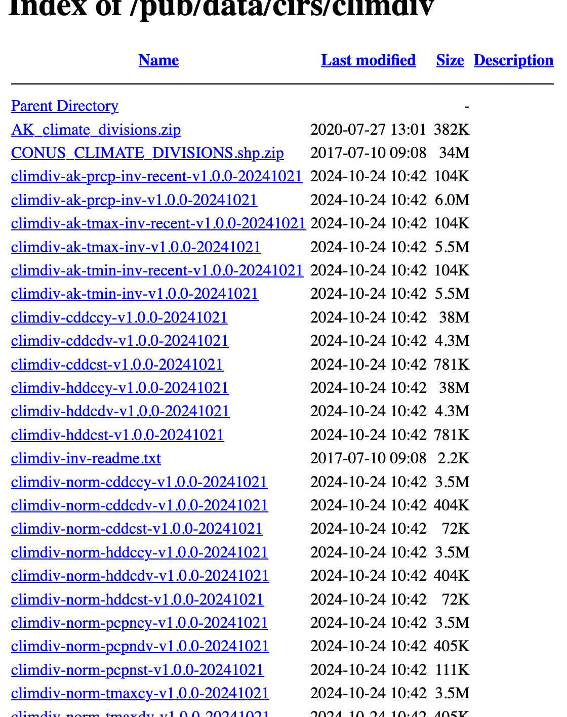
Period of record is 1895 through latest month available, updated monthly.
The major parameters in this file are sequential climatic divisional, statewide, regional and national monthly
Standardized Precipitation Index (SPI), and
Palmer Drought Indices (PDSI, PHDI, PMDI, and ZNDX).
The definitions are also listed in the readme file.
Palmer Drought Severity Index (PDSI)
This is a meteorological drought index used to assess the severity of dry or wet spells of weather.
This is the monthly value (index) that is generated indicating the severity of a wet or dry spell.
This index is based on the principles of a balance between moisture supply and demand. Man-made changes were not considered in this calculation.
The index generally ranges from -6 to +6, with negative values denoting dry spells and positive values indicating wet spells. There are a few values in the magnitude of +7 or -7.
PDSI values 0 to -.5 = normal;
-0.5 to -1.0 = incipient drought;
-1.0 to -2.0 = mild drought;
-2.0 to -3.0 = moderate drought;
-3.0 to -4.0 = severe drought;
and greater than -4.0 = extreme drought.
Similar adjectives are attached to positive values of wet spells.
Palmer Hydrological Drought Index (PHDI)
This is the monthly value (index) generated monthly that indicates the severity of a wet or dry spell.
This index is based on the principles of a balance between moisture supply and demand. Man-made changes such as increased irrigation, new reservoirs, and added industrial water use were not included in the computation of this index.
The index generally ranges from -6 to +6, with negative values denoting dry spells, and positive values indicating wet spells. There are a few values in the magnitude of +7 or -7.
PHDI values:
0 to -0.5 = normal
-0.5 to -1.0 = incipient drought
-1.0 to -2.0 = mild drought
-2.0 to -3.0 = moderate drought
-3.0 to -4.0 = severe drought
greater than -4.0 = extreme drought
Similar adjectives are attached to positive values of wet spells.
This is a hydrological drought index used to assess long-term moisture supply.
Palmer “Z” Index (ZNDX)
This is the generated monthly Z values, and they can be expressed as the “Moisture Anomaly Index.”
Each monthly Z value is a measure of the departure from normal of the moisture climate for that month.
This index can respond to a month of above-normal precipitation, even during periods of drought.
Table 1 contains expected values of the Z index and other drought parameters.
See Historical Climatology Series 3-6 through 3-9 for a detailed description of the drought indices.
Modified Palmer Drought Severity Index (PMDI)
This is a modification of the Palmer Drought Severity Index. The modification was made by the National Weather Service Climate Analysis Center for operational meteorological purposes. The Palmer drought program calculates three intermediate parallel index values each month. Only one value is selected as the PDSI drought index for the month. This selection is made internally by the program on the basis of probabilities.
If the probability that a drought is over is 100%, then one index is used.
If the probability that a wet spell is over is 100%, then another index is used.
If the probability is between 0% and 100%, the third index is assigned to the PDSI.
The modification (PMDI) incorporates a weighted average of the wet and dry index terms, using the probability as the weighting factor.1.
The PMDI and PDSI will have the same value during an established drought or wet spell (i.e., when the probability is 100%), but they will have different values during transition periods.
Standardized Precipitation Index (SPxx)
This is a transformation of the probability of observing a given amount of precipitation in xx months.
A zero index value reflects the median of the distribution of precipitation.
A -3 indicates a very extreme dry spell.
A +3 indicates a very extreme wet spell.
The more the index value departs from zero, the drier or wetter an event lasting xx months is when compared to the long-term climatology of the location.
The index allows for comparison of precipitation observations at different locations with markedly different climates.
An index value at one location expresses the same relative departure from median conditions at one location as at another location.
It is calculated for different time scales since it is possible to experience dry conditions over one time scale while simultaneously experiencing wet conditions over a different time scale.
Table 1 Classes for Wet and Dry Periods, expected values of the z-index
Approximate Cumulative Frequency %
PHDI Range
Category
Z Range
> 96
> 4.00
Extreme wetness
> 3.50
90-95
3.00, 3.99
Severe wetness
2.50, 3.49
73-89
1.50, 2.99
Mild to moderate wetness
1.00, 2.49
28-72
-1.49, 1.49
Near normal
-1.24, 0.99
11-27
-1.50, -2.99
Mild to moderate drought
-1.25, -1.99
5-10
-3.00, -3.99
Severe drought
-2.00, -2.74
< 4
<-4.00
Extreme drought
<-2.75
Let us get
Palmer Drought Severity Index (PDSI)
Palmer Hydrological Drought Index (PHDI)
Palmer “Z” Index (ZNDX)
There are two files for each index, one at the state level and one at the division level.
Let us first get the state level files.
import pandas as pddf_pdsi_st = pd.read_csv("https://www.ncei.noaa.gov/pub/data/cirs/climdiv/climdiv-pdsist-v1.0.0-20241021")df_pdsi_st.info
Now we see that there are 12480 rows (observations) and one column (variable).
We need to read the data into different variables. The readme file on the NOAA website lists the position of the variables. But as all the information is one variable, we need to separate or create new variables based on the position number.
An easier way maybe to use read_fwf that can read fixed width data files. There are two ways we can do, use default options and then rename the variables.
This doesn’t seem to help as all the variables are read into one column or variable.
A better option would be to check the position numbers of each of the variables and read it directly.
Note, we need to be careful about the column numbers. two things to keep in mind 1. index value starts from zero 2. if we give a value of (0,3), the variable is read from positions 0,1 and 2.
import pandas as pdpd.set_option('display.precision', 2)pd.set_option('display.max_columns', None)#let us build a list of tuples with the column / variable namescolspecs = [(0,3), (3,4), (4,6), (6,10), (10,17), (17,24), (24,31), (31,38), (38,45), (45,52), (52,59), (59,66), (66,73), (73,80), (80,87), (87,-1)]names = ['state', 'division', 'element', 'year','jan','feb','mar','apr','may','jun','jul','aug','sep','oct','nov','dec']df_pdsi_st = pd.read_fwf("https://www.ncei.noaa.gov/pub/data/cirs/climdiv/climdiv-pdsist-v1.0.0-20241021",colspecs=colspecs, names=names)df_pdsi_st
state
division
element
year
jan
feb
mar
apr
may
jun
jul
aug
sep
oct
nov
dec
0
1
0
5
1895
0.78
-0.59
-0.17
-0.54
-0.55
0.58
0.42
0.77
-0.78
-0.80
-1.41
-1.62
1
1
0
5
1896
-1.65
-1.19
-1.23
-1.70
-2.15
-1.58
-1.70
-2.29
-2.91
-2.88
-2.63
-3.39
2
1
0
5
1897
-3.49
-2.86
-1.58
-1.63
-2.22
-3.12
-3.49
-2.75
-3.65
-4.05
-4.41
-4.13
3
1
0
5
1898
-4.16
-4.61
-5.13
-4.57
-5.37
-5.43
-4.99
0.85
0.61
0.93
1.62
1.21
4
1
0
5
1899
1.45
1.79
-0.02
-0.65
-1.62
-2.25
-1.95
-2.23
-3.12
-3.07
-3.20
-2.92
...
...
...
...
...
...
...
...
...
...
...
...
...
...
...
...
...
12475
365
0
5
2020
3.34
3.76
3.60
3.83
-0.30
-0.23
-0.55
0.11
0.57
0.66
-0.86
-1.46
12476
365
0
5
2021
-1.94
-1.87
-1.73
-1.65
0.23
1.31
2.39
3.20
-0.28
-0.11
-1.09
-1.96
12477
365
0
5
2022
-2.79
-3.28
-3.18
-2.97
-3.15
-3.76
-4.19
-3.00
-3.72
-3.70
-3.39
-2.99
12478
365
0
5
2023
-1.92
-2.08
-1.54
-1.22
-1.26
-0.87
-0.99
-1.38
-2.08
-2.31
-2.97
-3.64
12479
365
0
5
2024
-3.12
-3.05
-2.66
-2.18
-1.61
-1.81
-1.59
-2.28
-1.41
-99.99
-99.99
-99.99
12480 rows × 16 columns
It is always a good idea to check the original file to see if all the variables are read properly.
Again, it appears that the file is read correctly.
Also from the readme file at NOAA, this file is for PSDI. Let us make sure that this is accurate.
df_pdsi_st['element'].describe()
count    12480.0
mean         5.0
std          0.0
min          5.0
25%          5.0
50%          5.0
75%          5.0
max          5.0
Name: element, dtype: float64
It appears that all of the element values are 5, Palmer Drought Severity Index (PDSI). So, we have used the right data set and read the variables correctly.
Let us check the values of the other variables also. It is a good idea to check to check the data before we do any visualization or analysis.
df_pdsi_st.describe()
state
division
element
year
jan
feb
mar
apr
may
jun
jul
aug
sep
oct
nov
dec
count
12480.00
12480.0
12480.0
12480.00
12480.00
12480.00
12480.00
12480.00
12480.00
12480.00
12480.00
12480.00
12480.00
12480.00
12480.00
12480.00
mean
111.05
0.0
5.0
1959.50
0.14
0.13
0.08
0.09
0.10
0.11
0.14
0.15
0.12
-0.58
-0.65
-0.65
std
102.87
0.0
0.0
37.53
2.50
2.44
2.42
2.37
2.39
2.49
2.63
2.63
2.53
9.10
9.10
9.10
min
1.00
0.0
5.0
1895.00
-8.03
-8.12
-8.37
-8.48
-9.01
-9.29
-9.83
-9.63
-8.58
-99.99
-99.99
-99.99
25%
24.75
0.0
5.0
1927.00
-1.61
-1.52
-1.57
-1.55
-1.58
-1.61
-1.67
-1.66
-1.59
-1.58
-1.67
-1.72
50%
74.50
0.0
5.0
1959.50
0.08
0.13
0.04
0.08
0.14
0.19
0.17
0.07
0.02
0.07
-0.05
0.01
75%
207.25
0.0
5.0
1992.00
1.97
1.91
1.83
1.80
1.81
1.92
2.07
2.07
1.91
1.98
1.96
1.98
max
365.00
0.0
5.0
2024.00
9.76
9.19
8.53
9.36
8.99
9.12
9.80
9.56
11.82
12.51
11.31
10.60
We see that division has a value of zero always and it makes sense as this is a state level dataset.
We see that the year ranges from 1895 to 2024.
The describe() method gives count, mean, std, min, 25%, 50%, 75% and max. These descriptive statistics give an idea of how the data is distributed.
What are these terms?
Note
mean: The mean is the average of a set of numbers. It is calculated by summing all the values and then dividing by the number of values.
25%: This refers to the 25th percentile, also known as the first quartile (Q1). It is the value below which 25% of the data falls.
50% or median: The median is the middle value of a dataset when it is ordered from least to greatest. If the dataset has an odd number of observations, the median is the middle number. If it has an even number, the median is the average of the two middle numbers. The 50th percentile is the same as the median.
75%: This refers to the 75th percentile, also known as the third quartile (Q3). It is the value below which 75% of the data falls.
std: This refers to the standard deviation, which measures the amount of variation or dispersion in a set of values. A low standard deviation means that the values tend to be close to the mean, while a high standard deviation means that the values are spread out over a wider range.
For the values of PDSI for some months, we see the minimum is -99.99 and this distorts the distribution and the standard deviation as it is an outlier
This is a common occurrence and that’s why it is always a good idea to check the documentation and the descriptive statistics of the data.
So we need to set -99.99 as missing value na.
Note, we are saving the new dataset using the same name, with only -99.99 as missing value nan.
import numpy as npdf_pdsi_st = df_pdsi_st.replace(-99.99,np.nan)
let us check the variable distribution now.
df_pdsi_st.describe()
state
division
element
year
jan
feb
mar
apr
may
jun
jul
aug
sep
oct
nov
dec
count
12480.00
12480.0
12480.0
12480.00
12480.00
12480.00
12480.00
12480.00
12480.00
12480.00
12480.00
12480.00
12480.00
12384.00
12384.00
12384.00
mean
111.05
0.0
5.0
1959.50
0.14
0.13
0.08
0.09
0.10
0.11
0.14
0.15
0.12
0.19
0.12
0.13
std
102.87
0.0
0.0
37.53
2.50
2.44
2.42
2.37
2.39
2.49
2.63
2.63
2.53
2.50
2.51
2.53
min
1.00
0.0
5.0
1895.00
-8.03
-8.12
-8.37
-8.48
-9.01
-9.29
-9.83
-9.63
-8.58
-8.14
-7.62
-7.50
25%
24.75
0.0
5.0
1927.00
-1.61
-1.52
-1.57
-1.55
-1.58
-1.61
-1.67
-1.66
-1.59
-1.54
-1.62
-1.68
50%
74.50
0.0
5.0
1959.50
0.08
0.13
0.04
0.08
0.14
0.19
0.17
0.07
0.02
0.12
-0.03
0.04
75%
207.25
0.0
5.0
1992.00
1.97
1.91
1.83
1.80
1.81
1.92
2.07
2.07
1.91
1.99
1.98
2.00
max
365.00
0.0
5.0
2024.00
9.76
9.19
8.53
9.36
8.99
9.12
9.80
9.56
11.82
12.51
11.31
10.60
Now we can see that the minimum values for some months are not -99.99 and as expected the standard deviation also has come down.
We can check the entire distribution of the values using boxplot().
import plotly.express as px#get national datadf = df_pdsi_st.loc[df_pdsi_st.state ==110]fig = px.bar(df, x ='year', y ='jul')fig.show()
Note: PDSI values are given as,
0 to -.5 = normal;
-0.5 to -1.0 = incipient drought;
-1.0 to -2.0 = mild drought;
-2.0to -3.0 = moderate drought;
-3.0 to -4.0 = severe drought; and
greater than - 4.0 = extreme drought.
Let us check the number of extreme drought incidents per each year nationally.
There is some more tidying up to do before we can analyze this dataset. Notice that the month values are in columns. It may be easier for our analysis if we can have these values in a new coulmn. This is called reshaping the data from wide to long format.
Let us do some tidying of the data in order to do analysis easily. we can convert the data from the values in columns to rows i.e.
# let us reshape the data to Loc*Year*Monthdf_long = pd.melt(df_pdsi_st, id_vars=['state', 'division', 'element', 'year'], value_vars=['jan','feb','mar','apr','may','jun','jul','aug','sep','oct','nov','dec'], var_name='month', value_name='PDSI')# let us drop cases where missing values are present, for 2024df_long = df_long.dropna()
What did the code do?
The code reshapes the DataFrame df_pdsi_st from a wide format to a long format using the pd.melt function.
The function pd.melt() is used to reshape the DataFrame df_pdsi_st from a wide format to a long format. pd.melt() is particularly useful when you want to consolidate multiple columns into a single column, which can make it easier to perform certain types of data analysis or visualization.
The id_vars parameter is set to [‘state’, ‘division’, ‘element’, ‘year’]. These columns will remain as they are in the resulting DataFrame and will not be unpivoted. They act as identifier variables that are repeated for each melted value.
The value_vars parameter is set to [‘jan’, ‘feb’, ‘mar’, ‘apr’, ‘may’, ‘jun’, ‘jul’, ‘aug’, ‘sep’, ‘oct’, ‘nov’, ‘dec’], which represents the months of the year. These columns contain the values that will be unpivoted into a single column.
The var_name parameter is set to ‘month’, which means that the names of the original columns specified in value_vars will be stored in a new column named ‘month’.
Finally, the value_name parameter is set to ‘PDSI’, which means that the values from the original columns specified in value_vars will be stored in a new column named ‘PDSI’.
This code effectively transforms the DataFrame from a format where each month is a separate column into a format where there is a single column for months and another column for the corresponding values. This long format is often more suitable for time series analysis and plotting.
We drop rows with missing values using the dropna method for the year 2024 (note we converted the -99 values to nan).
The original pdsi_st data set has 12480 rows and df_pdsi_st.shape[1] columns. The new data set, after transforming from wide to long, has 149472 rows and 6 columns which is 12480 rows and 16 columns.
After dropping the missing values, we have 149472 observations. It is always a good practice to check the data set information after each major manipulation to see that the size is what we expect.
Now that we have the data in the format that we want, we can analyze it.
Let us count the number of extreme drought or extreme precipitation over the years.
import numpy as nppdsi_conditions = [ (df_long['PDSI'] <-4.0), (df_long['PDSI'].between(-4.0, -3.0, 'left')), (df_long['PDSI'].between(-3.0, -2.0, 'left')), (df_long['PDSI'].between(-2.0, -1.0, 'left')), (df_long['PDSI'].between(-1.0, -0.5, 'left')), (df_long['PDSI'].between(-0.5, 0.5, 'neither')), (df_long['PDSI'].between(0.5, 1.0, 'right')), (df_long['PDSI'].between(1.0, 2.0, 'right')), (df_long['PDSI'].between(2.0, 3.0, 'right')), (df_long['PDSI'].between(3.0, 4.0, 'right')), (df_long['PDSI'] >=4.0)]# create a list of the PDSI labels that we want to assign for each condition based on PDSIpdsi_labels = [ 'extreme drought','severe drought', 'moderate drought', 'mild drought', 'incipient drought', 'normal', 'incipient wetspell', 'mild wetspell', 'moderate wetspell', 'severe wetspell', 'extreme wetspell']# create a new column and use np.select to assign values to it using our lists as argumentsdf_long['pdsi_label'] = np.select(pdsi_conditions, pdsi_labels, default='unlabeled')# display updated DataFramedf_long.head()
state
division
element
year
month
PDSI
pdsi_label
0
1
0
5
1895
jan
0.78
incipient wetspell
1
1
0
5
1896
jan
-1.65
mild drought
2
1
0
5
1897
jan
-3.49
severe drought
3
1
0
5
1898
jan
-4.16
extreme drought
4
1
0
5
1899
jan
1.45
mild wetspell
What did we do in this code?
First, a list named pdsi_conditions is created. This list contains a series of boolean conditions that check the values in the ‘PDSI’ column of the DataFrame df_long.
Each condition corresponds to a specific range of PDSI values.
For example, the first condition checks if the PDSI value is less than -4.0, indicating an extreme drought, while the last condition checks if the PDSI value is greater than or equal to 4.0, indicating an extreme wet spell.
The between method is used to check if the PDSI values fall within specific ranges.For example,
df_long[‘PDSI’].between(-4.0, -3.0, ‘left’): This checks if the PDSI value is between -4.0 (inclusive) and -3.0 (exclusive), indicating a severe drought.
df_long[‘PDSI’].between(-0.5, 0.5, ‘neither’): This checks if the PDSI value is between -0.5 and 0.5 (both exclusive), indicating near-normal conditions.
df_long[‘PDSI’].between(3.0, 4.0, ‘right’): This checks if the PDSI value is between 3.0 (exclusive) and 4.0 (inclusive), indicating severe wet conditions
Next, a list named pdsi_labels is defined. This list contains the labels that correspond to each of the conditions in pdsi_conditions. These labels describe the severity of the drought or wet spell, ranging from ‘extreme drought’ to ‘extreme wetspell’.
The np.select function from the NumPy library is then used to create a new column in the DataFrame called ‘pdsi_label’. This function takes the pdsi_conditions and pdsi_labels lists as arguments and assigns the appropriate label to each row in the DataFrame based on the PDSI value.
Finally, the head method is called on df_long to display the first few rows of the updated DataFrame, allowing the user to verify that the new ‘pdsi_label’ column has been correctly added and populated with the appropriate labels. This approach ensures that each PDSI value is categorized accurately, providing a clear and descriptive label for the severity of drought or wet spell conditions.
Let us plot the data to see the distribution of the extreme drought and extreme wetspell over the years.
import plotly.express as px# Plot the distribution of the 'PDSI' variablefig = px.histogram(df_long, x='PDSI', nbins=20, title='Distribution of PDSI')# Update layout for better visualizationfig.update_layout( xaxis_title='PDSI', yaxis_title='Frequency', title_x=0.5)# Show the plotfig.show()
We created a historgram to see the distribution of the variable. We can see that there are few values which are less than -6 or greater than 6.
We can also see that the distribution is skewed to the left, indicating that there are more months with negative PDSI values (indicating drought conditions) than positive values (indicating wet conditions).
Let us count the number of observations for each of the PDSI labels.
import pandas as pddf_long[['pdsi_label']].value_counts()
We can see that for some reason. there are some value of PDSI, -0.5 and +0.5 that are not labeled.
It looks like in the code, we have used neither for the condition -0.5 to 0.5. We should have used ‘both’ as we want to include both -0.5 and 0.5. We used neither as the description in the readme file is not clear.
Let us fix this by changing the conditions assuming that the lower value is inclusive and the upper limit is not inclusive (the documentation is not clear). As this impacts only a small fraction, less than 0.5%, it shouldn’t be much of an issue even if we were wrong.
import numpy as nppdsi_conditions = [ (df_long['PDSI'] <-4.0), (df_long['PDSI'].between(-4.0, -3.0, 'left')), (df_long['PDSI'].between(-3.0, -2.0, 'left')), (df_long['PDSI'].between(-2.0, -1.0, 'left')), (df_long['PDSI'].between(-1.0, -0.5, 'left')), (df_long['PDSI'].between(-0.5, 0.5, 'both')), (df_long['PDSI'].between(0.5, 1.0, 'right')), (df_long['PDSI'].between(1.0, 2.0, 'right')), (df_long['PDSI'].between(2.0, 3.0, 'right')), (df_long['PDSI'].between(3.0, 4.0, 'right')), (df_long['PDSI'] >=4.0)]# create a list of the PDSI labels that we want to assign for each condition based on PDSIpdsi_labels = [ 'extreme drought','severe drought', 'moderate drought', 'mild drought', 'incipient drought', 'normal', 'incipient wetspell', 'mild wetspell', 'moderate wetspell', 'severe wetspell', 'extreme wetspell']# create a new column and use np.select to assign values to it using our lists as argumentsdf_long['pdsi_label'] = np.select(pdsi_conditions, pdsi_labels, default='unlabeled')
The only difference is we have used,
(df_long[‘PDSI’].between(-0.5, 0.5, ‘both’)), instead of
(df_long[‘PDSI’].between(-0.5, 0.5, ‘neither’)).
Let us print the results, in a slightly better format.
import pandas as pdfrom tabulate import tabulate# Count the number of occurrences of each labellabel_counts = df_long[['pdsi_label']].value_counts().reset_index(name='count')# Rename columns for better readabilitylabel_counts.columns = ['PDSI Label', 'Count']# Print the table in a pretty formatprint(tabulate(label_counts, headers='keys', tablefmt='pretty'))
Now, we can analyze whether extreme drought or exteme wetspells are getting more common nationally or in any state.
Let us now find out the average value of these extreme events at the yearly level and plot them.
# let us count the number of months in which a extreme weather event has happened over the years, nationally#df = df.loc[df.state == 110 and df.pdsi_label == 'extreme drought']df = df_long.loc[(df_long.state ==110) & (df_long.pdsi_label =='extreme drought')]df_pivot = pd.pivot_table( data=df, index='year', aggfunc='count')df_pivot
PDSI
division
element
month
pdsi_label
state
year
1910
1
1
1
1
1
1
1911
6
6
6
6
6
6
1918
8
8
8
8
8
8
1925
4
4
4
4
4
4
1931
11
11
11
11
11
11
1933
1
1
1
1
1
1
1934
12
12
12
12
12
12
1935
4
4
4
4
4
4
1936
6
6
6
6
6
6
1937
1
1
1
1
1
1
1939
2
2
2
2
2
2
1940
10
10
10
10
10
10
1952
1
1
1
1
1
1
1953
1
1
1
1
1
1
1954
10
10
10
10
10
10
1955
6
6
6
6
6
6
1956
4
4
4
4
4
4
1957
2
2
2
2
2
2
1963
2
2
2
2
2
2
1964
2
2
2
2
2
2
1981
4
4
4
4
4
4
1988
5
5
5
5
5
5
1989
1
1
1
1
1
1
2000
10
10
10
10
10
10
2012
7
7
7
7
7
7
2013
3
3
3
3
3
3
We notice that df_pivot data set as the count of extreme drought nationally for each of the years that the extreme drought has happened (as we filtered data based on the code for nationally (110) and pdsi_label = extreme drought). However, we can see that all the columns have the same value. This is becuase of the aggregation function that we used, aggfunc = ‘count’.
In this particular case, we need only count the number of months each year when extreme drought conditions were there nationally. We don’t need the other variables. We can change our code slightly.
# let us count the number of months in which a extreme weather event has happened over the years, nationally#df = df.loc[df.state == 110 and df.pdsi_label == 'extreme drought']df = df_long.loc[(df_long.state ==110) & (df_long.pdsi_label =='extreme drought')]df_pivot = pd.pivot_table( data=df[['year', 'pdsi_label']], index='year', aggfunc='count').rename(columns={'pdsi_label': 'count'}).sort_values(by='count', ascending=False)df_pivot
count
year
1934
12
1931
11
2000
10
1940
10
1954
10
1918
8
2012
7
1955
6
1936
6
1911
6
1988
5
1981
4
1925
4
1935
4
1956
4
2013
3
1957
2
1963
2
1964
2
1939
2
1989
1
1910
1
1952
1
1937
1
1933
1
1953
1
What do we do in the code?
First, the code filters a DataFrame named df_long to create a new DataFrame df.
The filtering condition selects rows where the state column equals 110 and the pdsi_label column equals ‘extreme drought’.
This operation is performed using the .loc accessor, which allows for label-based indexing. The resulting df DataFrame contains only the rows that meet these specific criteria.
Next, the code creates a pivot table from the filtered DataFrame df. The pd.pivot_table function is used to reshape the data.
The pivot table is constructed using the year and pdsi_label columns from df.
The index parameter is set to ‘year’, meaning that each unique year will become a row in the pivot table.
The aggfunc parameter is set to ‘count’, which means that the pivot table will count the number of occurrences of each year.
The resulting pivot table is assigned to a new DataFrame named df_pivot.
The pivot table contains the count of extreme drought events for each year that they occurred nationally.
The columns of the pivot table are renamed to ‘count’ for clarity using the rename method.
The rows of the pivot table are sorted in descending order based on the count values using the sort_values method.
Finally, the pivot table df_pivot is displayed. This table shows the count of extreme drought events for each year that they occurred nationally.
It appears that nationally, 1934 had the highest number of months with extreme drought conditions with all the 12 months in extreme drought. This is followed by 1930 with 11 months in extreme drought. The year 2000 had 10 months in extreme drought.
How about by decade? Let us check the number of months with extreme drought by decade.
df_pivot['decade'] = (df_pivot.index //10) *10# sum up by decadedf_pivot_decade = df_pivot.groupby('decade').sum().sort_values(by='count', ascending=False)df_pivot_decade
count
decade
1930
37
1950
24
1910
15
1940
10
1980
10
2000
10
2010
10
1920
4
1960
4
It appears 1930s had the highest number of months with extreme drought conditions nationally.
The number of months with extreme drought are significantly higher since 2000, around 20 months compared to the 1980-2000 (10).
We can see it graphically.
fig = px.bar(df_pivot, x= df_pivot.index, y ='count')fig.update_layout( title='Extreme Drought Months Over the Years', title_x=0.5)fig.show()
How about extreme or severe drought? It is easy to change our code slightly.
df = df_long.loc[(df_long.state ==110) & ((df_long.pdsi_label =='extreme drought') | (df_long.pdsi_label =='severe drought'))]df_pivot = pd.pivot_table( data=df[['year', 'pdsi_label']], index='year', aggfunc='count').rename(columns={'pdsi_label': 'count'})fig = px.bar(df_pivot, x= df_pivot.index, y ='count')fig.update_layout( title='Extreme or Severe Drought Months Over the Years', title_x=0.5)fig.show()
How about extreme wetspell?
df = df_long.loc[(df_long.state ==110) & (df_long.pdsi_label =='extreme wetspell')]df_pivot = pd.pivot_table( data=df[['year', 'pdsi_label']], index='year', aggfunc='count').rename(columns={'pdsi_label': 'count'})fig = px.bar(df_pivot, x= df_pivot.index, y ='count')fig.update_layout( title='Extreme Wetspell Months Over the Years', title_x=0.5)fig.show()
When we compare with extreme drought, we see that the decades in which there is extreme drought, there are no extreme wetspells and it makes sense and gives confidence that our data manipulation is doing what we want it to do.
How about extreme drought or extreme wetspell? It is easy to change our code
# let us count the number of months in which a extreme weather event has happened over the years, nationally#df = df.loc[(df.state == 110) & ((df.pdsi_label == 'extreme drought') | (df.pdsi_label == 'severe drought'))]df = df_long.loc[(df_long.state ==110) & ((df_long.pdsi_label =='extreme drought') | (df_long.pdsi_label =='extreme wetspell'))]df_pivot = pd.pivot_table( data=df[['year', 'pdsi_label']], index='year', aggfunc='count').rename(columns={'pdsi_label': 'count'})fig = px.bar(df_pivot, x= df_pivot.index, y ='count')fig.update_layout( title='Extreme Weather Events Over the Years', title_x=0.5)fig.show()
Let us write a more general code that takes the count for each state and drought condition.
If we need for any state or climate division, we can just change our code by changing the state code. In fact, we can make it a small function with one input, the state
import plotly.express as pxdef pdsi_pivot_state(statecode): df = df_long.loc[ (df_long.state == statecode) & ((df_long.pdsi_label =='extreme drought') | (df_long.pdsi_label =='severe drought') | (df_long.pdsi_label =='extreme wetspell') | (df_long.pdsi_label =='severe wetspell') )]if df.empty:print('There are no severe or extreme weather events in this state')else: df_pivot_state = pd.pivot_table( data=df[['year','pdsi_label']], index='year', aggfunc='count' ).rename(columns={'pdsi_label': 'count'}) fig = px.bar(df_pivot_state, x= df_pivot_state.index, y ='count') fig.update_layout( title=f'Extreme Weather Events for statecode {statecode} Over the Years', title_x=0.5 ) fig.show()
Let us check for a nationally and for a few states.
#nationalpdsi_pivot_state(110)
Since we are in Georgia, we want to check for Georgia.
#georgiapdsi_pivot_state(9)
California is another state that has been in the news for extreme weather events. Let us check for California.
pdsi_pivot_state(4)
It appears that there are many extreme or severe events in California in the last 2 decades compared to before.
Similarly, let us get the years when the extreme or severe events happened to confirm our visual analysis.
Let us use nlargest and nsmallest to get the years with the most extreme weather events
import plotly.express as pxdef pdsi_pivot_state(statecode): df = df_long.loc[ (df_long.state == statecode) & ((df_long.pdsi_label =='extreme drought') | (df_long.pdsi_label =='severe drought') | (df_long.pdsi_label =='extreme wetspell') | (df_long.pdsi_label =='severe wetspell') )]if df.empty:print('There are no severe or extreme weather events in this state')else: df_pivot_state = pd.pivot_table( data=df[['year','pdsi_label']], index='year', aggfunc='count' ).rename(columns={'pdsi_label': 'count'})print(df_pivot_state.nlargest(5, 'count'))# most number of months with severe or extreme drought or wetspell# climate change is real for california!#national#pdsi_pivot_state(110)#georgia#pdsi_pivot_state(9)
Our initial observation is not supported by the data. The number of months with extreme or severe events in California is not significantly higher since 2000 as compared to earlier periods when we look by the decades.
We can dig deeper by analyzing the data by state or climate division. We can also analyze the data by month or season.
16.3 Anomalies
Let us use Palmer “Z” Index (ZNDX)
This is the generated monthly Z values, and they can be expressed as the “Moisture Anomaly Index.” Each monthly Z value is a measure of the departure from normal of the moisture climate for that month. This index can respond to a month of above-normal precipitation, even during periods of drought. Table 1 contains expected values of the Z index and other drought parameters. See Historical Climatology Series 3-6 through 3-9 for a detailed description of the drought indices.
The data is available at climdiv-zndxst-vx.y.z-YYYYMMDD as per the readme.txt file
The data seems to be in a similar format as the PDSI data, so we can use the same code as before with a minor modification to the URL.
import pandas as pdimport numpy as np#let us build a list of tuples with the column / variable namescolspecs = [(0,3), (3,4), (4,6), (6,10), (10,17), (17,24), (24,31), (31,38), (38,45), (45,52), (52,59), (59,66), (66,73), (73,80), (80,87), (87,-1)]names = ['state', 'division', 'element', 'year','jan','feb','mar','apr','may','jun','jul','aug','sep','oct','nov','dec']df_zndx_st = pd.read_fwf("https://www.ncei.noaa.gov/pub/data/cirs/climdiv/climdiv-zndxst-v1.0.0-20241021", colspecs=colspecs, names=names)# replace missing valuesdf_zndx_st = df_zndx_st.replace(-99.99,np.nan)df_zndx_st
state
division
element
year
jan
feb
mar
apr
may
jun
jul
aug
sep
oct
nov
dec
0
1
0
7
1895
2.35
-1.77
1.08
-1.17
-0.18
1.73
-0.30
1.19
-2.35
-0.28
-2.08
-1.07
1
1
0
7
1896
-0.60
0.87
-0.50
-1.80
-1.85
1.02
-0.84
-2.30
-2.54
-0.82
-0.13
-3.11
2
1
0
7
1897
-1.35
0.80
2.96
-0.63
-2.28
-3.39
-2.05
1.13
-3.56
-2.32
-2.34
-0.51
3
1
0
7
1898
-1.38
-2.61
-2.99
0.08
-3.81
-1.82
-0.36
2.54
-0.45
1.14
2.35
-0.72
4
1
0
7
1899
1.08
1.47
-0.07
-1.89
-3.10
-2.38
0.19
-1.44
-3.35
-0.84
-1.32
-0.16
...
...
...
...
...
...
...
...
...
...
...
...
...
...
...
...
...
12475
365
0
7
2020
1.61
2.31
0.68
1.80
-0.89
0.10
-1.04
0.34
1.40
0.46
-2.58
-2.06
12476
365
0
7
2021
-1.89
-0.38
-0.17
-0.31
0.68
3.31
3.66
3.16
-0.85
0.43
-2.99
-2.94
12477
365
0
7
2022
-3.08
-2.33
-0.72
-0.36
-1.45
-2.81
-2.46
2.29
-3.10
-1.09
-0.20
0.14
12478
365
0
7
2023
2.28
-1.07
0.99
0.49
-0.51
0.80
-0.63
-1.49
-2.53
-1.32
-2.70
-2.93
12479
365
0
7
2024
0.45
-0.77
0.24
0.60
1.05
-1.09
0.09
-2.57
1.91
NaN
NaN
NaN
12480 rows × 16 columns
Notice that the only difference from the PDSI data is that we changed the URL to zndxst instead of pdsist and for more clarity we changed the dataset names correspondingly.
let us tidy the data as before i.e. convert the columns into rows
# let us reshape the data to Loc*Year*Monthdf_zndx_long = pd.melt(df_zndx_st, id_vars=['state', 'division', 'element', 'year'], value_vars=['jan','feb','mar','apr','may','jun','jul','aug','sep','oct','nov','dec'], var_name='month', value_name='ZNDX')# let us drop cases where missing values are present, probably in 2024# note: we don't want to drop the missing values earlier in the wide format as it would have dropped the entire year. now it would only drop the monthdf_zndx_long = df_zndx_long.dropna()
Let us assign a label based on the zindex value as we did for PDSI index.
import numpy as npzndx_conditions = [ (df_zndx_long['ZNDX'] <=-2.75), (df_zndx_long['ZNDX'].between(-2.74,-2.0, 'both')), (df_zndx_long['ZNDX'].between(-1.99,-1.25, 'both')), (df_zndx_long['ZNDX'].between(-1.24, 0.99, 'both')), (df_zndx_long['ZNDX'].between(1.0, 2.49, 'both')), (df_zndx_long['ZNDX'].between(2.50, 3.49, 'both')), (df_zndx_long['ZNDX'] >=3.50) ]# create a list of the PDSI labels that we want to assign for each condition based on PDSIzndx_labels = [ 'extreme drought','severe drought', 'mild to moderate drought', 'near normal', 'mild to moderate wetspell', 'severe wetspell', 'extreme wetspell' ]# create a new column and use np.select to assign values to it using our lists as argumentsdf_zndx_long['zndx_label'] = np.select(zndx_conditions, zndx_labels)# display updated DataFramedf_zndx_long.head()
state
division
element
year
month
ZNDX
zndx_label
0
1
0
7
1895
jan
2.35
mild to moderate wetspell
1
1
0
7
1896
jan
-0.60
near normal
2
1
0
7
1897
jan
-1.35
mild to moderate drought
3
1
0
7
1898
jan
-1.38
mild to moderate drought
4
1
0
7
1899
jan
1.08
mild to moderate wetspell
We can use a slight modification of the previous function to get for each state a graph of anamolous extreme or sever weather events
import plotly.express as pxdef zndx_pivot_state(statecode): df = df_zndx_long.loc[ (df_zndx_long.state == statecode) & ((df_zndx_long.zndx_label =='extreme drought') | ( df_zndx_long.zndx_label =='severe drought') | ( df_zndx_long.zndx_label =='extreme wetspell') | ( df_zndx_long.zndx_label =='severe wetspell') )]if df.empty:print('There are no severe or extreme weather events in this state')else: df_pivot_state = pd.pivot_table( data=df[['year','zndx_label']], index='year', aggfunc='count' )# most number of months with severe or extreme drought or wetspell# climate change is real for california! fig = px.bar(df_pivot_state, x= df_pivot_state.index, y ='zndx_label') fig.update_layout( title=f'Months with Extreme / Severe Drought/ Wetspell for statecode {statecode}', title_x=0.5 ) fig.show()
We can check for the national level and for a few states.
#nationalzndx_pivot_state(110)
Let us try Georgia and California.
zndx_pivot_state(9)
How about California?
zndx_pivot_state(4)
Instead of time-series for each state, let us compute the number of months with extreme or severe events by decade for each state.
def zndx_pivot_decade_state(statecode): df = df_zndx_long.loc[ (df_zndx_long.state == statecode) & ((df_zndx_long.zndx_label =='extreme drought') | ( df_zndx_long.zndx_label =='severe drought') | ( df_zndx_long.zndx_label =='extreme wetspell') | ( df_zndx_long.zndx_label =='severe wetspell') )]if df.empty:print('There are no severe or extreme weather events in this state')else: df_pivot_state = pd.pivot_table( data=df[['year','zndx_label']], index='year', aggfunc='count' ) df_pivot_state['decade'] = (df_pivot_state.index //10) *10 df_pivot_decade = df_pivot_state.groupby('decade').sum().sort_values(by='zndx_label', ascending=False)print(df_pivot_decade) fig = px.bar(df_pivot_state, x= df_pivot_state.decade, y ='zndx_label') fig.update_layout( title=f'Months with Extreme / Severe Drought/ Wetspell for statecode {statecode}', title_x=0.5 ) fig.show()
Note that we need to ignore 1890s as the data is only available from 1895 and 2020s as the data is only available till 2024.
At least for California, the number of months with extreme or severe drought or wetspell seem to be higher in 1970-1990s compared to 2000s.
16.4 Programming Lab or Activities
We have given you the tools to get the data and understand the data. what can you do with it? use your imagination!
How is your state on drought and wet spells. play around with the data hint: change the state code in the code above
What are the top 5 years for extreme drought / extreme wetspells for your state?
Get the division level data. Hint: it needs only 2 or 3 lines of modification. How can you use it?
Thomas R. Heddinghause and Paul Sabol, 1991; “A Review of the Palmer Drought Severity Index and Where Do We Go From Here?,” Proceedings of the Seventh Conference on Applied Climatology, pp. 242-246, American Meteorological Society, Boston, MA)↩︎