flowchart LR
    A[Heat and Temperature] --> B[Ocean Heat] --> C[Melting Ice and Glaciers] --> D[Sea Level Rise]
    style A fill:#f96,stroke:#333,stroke-width:2px
8 Temperature and Heat
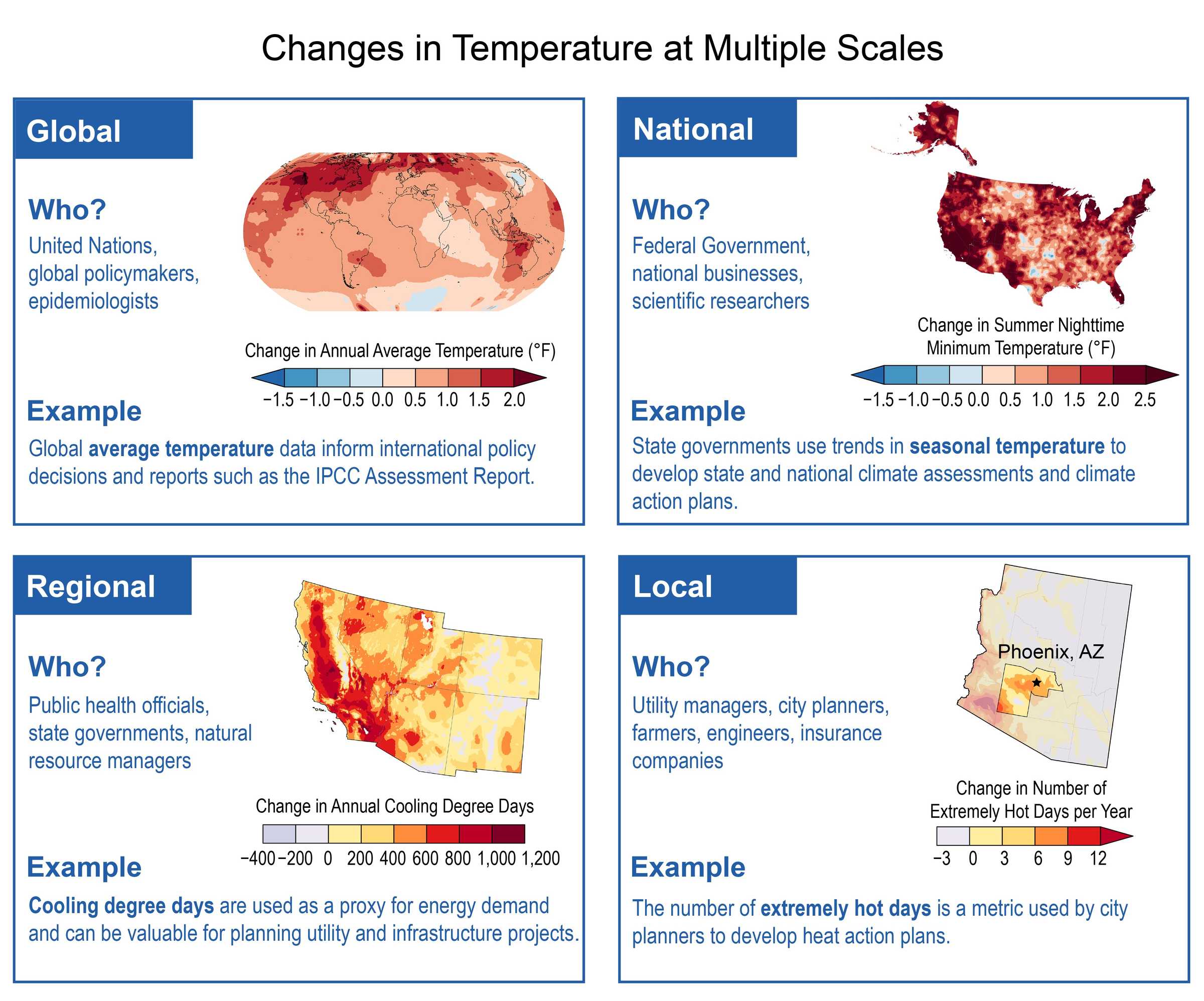
We are going to gather data and visualize some of the climate indicators that are highlighted in the previous climate dashboard chapter. The plan is to go through these indicators step-by-step.
The learning objectives are
Understand how average temperatures are changing over time.
Gather data either from government agencies, academic labs or non-profits to analyze.
Learn how to manipulate the data.
Analyze the data.
We can directly get the visualizations from various research or government organizations


The key message highlighted by The 2023 Annual Climate Summary Global Climate Highlights 2023 from European Union’s Copernicus are:
- 2023 is confirmed as the warmest calendar year in global temperature data records going back to 1850
- 2023 had a global-average temperature of 14.98°C, 0.17°C higher than the previous highest annual value in 2016
- 2023 was 0.60°C warmer than the 1991-2020 average and 1.48°C warmer than the 1850-1900 pre-industrial level
- It is likely that a 12-month period ending in January or February 2024 will exceed 1.5°C above the pre-industrial level
- Each month from June to December in 2023 was warmer than the corresponding month in any previous year July and August 2023 were the warmest two months on record. Boreal summer (June-August) was also the warmest season on record.
- In September 2023, the temperature deviation above the 1991–2020 average was larger than in any month in any year in the ERA5 dataset (0.93°C higher than the 1991-2020 average).
- October, November and December 2023, each with a temperature of 0.85°C above average, ranked all joint second-largest in terms of temperature deviation above the 1991–2020 average
Let us try to recreate some of these figures with data from a different data provider, Berkeley Earth.
8.1 Earth’s Global Average Surface Temperatures
We can use Berkeley Earth Data. Berkeley Earth is an independent U.S. non-profit organization focused on environmental data science and analysis. Berkeley Earth supplies comprehensive open-source global air pollution data and highly accessible global temperature data that is timely, impartial, and verified.
Let us start with the Global temperature data available from Berkeley Earth. There are three global temperature datasets that we can use:
- Global Monthly Averages (1850 - )
- Global Land Only (1750 - )
- Global Daily Land (1880 - )
Let us first focus on the Land data as it is available for a longer time, 1750 onwards. This file contains a detailed summary of the land-surface average results produced by Berkeley Earth.
Temperatures are in Celsius and reported as anomalies relative to the Jan 1951-Dec 1980 average. Uncertainties represent the 95% confidence interval for these anomalies.
terms:
Anomalies: Anomalies are cases where the observations differ from the usual or what we normally expect, say based on the average over a certain period of time. In this case, the reported anomalies are relative to the Jan 1951-Dec 1980 average.
95% confidence intervals: The confidence interval can be expressed in terms of a long-run frequency in repeated samples (or in resampling): “Were this procedure to be repeated on numerous samples, the proportion of calculated 95% confidence intervals that encompassed the true value of the population parameter would tend toward 95% (source: https://en.wikipedia.org/wiki/Confidence_interval)
There are three files for the global land-average, minimum and maximum temperatures.
It is a good idea to read the description at the top of the page describing the data. These comments are placed using a % sign. Some things to note from the description.
- Results are based on 50709 time series with 21378860 data points.
- For each month, they report the estimated land-surface average for that month and its uncertainty.
- They also report the corresponding values for year, five-year, ten-year, and twenty-year moving averages CENTERED about that month (rounding down if the center is in between months). For example, the annual average from January to December 1950 is reported at June 1950.
- As Earth’s land is not distributed symmetrically about the equator, there exists a mean seasonality to the global land-average.
- Estimated Jan 1951-Dec 1980 absolute temperature (C): 8.60 +/- 0.05
Lets us read the file into a DataFrame and plot. We need to make sure that our code skips these lines and gets the data. The file also has headers which denote the variables or columns of data.
There is always something slightly different with each dataset, sometimes from the same source. In this case.
- we have a text file that has a number of lines of comments that we have to skip
- has a whitespace delimiter that has a varying length.
- we had to assign names for the columns.
import pandas as pd

url = "https://berkeley-earth-temperature.s3.us-west-1.amazonaws.com/Global/Complete_TAVG_complete.txt"

df = pd.read_csv(url, comment='%', delimiter=r'\s+', header=None,
    names = ['Year', 'Month', 'Monthly Anomaly', 'Monthly Anomaly Unc', 'Annual Anomaly', 'Annual Anomaly Unc', '5-year-anomaly', '5-year-unc', '10-year-anomaly', '10-year-unc', '20-year-anomaly', '20-year-unc'])
Let’s do a step by step-by-step explanation:
The code starts by assigning the URL to a variable called “url”. This variable holds the location of the CSV file that we want to read.
Next, the code uses the “pd.read_csv()” function to read the CSV file. The “read_csv()” function takes several parameters to customize how the CSV file is read.
- “url”: This is the URL of the CSV file that we want to read.
- “comment”: This parameter is set to ‘%’ which indicates that any lines in the CSV file starting with ‘%’ should be treated as comments and ignored.
- “delimiter”: This parameter is set to “r’+’”” which indicates that the values in the CSV file are separated by one or more whitespace characters.
- “header”: This parameter is set to “None” which means that the CSV file does not have a header row. Instead, the column names are specified explicitly in the “names” parameter.
- The “names” parameter is used to specify the column names for the DataFrame that will be created from the CSV file. In this case, the code provides a list of column names: ‘Year’, ‘Month’, ‘Monthly Anomaly’, ‘Monthly Anomaly Unc’, ‘Annual Anomaly’, ‘Annual Anomaly Unc’, ‘5-year-anomaly’, ‘5-year-unc’, ‘10-year-anomaly’, ‘10-year-unc’, ‘20-year-anomaly’, ‘20-year-unc’.
Once the code executes, it will create a DataFrame object named “df” that holds the data from the CSV file. The DataFrame will have the specified column names and the corresponding data from the file.
As always, first let us make sure that the data is read correctly.
# Get the number of observations and columns
num_observations, num_columns = df.shape[0], df.shape[1]

# Print the result
print("Number of Observations (Rows):", num_observations)
print("Number of Columns:", num_columns)

df.describe()
Number of Observations (Rows): 3296
Number of Columns: 12| Year | Month | Monthly Anomaly | Monthly Anomaly Unc | Annual Anomaly | Annual Anomaly Unc | 5-year-anomaly | 5-year-unc | 10-year-anomaly | 10-year-unc | 20-year-anomaly | 20-year-unc | |
|---|---|---|---|---|---|---|---|---|---|---|---|---|
| count | 3296.000000 | 3296.000000 | 3295.000000 | 3295.000000 | 3277.000000 | 3277.000000 | 3204.000000 | 3204.000000 | 3144.000000 | 3144.000000 | 3024.000000 | 3024.000000 |
| mean | 1886.833738 | 6.495146 | -0.242823 | 0.888363 | -0.246557 | 0.411467 | -0.249525 | 0.268254 | -0.257316 | 0.229558 | -0.269186 | 0.196775 |
| std | 79.301642 | 3.451635 | 0.975729 | 1.046629 | 0.647380 | 0.449891 | 0.574516 | 0.281418 | 0.536098 | 0.230924 | 0.474043 | 0.192862 |
| min | 1750.000000 | 1.000000 | -5.965000 | 0.032000 | -2.545000 | 0.012000 | -1.530000 | 0.011000 | -1.380000 | 0.009000 | -1.025000 | 0.007000 |
| 25% | 1818.000000 | 3.000000 | -0.698000 | 0.154000 | -0.613000 | 0.062000 | -0.640000 | 0.047000 | -0.607000 | 0.038000 | -0.639500 | 0.036000 |
| 50% | 1887.000000 | 6.000000 | -0.177000 | 0.382000 | -0.270000 | 0.194000 | -0.293000 | 0.152000 | -0.311500 | 0.145000 | -0.334000 | 0.138000 |
| 75% | 1955.250000 | 9.000000 | 0.261000 | 1.306500 | 0.071000 | 0.674000 | -0.008750 | 0.432000 | -0.019000 | 0.369000 | -0.018000 | 0.323000 |
| max | 2024.000000 | 12.000000 | 5.587000 | 6.684000 | 1.880000 | 2.311000 | 1.451000 | 1.470000 | 1.357000 | 1.010000 | 1.167000 | 0.848000 |
The data starts at 1750 (minimum) and ends in Jan 2024. The number of monthly observations is 3289 (almost 275 years of data). As expected the number of observations for the five-year, ten-year and 20-year anomaly values are progressively lower as they need historical data to compute the observations.
import pandas as pd
url = "https://berkeley-earth-temperature.s3.us-west-1.amazonaws.com/Global/Complete_TAVG_complete.txt"


df = pd.read_csv(url, comment='%', delimiter=r'\s+', header=None,
    names = ['Year', 'Month', 'Monthly Anomaly', 'Monthly Anomaly Unc', 'Annual Anomaly', 'Annual Anomaly Unc', '5-year-anomaly', '5-year-unc', '10-year-anomaly', '10-year-unc', '20-year-anomaly', '20-year-unc'])


import plotly.express as px
fig = px.line(df, x = 'Year', y = 'Annual Anomaly')
fig.show()
We can plot the 10 year and 20 year anomaly as they may be more informative about the trends and less noisy than those based on year-to-year changes.
import plotly.express as px

fig = px.line(df, x = 'Year', y = '10-year-anomaly', title = 'Global Land Temperatures (1750-): Ten-year anomaly')
fig.show()
import plotly.express as px
fig = px.line(df, x = 'Year', y = '20-year-anomaly', title = 'Global Land Temperatures (Average): Twenty-year anomaly')
fig.show()As we can see, the ten-year and 20-year anomalies are smoother than the annual anomaly graph. It is obvious that - for most of the time period, and at least from 1800 onwards, the temperature anomalies, relative to the Jan 1951-Dec 1980 average, are increasing. - put more simply, the earth is warming up at least over the last couple of hundred years, based on the average land temperatures
Let us see how the minimum temperature trend looks
import pandas as pd
url = "https://berkeley-earth-temperature.s3.us-west-1.amazonaws.com/Global/Complete_TMIN_complete.txt"


df = pd.read_csv(url, comment='%', delimiter=r'\s+', header=None,
    names = ['Year', 'Month', 'Monthly Anomaly', 'Monthly Anomaly Unc', 'Annual Anomaly', 'Annual Anomaly Unc', '5-year-anomaly', '5-year-unc', '10-year-anomaly', '10-year-unc', '20-year-anomaly', '20-year-unc'])


fig = px.line(df, x = 'Year', y = '20-year-anomaly', title = 'Global Land Temperatures (Min): Twenty-year anomaly')
fig.show()
We can do the same for the minimum and maximum temperatures. We just need to change the URL where the data is stored.
import pandas as pd
url = "https://berkeley-earth-temperature.s3.us-west-1.amazonaws.com/Global/Complete_TMAX_complete.txt"


df = pd.read_csv(url, comment='%', delimiter=r'\s+', header=None,
    names = ['Year', 'Month', 'Monthly Anomaly', 'Monthly Anomaly Unc', 'Annual Anomaly', 'Annual Anomaly Unc', '5-year-anomaly', '5-year-unc', '10-year-anomaly', '10-year-unc', '20-year-anomaly', '20-year-unc'])


import plotly.express as px
fig = px.line(df, x = 'Year', y = '20-year-anomaly', title = 'Global Land Temperatures (Max): Twenty-year anomaly')
fig.show()
It is clear from the graphs that the minimum, average and maximum global temperatures have been increasing, at least, over the past couple of centuries.
This is an important issue as the recent IPCC report states that
“… Global warming is likely to reach 1.5°C between 2030 and 2052 if it continues to increase at the current rate…”
8.2 Global Land and Ocean Temperature
Berkeley Earth also provides a global average temperature data set where they combine land data with ocean temperature data set 1. It is available for a shorter time period, from 1850 onwards.
import pandas as pd
url = "https://berkeley-earth-temperature.s3.us-west-1.amazonaws.com/Global/Land_and_Ocean_complete.txt"

df = pd.read_csv(url, comment='%', delimiter=r'\s+', header=None,
    names = ['Year', 'Month', 'Monthly Anomaly', 'Monthly Anomaly Unc', 'Annual Anomaly', 'Annual Anomaly Unc', '5-year-anomaly', '5-year-unc', '10-year-anomaly', '10-year-unc', '20-year-anomaly', '20-year-unc'])
df| Year | Month | Monthly Anomaly | Monthly Anomaly Unc | Annual Anomaly | Annual Anomaly Unc | 5-year-anomaly | 5-year-unc | 10-year-anomaly | 10-year-unc | 20-year-anomaly | 20-year-unc | |
|---|---|---|---|---|---|---|---|---|---|---|---|---|
| 0 | 1850 | 1 | -0.788 | 0.390 | NaN | NaN | NaN | NaN | NaN | NaN | NaN | NaN |
| 1 | 1850 | 2 | -0.240 | 0.492 | NaN | NaN | NaN | NaN | NaN | NaN | NaN | NaN |
| 2 | 1850 | 3 | -0.400 | 0.361 | NaN | NaN | NaN | NaN | NaN | NaN | NaN | NaN |
| 3 | 1850 | 4 | -0.629 | 0.296 | NaN | NaN | NaN | NaN | NaN | NaN | NaN | NaN |
| 4 | 1850 | 5 | -0.660 | 0.331 | NaN | NaN | NaN | NaN | NaN | NaN | NaN | NaN |
| ... | ... | ... | ... | ... | ... | ... | ... | ... | ... | ... | ... | ... |
| 4185 | 2024 | 3 | 1.222 | 0.034 | NaN | NaN | NaN | NaN | NaN | NaN | NaN | NaN |
| 4186 | 2024 | 4 | 1.222 | 0.039 | NaN | NaN | NaN | NaN | NaN | NaN | NaN | NaN |
| 4187 | 2024 | 5 | 1.085 | 0.032 | NaN | NaN | NaN | NaN | NaN | NaN | NaN | NaN |
| 4188 | 2024 | 6 | 1.126 | 0.039 | NaN | NaN | NaN | NaN | NaN | NaN | NaN | NaN |
| 4189 | 2024 | 7 | 1.142 | 0.043 | NaN | NaN | NaN | NaN | NaN | NaN | NaN | NaN |
4190 rows × 12 columns
The data shows 4176 observations as compared to 3289 observations for the longer time period (1750 onwards). Also, monthly observations from 1850 should only be approximately 174*12 = 2088 (depending on when the data stopped in 2024). How come we have 4176?
We didn’t get any errors and the code ran fine! The numbers look reasonable!
This is why we need to always read the documentation or the description of the data.
From the documentation in the % block at the beginning of the text file
Two versions of this average are reported. These differ in how they treat locations with sea ice. In the first version, temperature anomalies in the presence of sea ice are extrapolated from land-surface air temperature anomalies. In the second version, temperature anomalies in the presence of sea ice are extrapolated from sea-surface water temperature anomalies (usually collected from open water areas on the periphery of the sea ice). For most of the ocean, sea-surface temperatures are similar to near-surface air temperatures; however, air temperatures above sea ice can differ substantially from the water below the sea ice. The air temperature version of this average shows larger changes in the recent period, in part this is because water temperature changes are limited by the freezing point of ocean water. We believe that the use of air temperatures above sea ice provides a more natural means of describing changes in Earth’s surface temperature.
The data is already sorted by year and month and the first observations are for the use of air temperatures above sea ice.
Let us check the data for a particular year and month
| Year | Month | Monthly Anomaly | Monthly Anomaly Unc | Annual Anomaly | Annual Anomaly Unc | 5-year-anomaly | 5-year-unc | 10-year-anomaly | 10-year-unc | 20-year-anomaly | 20-year-unc | |
|---|---|---|---|---|---|---|---|---|---|---|---|---|
| 0 | 1850 | 1 | -0.788 | 0.390 | NaN | NaN | NaN | NaN | NaN | NaN | NaN | NaN |
| 2095 | 1850 | 1 | -0.744 | 0.344 | NaN | NaN | NaN | NaN | NaN | NaN | NaN | NaN |
We can see that the first observation and 2095th observation are for the same year and month. They are measured based on air temperature vs sea-surface water temperature anomalies.
We can just take the first observation for each year and month and ignore the second observation. How do we do that?
Let us verify that we dropped the right observation
| Year | Month | Monthly Anomaly | Monthly Anomaly Unc | Annual Anomaly | Annual Anomaly Unc | 5-year-anomaly | 5-year-unc | 10-year-anomaly | 10-year-unc | 20-year-anomaly | 20-year-unc | |
|---|---|---|---|---|---|---|---|---|---|---|---|---|
| 0 | 1850 | 1 | -0.788 | 0.39 | NaN | NaN | NaN | NaN | NaN | NaN | NaN | NaN |
From the values we can see that we have kept the air surface temperature anomalies as we wanted to.
Now that we have the data in a DataFrame, we can easily visualize the data using pandas as before:
import plotly.express as px
fig = px.line(df, x = 'Year', y = '10-year-anomaly', title = 'Global Land and Ocean Temperatures: Ten-year anomaly')
fig.show()
import plotly.express as px
fig = px.line(df, x = 'Year', y = '20-year-anomaly', title = 'Global Land and Ocean Temperatures: Twenty-year anomaly')
fig.show()As we can see the last fifty years have more positive annual anomalies in Earth’s global average surface temperature than anytime from 1850 onwards.
8.3 Country Level Data
Berkeley Earth also provides country level data. Let us look at three countries that are at different stages of growth and population.
The format of the data is similar. We can rewrite the code by changing the country name. Or better, we can write some functions that we can call with the country name as an input.
Lets us start with the countries with the largest population, India and China and the largest economy, USA.
China has 6.3% of the landmass and approximately 1064 temperature stations. The data is based on approximately 616136 monthly observations.
We can do the same for multiple countries. Since all the datasets have a similar format and we need to write the code repeatedly, we can write a small function to reduce the repetition.
Note the URL for these countries
- https://berkeley-earth-temperature.s3.us-west-1.amazonaws.com/Regional/TMAX/united-states-TMAX-Trend.txt
- https://berkeley-earth-temperature.s3.us-west-1.amazonaws.com/Regional/TMAX/india-TMAX-Trend.txt
- https://berkeley-earth-temperature.s3.us-west-1.amazonaws.com/Regional/TMIN/china-TMAX-Trend.txt
So, all we have to do put the country name and join with -TMAX-Trend.txt in order to get the data.
import pandas as pd


def berkeley_regional_temp(tempindicator, country):
    url = f"https://berkeley-earth-temperature.s3.us-west-1.amazonaws.com/Regional/{tempindicator}/{country}-{tempindicator}-Trend.txt"
    df = pd.read_csv(url, comment='%', delimiter=r'\s+', header=None,
    names = ['Year', 'Month', 'Monthly Anomaly', 'Monthly Anomaly Unc', 'Annual Anomaly', 'Annual Anomaly Unc', '5-year-anomaly', '5-year-unc', '10-year-anomaly', '10-year-unc', '20-year-anomaly', '20-year-unc'])

    import plotly.express as px
    fig = px.line(df, x = 'Year', y = '10-year-anomaly')

    fig.update_layout(
        xaxis_title = "Year",
        title=f"Mean of {tempindicator} in the {country}", title_x = 0.5,
        hovermode="x",
        legend=dict(x=0.4,y=1)
    )

    fig.update_layout(legend={'title_text':''})

    fig.update_yaxes(title_text=f"{tempindicator} Temperature (degree C)")


    fig.show()

berkeley_regional_temp('TAVG','china')

berkeley_regional_temp('TAVG', 'india')

berkeley_regional_temp('TAVG','united-states')

berkeley_regional_temp('TMAX','united-states')
We defined function berkeley_regional_temp that fetches and visualizes temperature anomaly data from the Berkeley Earth dataset for a specified temperature indicator and country.
Let us unpack this code step-by-step
pandas is imported for data manipulation and analysis.
plotly.express is imported for creating interactive plots. Defining the Function:
The function berkeley_regional_temp takes two parameters: tempindicator (e.g., ‘TAVG’ for average temperature, ‘TMAX’ for maximum temperature) and country (e.g., ‘china’, ‘india’).
Constructing the URL: The URL for the data file is constructed using the temp indicator and country parameters.
The data is read from the URL into a DataFrame df using pd.read_csv.
The comment=‘%’ parameter skips lines starting with ‘%’.
The delimiter=“r’+’”” parameter uses whitespace as the delimiter.
The header=None parameter indicates that the file has no header row.
The names parameter assigns column names to the DataFrame.
Creating the Plot: A line plot is created using plotly.express with ‘Year’ on the x-axis and ‘10-year-anomaly’ on the y-axis.
Updating the Layout: The layout of the plot is updated to include:
- xaxis_title: Title for the x-axis.
- title: Title of the plot, centered horizontally.
- hovermode: Hover mode set to ‘x’ to show hover information for all traces at the same x-coordinate.
- legend: Position of the legend.
- legend={‘title_text’:’’}: Removing the legend title.
- update_yaxes: Title for the y-axis.
The plot is displayed using fig.show().
The function is called four times with different parameters to generate and display plots for:
- Average temperature anomalies in China, India, and the United States.
- Maximum temperature anomalies in the United States.
What are the insights from the analysis of these three major economies?
- As with the global temperatures, all three country temperature data shows that temperatures have been increasing over the last 160 years, with significant increases over the last few decades
- India and China are the most populous countries and together with the U.S. account for almost 40% of the world population. These three charts show how a majority of the world population would be suffering from increased temperatures.
Why do we care?
 Source: NASA, Earth observatory, CC BY-SA 4.0 https://creativecommons.org/licenses/by-sa/4.0, via Wikimedia Commons
India is the most populous country in the world now and the country facing one of the worst heat waves in recorded history!
Some recent reporting highlights the dire conditions and the impact of the heat waves.

8.4 Historical Perspective: Where do we stand now relative to the last 11,300 years?
Let’s go back in time! Way back! Even before our parents, grandparents, grand grandparents ….
Marcott et al. (2013, p. 1198) constructed a record of global mean surface temperature for more than the last 11,000 years, using a variety of land- and marine-based proxy data from all around the world. The pattern of temperatures shows a rise as the world emerged from the last deglaciation, warm conditions until the middle of the Holocene, and a cooling trend over the next 5000 years that culminated around 200 years ago in the Little Ice Age. Temperatures have risen steadily since then, leaving us now with a global temperature higher than those during 90% of the entire Holocene.
Marcott et al (2013) note that:
Surface temperature reconstructions of the past 1500 years suggest that recent warming is unprecedented in that time. Here we provide a broader perspective by reconstructing regional and global temperature anomalies for the past 11,300 years from 73 globally distributed records. Early Holocene (10,000 to 5000 years ago) warmth is followed by ~0.7°C cooling through the middle to late Holocene (<5000 years ago), culminating in the coolest temperatures of the Holocene during the Little Ice Age, about 200 years ago. This cooling is largely associated with ~2°C change in the North Atlantic. Current global temperatures of the past decade have not yet exceeded peak interglacial values but are warmer than during ~75% of the Holocene temperature history. Intergovernmental Panel on Climate Change model projections for 2100 exceed the full distribution of Holocene temperature under all plausible greenhouse gas emission scenarios.
More information can be found in the paper. A Reconstruction of Regional and Global Temperature for the Past 11,300 Years
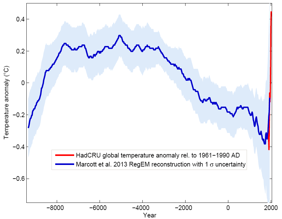
Blue curve: Global temperature reconstruction from proxy data of Marcott et al, Science 2013. Shown here is the RegEM version – significant differences between the variants with different averaging methods arise only towards the end, where the number of proxy series decreases. This does not matter since the recent temperature evolution is well known from instrumental measurements, shown in red (global temperature from the instrumental HadCRU data). Graph: Klaus Bitterman.
8.5 Historical Perspective: Where do we stand now relative to the last 20,000 years?
We have read and tried to understand as much as we could from the scientific discussions. We didn’t always understand the scientific papers, but we relied on the blogs and other popular writing by some scientists.
Two blogs that we followed were:
- Real Climate
- Bart Verheggen, an atmospheric scientist working in the Netherlands.
These blogs have highlighted a couple of interesting figures that we reproduce below.
Going back a few thousand more years!!

A few more thousand years!

Marcott et al. mention that
By 2100, global average temperatures will probably be 5 to 12 standard deviations above the Holocene temperature mean.
As with any projections about the future, there can be significant uncertainty, measurement error and many other reasons why things may turn out to be different. But, do we want to take a chance even if there is a small probability that this global warming happens correlated with more extreme weather events?
8.6 Berkeley Earth Temperature Report 2023
The full report can be accessed at https://berkeleyearth.org/global-temperature-report-for-2023/
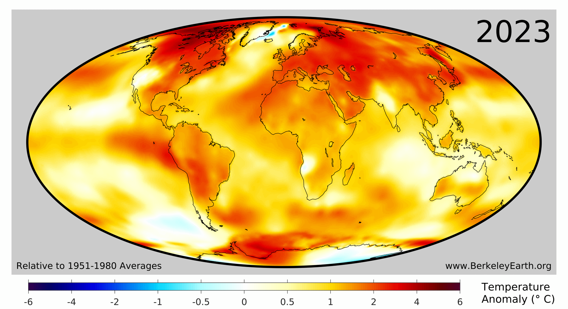
As the Berkeley Earth Report highlights,
In 2023, 95.5% of the Earth’s surface was significantly warmer than the average temperature during 1951-1980, 3.5% was of a similar temperature, and only 1% was significantly colder.
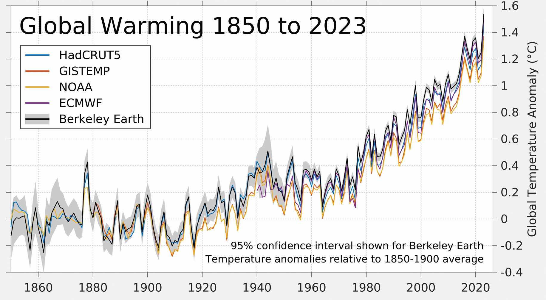
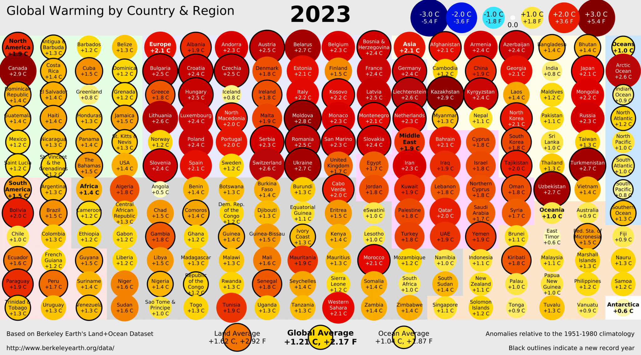
8.6.1 Temperature Highlights
Copernicus Temperature Highlights
- 2023 is confirmed as the warmest calendar year in global temperature data records going back to 1850
- 2023 had a global average temperature of 14.98°C, 0.17°C higher than the previous highest annual value in 2016
- 2023 was 0.60°C warmer than the 1991-2020 average and 1.48°C warmer than the 1850-1900 pre-industrial level
- 2023 marks the first time on record that every day within a year has exceeded 1°C above the 1850-1900 pre-industrial level.
- Close to 50% of days were more than 1.5°C warmer then the 1850-1900 level, and two days in November were, for the first time, more than 2°C warmer.
- Annual average air temperatures were the warmest on record, or close to the warmest, over sizeable parts of all ocean basins and all continents except Australia
- Each month from June to December in 2023 was warmer than the corresponding month in any previous year
- July and August 2023 were the warmest two months on record. Boreal summer (June-August) was also the warmest season on record
- December 2023 was the warmest December on record globally, with an average temperature of 13.51°C, 0.85°C above the 1991-2020 average and 1.78°C above the 1850-1900 level for the month.
8.6.2 Ocean surface temperature highlights:
Global average sea surface temperatures (SSTs) remained persistently and unusually high, reaching record levels for the time of year from April through December.
2023 saw a transition to El Niño. In spring 2023, La Niña came to an end and El Niño conditions began to develop, with the WMO declaring the onset of El Niño in early July.
High SSTs in most ocean basins, and in particular in the North Atlantic, played an important role in the record-breaking global SSTs.
The unprecedented SSTs were associated with marine heatwaves around the globe, including in parts of the Mediterranean, Gulf of Mexico and the Caribbean, Indian Ocean and North Pacific, and much of the North Atlantic.
8.6.3 Exercise
What is the temperature in your city? Can you plot it?
Check out https://berkeleyearth.org/temperature-city-list/ for the data on some cities.
8.7 Resources
8.8 References
Rohde, R. A. and Hausfather, Z.: The Berkeley Earth Land/Ocean Temperature Record, Earth Syst. Sci. Data, 12, 3469�3479, https://doi.org/10.5194/essd-12-3469-2020, 2020.↩︎