flowchart LR
    A[Heat and Temperature] --> B[Ocean Heat] --> C[Glacier and Ice Melting] --> D[Sea Level Rise]
10 Oceans
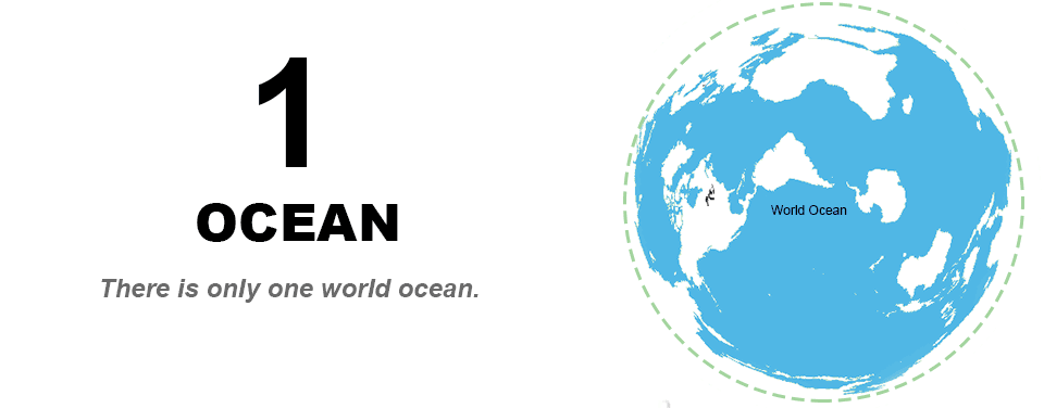
Oceans cover almost 71% of the earth’s surface area!
Historically, there are four named oceans: the Atlantic, Pacific, Indian, and Arctic. However, most countries - including the United States - now recognize the Southern (Antarctic) as the fifth ocean. The Pacific, Atlantic, and Indian are the most commonly known. See https://oceanservice.noaa.gov/facts/howmanyoceans.html
NASA maintains a wealth of information on Global Climate Change at NASA Climate Change
In particular, information on Ocean warming is available at https://climate.nasa.gov/vital-signs/ocean-warming/
We can create the same graph using the data underlying the graphs that NASA has made available.
It seems that the data is in JSON format. Also, we have noticed that we are sometimes getting 403 error when accessing the data files from EPA or NASA website and we need to write some extra code.
As before, we need to download the data from EPA. We have written code that we had to repeat many times. Let us make a small function in Python so that we don’t need to repeat the code.
Functions
It is always a good idea to make a code that we had to cut and copy multiple times in to a function.
- Functions allow us to write a block of code once and reuse it multiple times throughout your program. This reduces redundancy and makes our code more efficient.
- Functions help break down complex problems into smaller, manageable pieces.
- Functions can help make our code more readable
- Functions help in making our code easier to update and maintain.
- We can isolate and test each function to ensure it works correctly before integrating it into the larger program.
Even though we get the same insight as the graph from the NASA website (as we should as the underlying data is the same), we learn a bit more Python and Pandas. For example, reading json files and converting a dictionary into a a DataFrame etc.,
from io import StringIO
import pandas as pd
import requests

headers = {
        "User-Agent": "Mozilla/5.0 (X11; Ubuntu; Linux x86_64; rv:109.0) Gecko/20100101 Firefox/118.0",
    }
url = "https://climate.nasa.gov/rails/active_storage/blobs/eyJfcmFpbHMiOnsibWVzc2FnZSI6IkJBaHBBM1JaQWc9PSIsImV4cCI6bnVsbCwicHVyIjoiYmxvYl9pZCJ9fQ==--bada9f8cfb10f83437d5fdef16653d51e93445b2/ECCO_V4r5_OHC_ZJ_YYYY-MM-DDTHHMMSS_anom.json"

# gets the data as a json dictionary
response = requests.get(url, headers=headers)

if response.status_code != 403:
    d = response.json()
    df = pd.DataFrame.from_dict(d, orient='index')
else:
    print("Error")
df = df.reset_index()
df.rename({'index': 'Year', 0: 'ZJ'}, axis = 1, inplace=True)
df['Year'] = pd.to_datetime(df['Year'])
What did we do? Let’s break down the code step by step:
The code begins by importing necessary libraries: StringIO from the io module, pandas as pd, and requests.
Next, a dictionary named headers is defined. This dictionary contains a user-agent string, which is used to identify the client making the HTTP request. In this case, the user-agent string is set to mimic the behavior of the Mozilla Firefox browser.
The url variable is assigned a URL string pointing to a JSON file hosted on the NASA website. This JSON file contains data related to ocean heat content anomalies.
The code then makes an HTTP GET request to the specified URL using the requests.get() function. The headers dictionary is passed as an argument to the function to provide the necessary user-agent information.
The code checks the status code of the response using response.status_code. If the status code is not equal to 403 (which indicates a forbidden access error), the code proceeds to the next steps. Otherwise, it prints an error message.
Assuming the response status code is not 403, the code proceeds to parse the response content as JSON using response.json(). The resulting JSON data is stored in the variable d.
The JSON data is then converted into a pandas DataFrame using pd.DataFrame.from_dict(). The orient=‘index’ argument specifies that the keys of the JSON object should be used as the DataFrame index.
The DataFrame is then reset using df.reset_index(), which assigns a new default index to the DataFrame.
The column names of the DataFrame are renamed using df.rename(). The ‘index’ column is renamed to ‘Year’, and the 0 column is renamed to ‘ZJ’. The axis=1 argument specifies that the renaming should be applied to column names.
Finally, the ‘Year’ column is stored as an object. We converted to datetime format using pd.to_datetime(). This allows for easier manipulation and analysis of the data based on time.
In summary, this code retrieves data from a specified URL, checks the response status code, parses the JSON data into a pandas DataFrame, renames the columns, and converts the ‘Year’ column to datetime format.
By the way, the above documentation was written by Github copilot when we asked to explain our code and we only had to slightly revise it.
When we wrote the first version of the book, in the pre-ChatGPT era, this is the explanation that we gave.
- We had to read the response (when the server didn’t reject it with a 403 code) into a json object
- We then converted the object into a DataFrame
- We reset the index so that the year is a column
- We renamed the columns so that we have Year and Heat
- Year is stored as an object and we converted into a datetime format so that we can plot it easily on the x-axis
As you could see, Copilot gave much more detailed explanation and we decided to use their explanation as it is more clearer! A bit verbose for our taste though :(
Now that we have the data, we can plot the data to see the patterns in ocean heat changes
import plotly.express as px
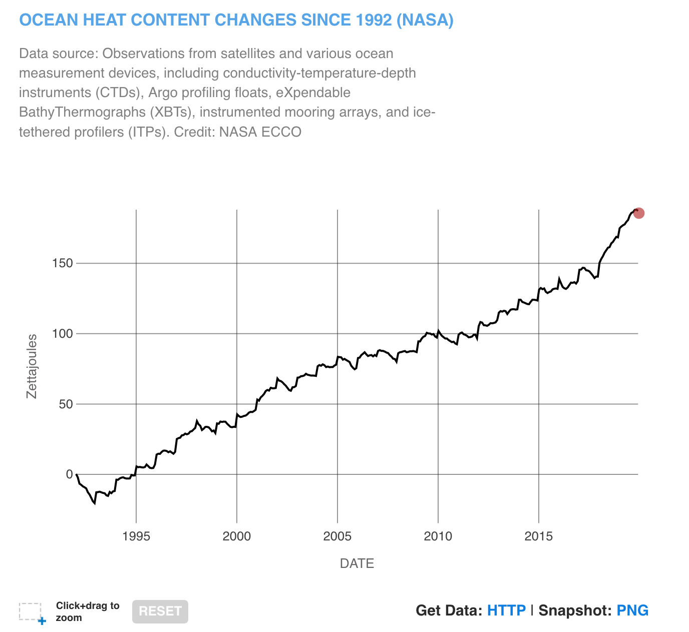
fig = px.line(df, x= 'Year', y = 'ZJ', title= 'Ocean Heat Content Changes since 1992 (NASA)').update_layout(yaxis_title="Ocean Heat Change (Zetta Joules)")
fig.update_layout(title_x = 0.5)
fig.show()We have used similar code many a time in the book already. So, we won’t go into details of the code.
We can see that there is a huge increase in the ocean heat since 1995!
We can find more detailed information on Ocean heat from NASA Ocean Warming website.
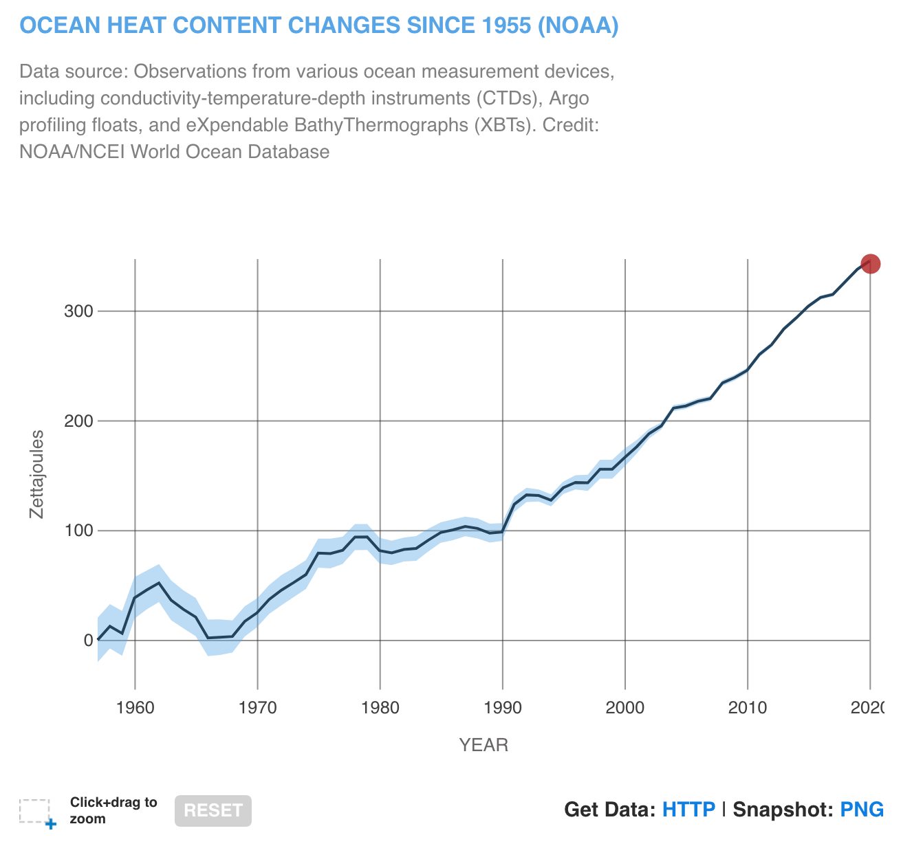
Since 1955, approximately 355 ZettaJoules of heat is absorbed by the Oceans.
What is a Zettajoule? It is \(10^{21}\) joules. or 1,000,000,000,000,000,000,000 joules.
U.S. total energy consumption is 93 exajoules or slightly roudning up 0.1 Zettajoules (source: BP Energy Year Book). So since 1955, the oceans absorbed 3500 times the energy consumed in the U.S. in 2021.
Wikipedia lists:
| Energy | Example |
|---|---|
| 6.9 Zettajoules | Estimated energy contained in the world’s natural gas reserves as of 2010 |
| 7.9 Zettajoules | Estimated energy contained in the world’s petroleum reserves as of 2010 |
| 9.3 Zettajoules | Annual net uptake of thermal energy by the global ocean during 2003-2018 |
To put in perspective, check out Syvitski et al , 2020 which finds that human energy expenditure during 1950-2020 time period is approximately 22 zetajoules (ZJ), largely through combustion of fossil fuels. It exceeds that across the prior 11,700 years ( approximately 14.6 ZJ), .
10.0.1 Why do Oceans matter?
Covering more than 70% of Earth’s surface, our global ocean has a very high heat capacity. It has absorbed 90% of the warming that has occurred in recent decades:
As the NASA webpage highlights
- Ninety percent of global warming is occurring in the ocean, causing the water’s internal heat to increase
- Heat stored in the ocean causes its water to expand, which is responsible for one-third to one-half of global sea level rise.
- The last 10 years were the ocean’s warmest decade since at least the 1800s.
- The year 2022 was the ocean’s warmest recorded year and saw the highest global sea level.
Learning Objectives: Climate
The learning objectives are
Understand how melting of glaciers and Icesheets can lead to SLR over time.
Impact on humans.
In the previous chapter, we have seen how
- Arctic Ice melt
- Antarctic Ice melt
- Length of melt
- Glacier melt
Now where does all the ice that melted from the glaciers go?
- If the entire Antarctic Ice Sheet melted, sea level would rise about 60 meters (197 feet).
- If the entire Greenland Ice Sheet melted, sea level would rise about 7.4 meters (24.3 feet).
Climate Terms of Interest
Ice Sheet is a mass of glacial ice that sits on land and extends more than 50,000 square kilometers (19,300 square miles).
Zetta Joules It is \(10^{21}\) joules. or 1,000,000,000,000,000,000,000 joules.
Ocean Heat As per NASA, heat stored in the ocean causes its water to expand, which is responsible for one-third to one-half of global sea level rise. Most of the added energy is stored at the surface, at a depth of zero to 700 meters. The last 10 years were the ocean’s warmest decade since at least the 1800s. The year 2023 was the ocean’s warmest recorded year.
Sea Level Rise (SLR) SLR occurs partly as a result of thermal expansion of the oceans and melting of the polar ice caps and glaciers due to increasing global temperatures.
Storm Surge Storm surge is an abnormal rise of water generated by a storm, over and above the predicted astronomical tides. This rise in water level can cause extreme flooding in coastal areas, particularly when storm surge coincides with normal high tide, resulting in storm tides reaching up to 20 feet or more in some cases. Storm surge is produced by water being pushed toward the shore by the force of the winds moving cyclonically around the storm. Source: NOAA’s National Hurricane Center
10.1 Impact on Oceans
Let us check impact on Oceans.
We are going to focus mostly on datasets that are already curated by EPA
See https://www.epa.gov/climate-indicators/climate-change-indicators-sea-level fore more information and interpretation of the indicators
10.1.1 Ocean Heat
Let us recreate the first graph on Ocean Heat.
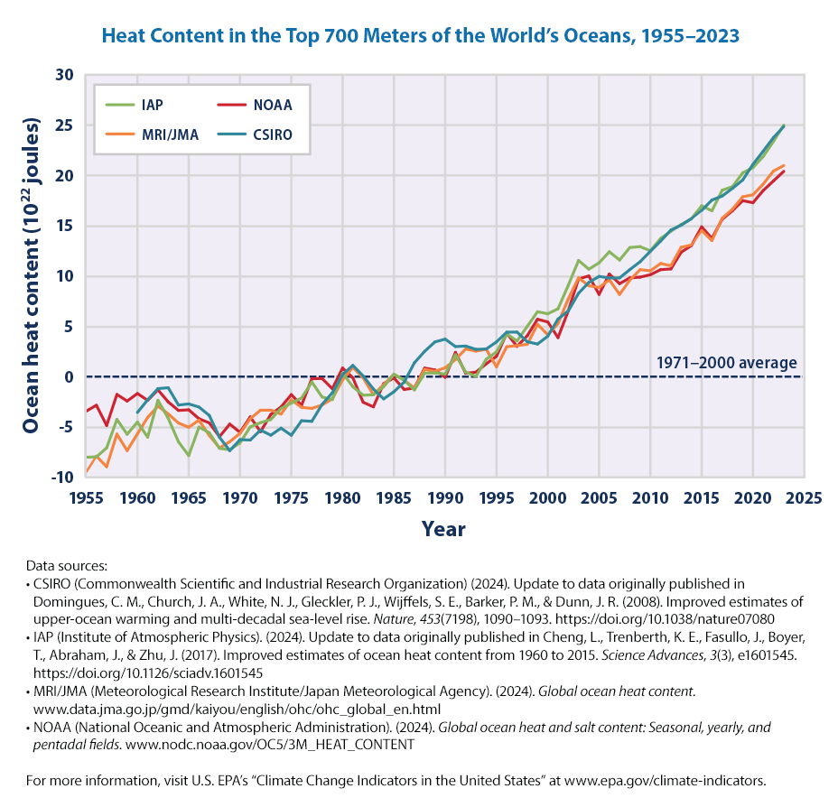
What is Ocean Heat? EPA explains the figure as:
This figure shows changes in heat content of the top 700 meters of the world’s oceans between 1955 and 2023. Ocean heat content is measured in joules, a unit of energy, and compared against the 1971–2000 average, which is set at zero for reference. Choosing a different baseline period would not change the shape of the data over time. The lines were independently calculated using different methods by government organizations in four countries: the United States’ National Oceanic and Atmospheric Administration (NOAA), Australia’s Commonwealth Scientific and Industrial Research Organisation (CSIRO), China’s Institute of Atmospheric Physics (IAP), and the Japan Meteorological Agency’s Meteorological Research Institute (MRI/JMA). For reference, an increase of 1 unit on this graph (1 × 10²² joules) is equal to approximately 17 times the total amount of energy used by all the people on Earth in a year (based on a total global energy supply of 606 exajoules in the year 2019, which equates to 6.06 × 10²⁰ joules).
See https://www.epa.gov/climate-indicators/climate-change-indicators-ocean-heat
Let us get the underlying data as before
from io import StringIO
import pandas as pd
import requests

def url_data_request(url, skiprows):
    headers = {
        "User-Agent": "Mozilla/5.0 (X11; Ubuntu; Linux x86_64; rv:109.0) Gecko/20100101 Firefox/118.0",
    }
    f = StringIO(requests.get(url, headers=headers).text)
    df_url = pd.read_csv(f, skiprows = skiprows)
    return df_url
Now that we have defined the function, we can call to each time to get the data from a URL. Note that we don’t normally need to write such a function as we can directly pass on the URL to pandas read_csv method. However, EPA site is giving a 403 error and we need to work around it with this code.
url = "https://www.epa.gov/sites/default/files/2021-04/ocean-heat_fig-1.csv"
df_oceanheat = url_data_request(url, 6)
df_oceanheat.head()| Year | CSIRO | IAP | MRI/JMA | NOAA | |
|---|---|---|---|---|---|
| 0 | 1955 | NaN | -7.567433 | -9.497333 | -3.437233 |
| 1 | 1956 | NaN | -6.933433 | -7.897333 | -2.844233 |
| 2 | 1957 | NaN | -6.810433 | -8.947333 | -4.849233 |
| 3 | 1958 | NaN | -2.275433 | -5.707333 | -1.769233 |
| 4 | 1959 | NaN | -5.154433 | -7.347333 | -2.425233 |
As we can see there are measurements from four different by government organizations in four countries using different methodologies: the United States’ National Oceanic and Atmospheric Administration, Australia’s Commonwealth Scientific and Industrial Research Organisation, China’s Institute of Atmospheric Physics, and the Japan Meteorological Agency’s Meteorological Research Institute.
import pandas as pd
import plotly.express as px
fig = px.line(df_oceanheat, x= 'Year', y = ['CSIRO', 'IAP', 'MRI/JMA','NOAA'])
fig.update_layout(title = "Heat Content in the Top 700 Meters of the World's Oceans, 1955–2020 ")
fig.update_layout(yaxis_title="Ocean Heat (10^22 Joules)", legend=dict(x=0.5,y=1))
fig.update_layout(legend={'title_text':''})
fig.show()
Let us do the same for Heat Content in the Top 2,000 Meters of the World’s Oceans, 1955–2020.
This is the EPA graph that we plan to recreate 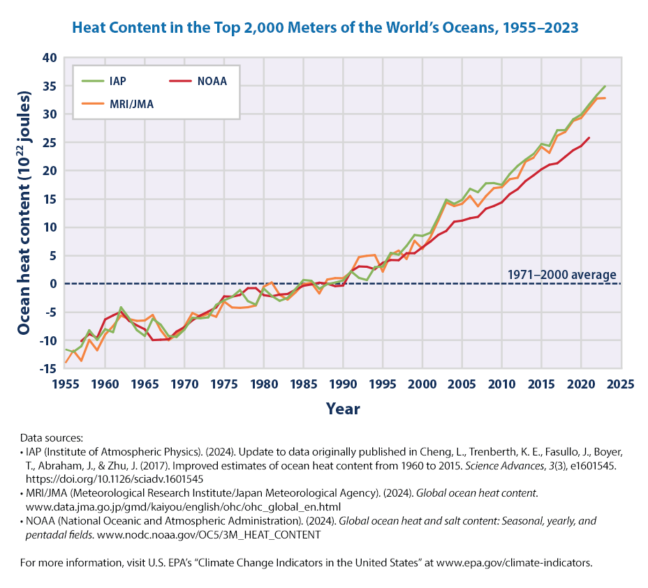
All we have to do now is to change the URL and rerun the code. One diffence we see is the number of columns are less. So it is always a good idea to automatically include the columns. Of course, we always need to browse the data first before writing the code.
url = "https://www.epa.gov/sites/default/files/2021-04/ocean-heat_fig-2.csv"
df = url_data_request(url, 6)
df.head()

fig = px.line(df, x= 'Year', y = df.columns)
fig.update_layout(title = "Heat Content in the Top 2000 Meters of the World's Oceans, 1955–2020 ")
fig.update_layout(yaxis_title="Ocean Heat (10^22 Joules)", legend=dict(x=0.5,y=1))
fig.update_layout(legend={'title_text':''})
fig.show()
The key findings that EPA highlights for these two figures are
In four different data analyses, the long-term trend shows that the top 700 meters of the oceans have become warmer since 1955 (see Figure 1). All three analyses in Figure 2 show additional warming when the top 2,000 meters of the oceans are included. These results indicate that the heat absorbed by surface waters extends to much lower depths over time.
Although concentrations of greenhouse gases have risen at a relatively steady rate over the past few decades (see the Atmospheric Concentrations of Greenhouse Gases indicator), the rate of change in ocean heat content can vary from year to year (see Figures 1 and 2). Year-to-year changes are influenced by events such as volcanic eruptions and recurring ocean-atmosphere patterns such as El Niño.
more on Ocean heat can be found at EPA website for the climate indicator https://www.epa.gov/climate-indicators/climate-change-indicators-ocean-heat
10.2 Sea Surface Temperature
Let us move to the next indicator, Sea Surface Temperature. See https://www.epa.gov/climate-indicators/climate-change-indicators-sea-surface-temperature
As EPA explains,
Sea surface temperature—the temperature of the water at the ocean surface—is an important physical attribute of the world’s oceans. The surface temperature of the world’s oceans varies mainly with latitude, with the warmest waters generally near the equator and the coldest waters in the Arctic and Antarctic regions. As the oceans absorb more heat, sea surface temperature increases, and the ocean circulation patterns that transport warm and cold water around the globe change.
The first graph that we can try to recreate is
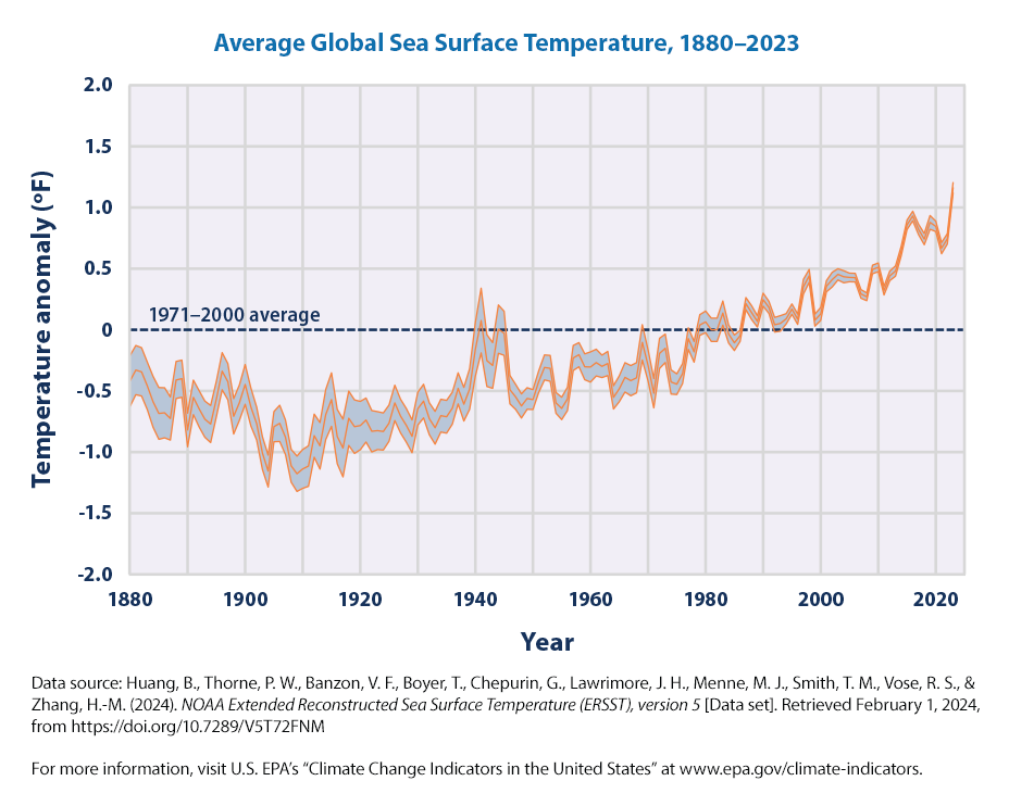
EPA’s description of the graph is
This graph shows how the average surface temperature of the world’s oceans has changed since 1880. This graph uses the 1971 to 2000 average as a baseline for depicting change. Choosing a different baseline period would not change the shape of the data over time. The shaded band shows the range of uncertainty in the data, based on the number of measurements collected and the precision of the methods used.
Let us start with getting the data and follow through the recipe of generating the figure as before. Nothing new! By now, the programming must be getting boring! We can cut and copy the previous code and make minor modifications to the title etc.,
But there are always some changes and the code will break if are not careful!
import pandas as pd
import plotly.express as px

url = "https://www.epa.gov/sites/default/files/2021-04/sea-surface-temp_fig-1.csv"

df = url_data_request(url, 6)
df.head()

fig = px.line(df, x= 'Year', y = df.columns)
fig.update_layout(title = "Heat Content in the Top 2000 Meters of the World's Oceans, 1955–2020 ")
fig.update_layout(yaxis_title="Ocean Heat (10^22 Joules)", legend=dict(x=0.5,y=1))
fig.update_layout(legend={'title_text':''})
fig.show()
We can adapt the Plotly code at https://plotly.com/python/continuous-error-bars/ to create a graph similar to the EPA graph
import plotly.graph_objs as go

fig = go.Figure([
    go.Scatter(
        name='Annual anomaly',
        x=df['Year'],
        y=df['Annual anomaly'],
        mode='lines',
        line=dict(color='rgb(31, 119, 180)'),
    ),
    go.Scatter(
        name='Upper Bound',
        x=df['Year'],
        y= df['Upper 95% confidence interval'],
        mode='lines',
        marker=dict(color="#444"),
        line=dict(width=0),
        showlegend=False
    ),
    go.Scatter(
        name='Lower Bound',
        x=df['Year'],
        y= df['Lower 95% confidence interval'],
        marker=dict(color="#444"),
        line=dict(width=0),
        mode='lines',
        fillcolor='rgba(68, 68, 68, 0.3)',
        fill='tonexty',
        showlegend=False
    )
])
fig.update_layout(
    yaxis_title='Temperature Anomalys (F)',
    title='Average Global Sea Surface Temperature, 1880–2020',
    hovermode="x",
    legend=dict(x=0.5,y=1)
)
fig.show()
Let us unpack the above code step-by-step:
- Note we used the Plotly graph objects library, a more full-featured version of the Plotly library than the plotly express
- The first part of the code creates a simple graph of the time-series of the sea surface temperature
import plotly.graph_objs as go

fig = go.Figure([
    go.Scatter(
        name='Annual anomaly',
        x=df['Year'],
        y=df['Annual anomaly'],
        mode='lines',
        line=dict(color='rgb(31, 119, 180)')
)
])
fig.show()- Now we need to add two bands, the upper and lower 95% confidence bands around this and shade the area in-between. Here show the code filling in between the annual anomaly values and the lower bound.
import plotly.graph_objs as go

fig = go.Figure([
    go.Scatter(
        name='Annual anomaly',
        x=df['Year'],
        y=df['Annual anomaly'],
        mode='lines',
        line=dict(color='rgb(31, 119, 180)'),
    ),
    go.Scatter(
        name='Lower Bound',
        x=df['Year'],
        y= df['Lower 95% confidence interval'],
        marker=dict(color="#444"),
        line=dict(width=0),
        mode='lines',
        fillcolor='rgba(68, 68, 68, 0.3)',
        fill='tonexty',
        showlegend=False
    )
])

fig.show()
Let us maximize the graph area by moving the legend and give it a title
fig.update_layout(
    yaxis_title='Temperature Anomalys (F)',
    title='Average Global Sea Surface Temperature, 1880–2020',
    hovermode="x",
    legend=dict(x=0.5,y=1)
)- legend=dict(x=0.5,y=1) moves the legend inside the graph so that the legend doesn’t take more space. Think of the (x,y) coordinate plane and this helps put the legend where we want to put it in the graph area based on the particular graph (some graphs may have more white space at the bottom, some at the top etc., We can adjust as needed based on the graph.)
By the way, what do the error bars represent?
A 95% confidence interval is a range of values that you can be 95% certain contains the true mean of the population. It is calculated from the data and provides an estimate of the uncertainty around the sample mean.
If you were to take 100 different samples and calculate a 95% confidence interval for each sample, approximately 95 of those intervals would contain the true population mean. This does not mean that there is a 95% probability that the true mean lies within the interval for a given sample; rather, it means that the method used to calculate the interval will capture the true mean 95% of the time in repeated sampling.
Error Bars:: In a Plotly graph, error bars can be used to represent confidence intervals. They are typically shown as vertical or horizontal lines extending from the data points, indicating the range of the confidence interval.
We can unpack our Plotly code,
A sample DataFrame df is created with columns for ‘Year’, ‘Annual anomaly’, ‘Lower 95% confidence interval’, and ‘Upper 95% confidence interval’.
The go.Figure object is created with three go.Scatter traces:
The first trace plots the ‘Annual anomaly’ as a line.
The second trace plots the ‘Lower 95% confidence interval’ and fills the area between this line and the ‘Annual anomaly’ line.
The third trace plots the ‘Upper 95% confidence interval’ and fills the area between this line and the ‘Annual anomaly’ line.
The layout is updated to include titles for the x-axis and y-axis, and the legend is positioned inside the graph.
Using 95% confidence intervals or error bars in a Plotly graph helps to visually communicate the uncertainty or variability in the data. This can be particularly useful in scientific and statistical analyses where understanding the range of possible values is crucial.
What are the insights based on these figures. Per EPA,
Sea surface temperature increased during the 20th century and continues to rise. From 1901 through 2023, temperature rose at an average rate of 0.14°F per decade (Figure 1).
Sea surface temperature has been consistently higher during the past three decades than at any other time since reliable observations began in 1880. The year 2023 was the warmest ever recorded (Figure 1).
Based on the historical record, increases in sea surface temperature have largely occurred over two key periods: between 1910 and 1940 and from about 1970 to the present. Sea surface temperature appears to have cooled between 1880 and 1910 (Figure 1).
Changes in sea surface temperature vary regionally. While most parts of the world’s oceans have seen temperature rise, a few areas have actually experienced cooling—for example, parts of the North Atlantic (Figure 2).
10.2.1 Sea Surface temperatures Globally
Let us plot the second figure for this climate change indicator from the EPA website. It is more global!
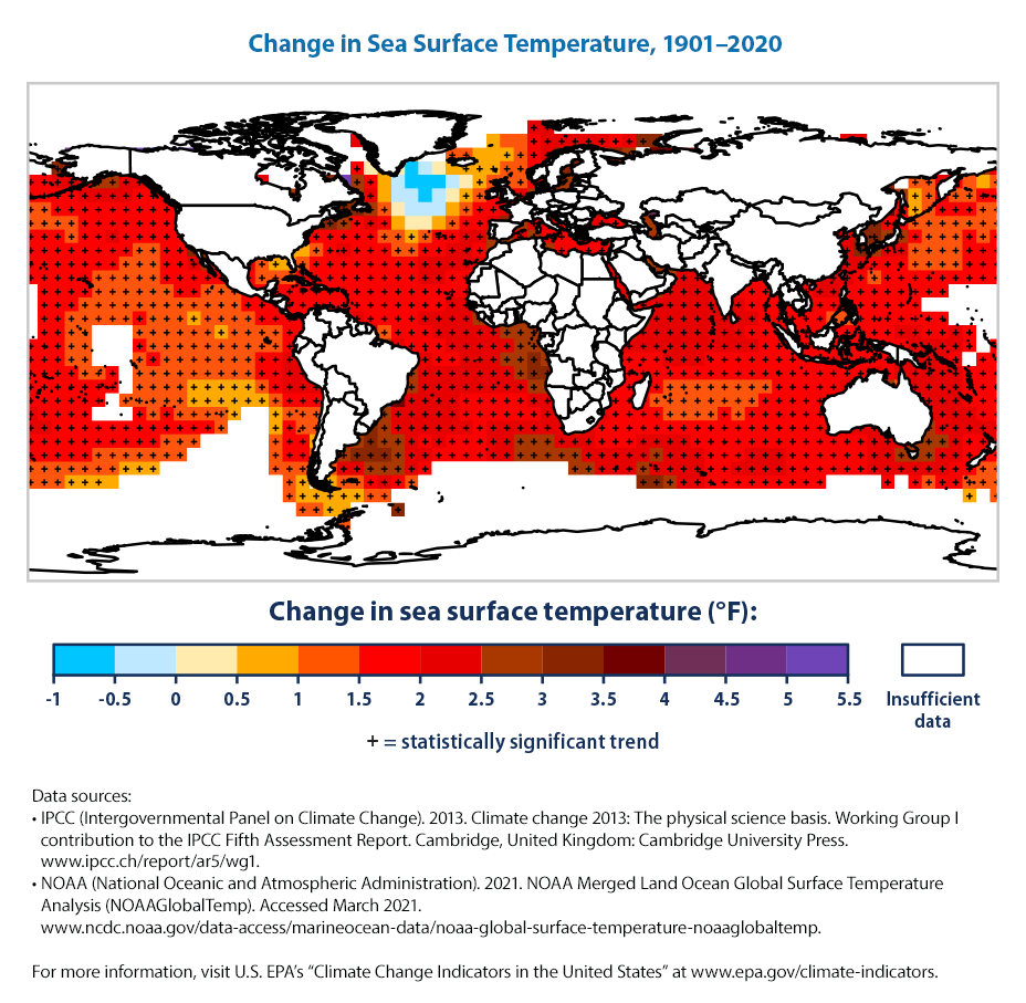
This is going to be a bit more complicated than what we tried before. So, there is more for us to learn!
The data seems to be in grids of lat/long and the header is the longitude
url = "https://www.epa.gov/sites/default/files/2021-04/sea-surface-temp_fig-2.csv"
df_seatempchg = url_data_request(url, 6)
df_seatempchg.head()| Lat/long | -177.5 | -172.5 | -167.5 | -162.5 | -157.5 | -152.5 | -147.5 | -142.5 | -137.5 | ... | 132.5 | 137.5 | 142.5 | 147.5 | 152.5 | 157.5 | 162.5 | 167.5 | 172.5 | 177.5 | |
|---|---|---|---|---|---|---|---|---|---|---|---|---|---|---|---|---|---|---|---|---|---|
| 0 | -87.5 | NaN | NaN | NaN | NaN | NaN | NaN | NaN | NaN | NaN | ... | NaN | NaN | NaN | NaN | NaN | NaN | NaN | NaN | NaN | NaN |
| 1 | -82.5 | NaN | NaN | NaN | NaN | NaN | NaN | NaN | NaN | NaN | ... | NaN | NaN | NaN | NaN | NaN | NaN | NaN | NaN | NaN | NaN |
| 2 | -77.5 | NaN | NaN | NaN | NaN | NaN | NaN | NaN | NaN | NaN | ... | NaN | NaN | NaN | NaN | NaN | NaN | NaN | NaN | NaN | NaN |
| 3 | -72.5 | NaN | NaN | NaN | NaN | NaN | NaN | NaN | NaN | NaN | ... | NaN | NaN | NaN | NaN | NaN | NaN | NaN | NaN | NaN | NaN |
| 4 | -67.5 | NaN | NaN | NaN | NaN | NaN | NaN | NaN | NaN | NaN | ... | NaN | NaN | NaN | NaN | NaN | NaN | NaN | NaN | NaN | NaN |
5 rows × 73 columns
Lots of NaN (not available)! Remember, NaN is not the same as 0 and shouldn’t be replaced with 0 unless we know that we can.
# let us reshape the  data to Lat / Long / Change

#df_seatempchg = df_seatempchg.dropna()

# rename Lat/long to Lat
df_seatempchg.rename(columns= {'Lat/long':'Lat'}, inplace = True)

# get all column names
listcol = df_seatempchg.columns.tolist()

# we need to get all columns except Lat
listcol.remove('Lat')

# units are degrees degrees F
df_seatempchg_long = pd.melt(df_seatempchg,
                        id_vars=['Lat'],
             value_vars= listcol,
             var_name='Long',
             value_name='Sea Surface Temperature Change 1901-2020')

# let us drop cases where missing values are present, from 1676 to 1673
df_seatempchg_long = df_seatempchg_long.dropna()

# for all locations
import plotly.express as px
fig = px.scatter_geo(df_seatempchg_long, lat = 'Lat', lon = 'Long',
            color = 'Sea Surface Temperature Change 1901-2020',
            labels={'Sea Surface Temperature Change 1901-2020': 'Δ SST 1901-2020'})
fig.show()

# say only for more than 2 degrees F
fig = px.scatter_geo(df_seatempchg_long.loc[(df_seatempchg_long['Sea Surface Temperature Change 1901-2020'] >= 3)],
            lat = 'Lat', lon = 'Long',
            color = 'Sea Surface Temperature Change 1901-2020',
            labels={'Sea Surface Temperature Change 1901-2020': 'Δ SST 1901-2020'})


fig.update_layout(title = "Sea Surface Temperature Change 1901-2020")

fig.show()
There is much we don’t know about climate change yet! For example, the Pacific Cold Tongue and what is causing it and what its impact on climate change and future climate

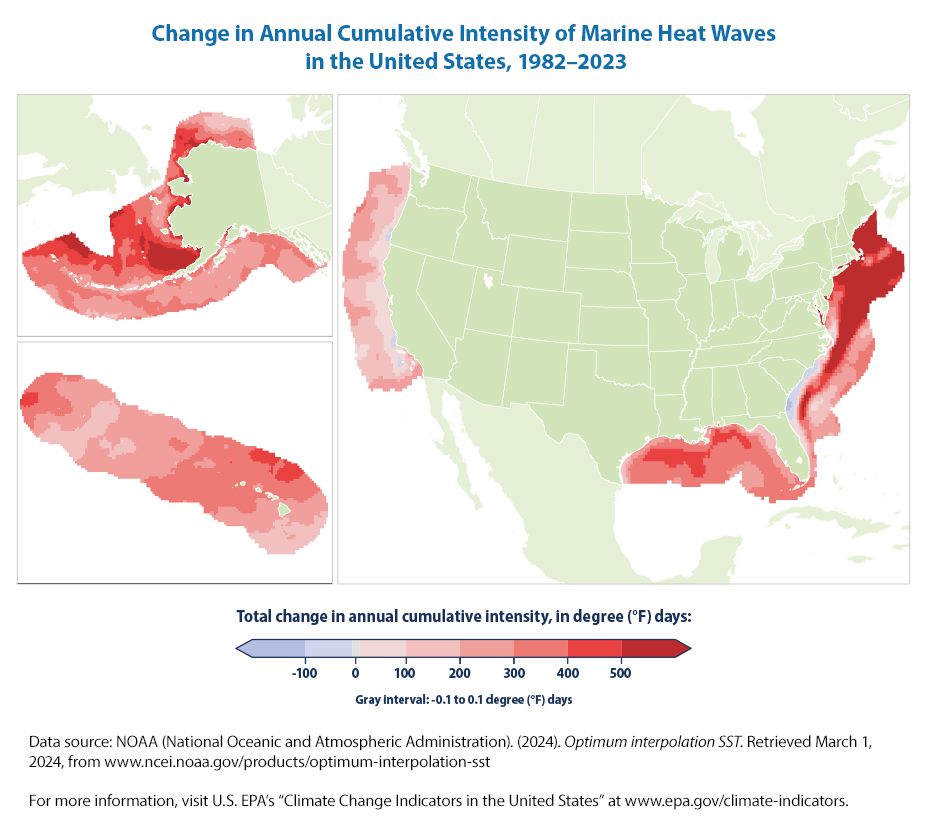
10.3 Marine Heat Waves
Let us move on to the next climate change indicator from EPA.
As EPA states,
This map shows the change in annual cumulative intensity of marine heat waves along U.S. coasts from 1982 to 2023. Cumulative intensity is measured in degree days—marine heat wave intensity multiplied by duration. Areas with increases are shown in red, with darker colors indicating greater change. The map shows total change, which is the annual rate of change (trend slope) multiplied by the number of years analyzed. The boundaries include the area within the U.S. exclusive economic zone.
How can we recreate the figure? Unfortunately, not so easily as the EPA hasn’t made the underlying data available along with the figure. This shows the importance of the data that EPA has made available for the other figures which made recreating their graphs so easy! In effect, EPA has done much of the work for us and we just needed to call in Plotly functions to graph it. This highlights that the right data is everything!
Let us reprint the other EPA figures for marine heat waves (that we can’t recreate easily as data is not made available).
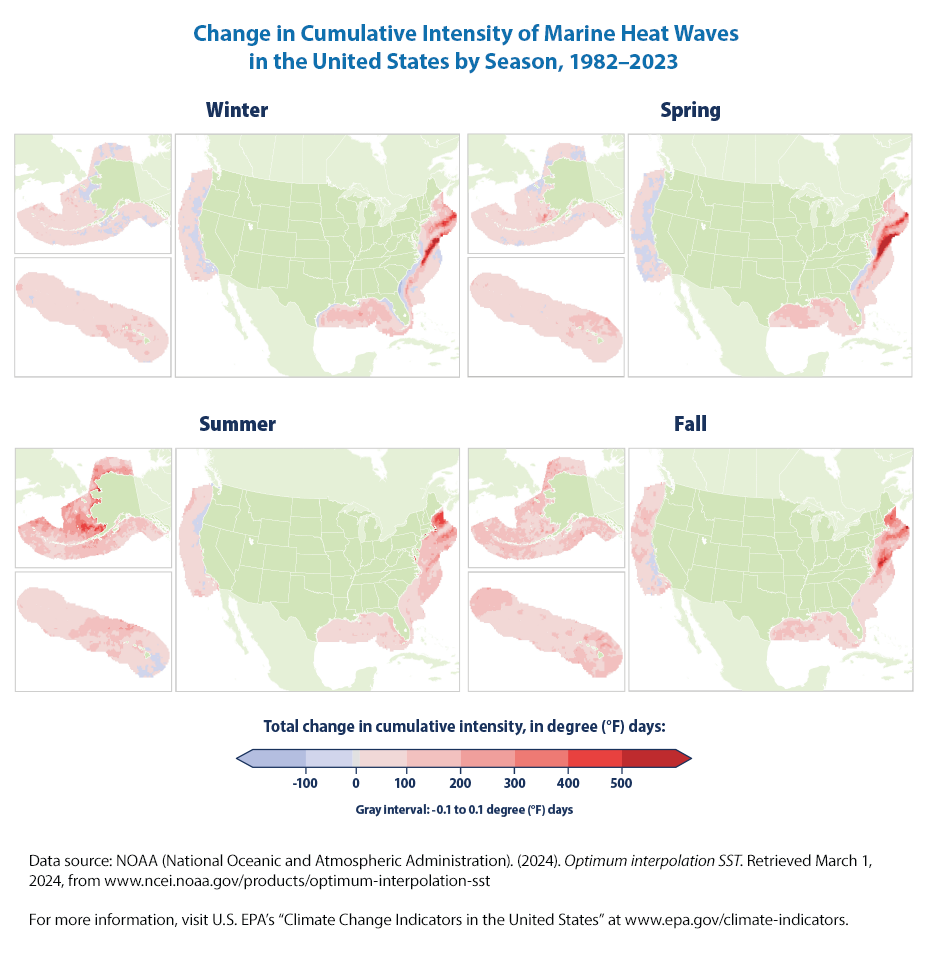
What is the learning from these figures?
Over the period shown (1982–2023), the annual cumulative intensity of marine heat waves has increased in most coastal U.S. waters, with the largest changes in waters off the northeastern U.S. and Alaskan coasts (Figure 1). Changes were particularly pronounced in the spring in the Northeast and the summer in Alaska (Figure 2).
Let us move to the next figure.
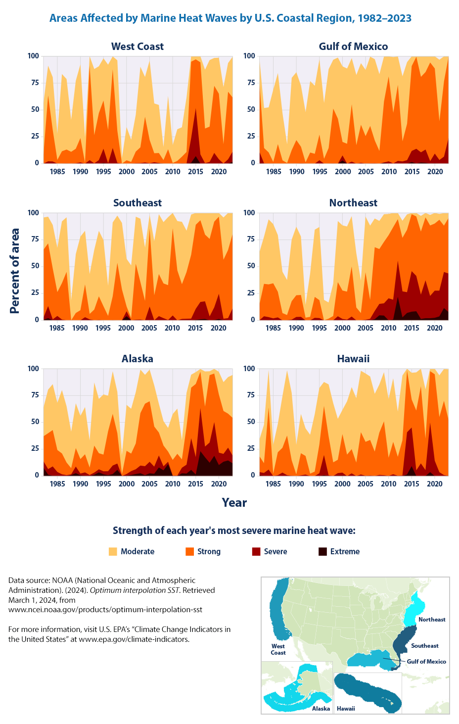
The underlying data is made available by EPA! yay! Now it is easy to download the data and recreate the figure :)
url = "https://www.epa.gov/system/files/other-files/2024-06/marine-heat-waves_fig-3.csv"

df_mh = url_data_request(url, 6)

df_mh| Year | West Coast Moderate | West Coast Strong | West Coast Severe | West Coast Extreme | Gulf of Mexico Moderate | Gulf of Mexico Strong | Gulf of Mexico Severe | Gulf of Mexico Extreme | Southeast Moderate | ... | Northeast Severe | Northeast Extreme | Alaska Moderate | Alaska Strong | Alaska Severe | Alaska Extreme | Hawaii Moderate | Hawaii Strong | Hawaii Severe | Hawaii Extreme | |
|---|---|---|---|---|---|---|---|---|---|---|---|---|---|---|---|---|---|---|---|---|---|
| 0 | 1982 | 47.845142 | 8.619430 | 0.000000 | 0.000000 | 21.535394 | 64.805583 | 10.468594 | 0.498504 | 30.000000 | ... | 0.000000 | 0.000000 | 26.822348 | 23.308599 | 5.936272 | 7.802270 | 15.358362 | 14.817975 | 2.929465 | 0.767918 |
| 1 | 1983 | 27.757487 | 61.285610 | 2.191381 | 0.000000 | 37.288136 | 14.257228 | 0.299103 | 0.000000 | 24.927536 | ... | 3.761349 | 0.000000 | 40.615452 | 33.391532 | 5.172414 | 1.320384 | 35.836177 | 9.044369 | 2.929465 | 0.000000 |
| 2 | 1984 | 49.233017 | 29.291454 | 2.045289 | 0.000000 | 41.974078 | 10.368893 | 0.099701 | 0.000000 | 40.579710 | ... | 2.853437 | 0.129702 | 42.743344 | 33.860759 | 8.729812 | 0.250982 | 34.869170 | 57.792947 | 5.972696 | 0.056883 |
| 3 | 1985 | 24.178232 | 3.433163 | 0.000000 | 0.000000 | 67.497507 | 1.495513 | 0.000000 | 0.000000 | 41.159420 | ... | 1.815824 | 0.000000 | 43.900044 | 20.460498 | 3.601048 | 0.218245 | 27.047782 | 1.962457 | 0.000000 | 0.000000 |
| 4 | 1986 | 71.950329 | 11.541271 | 0.000000 | 0.000000 | 66.201396 | 18.145563 | 0.000000 | 0.000000 | 57.536232 | ... | 2.723735 | 0.000000 | 59.013531 | 19.423832 | 1.505893 | 0.130947 | 26.393629 | 21.359499 | 0.824801 | 0.000000 |
| 5 | 1987 | 65.668371 | 12.929145 | 0.219138 | 0.000000 | 43.668993 | 3.090728 | 0.000000 | 0.000000 | 50.869565 | ... | 0.000000 | 0.000000 | 52.389786 | 11.719773 | 0.872981 | 0.000000 | 48.009101 | 23.065984 | 3.185438 | 0.056883 |
| 6 | 1988 | 29.656684 | 11.029949 | 0.000000 | 0.000000 | 17.347956 | 0.598205 | 0.000000 | 0.000000 | 18.405797 | ... | 0.129702 | 0.000000 | 33.958970 | 5.750764 | 0.709297 | 0.883893 | 60.722412 | 36.831627 | 0.853242 | 0.000000 |
| 7 | 1989 | 63.330898 | 13.513514 | 0.365230 | 0.000000 | 67.298106 | 12.662014 | 0.000000 | 0.000000 | 54.927536 | ... | 0.648508 | 0.000000 | 41.739415 | 17.164993 | 6.132693 | 2.695330 | 62.770193 | 14.448237 | 0.255973 | 0.000000 |
| 8 | 1990 | 68.590212 | 22.644266 | 1.168736 | 0.000000 | 63.210369 | 21.934197 | 0.000000 | 0.000000 | 68.550725 | ... | 2.853437 | 0.259403 | 40.266259 | 13.476648 | 1.571366 | 0.752946 | 27.389079 | 1.535836 | 0.000000 | 0.000000 |
| 9 | 1991 | 23.374726 | 0.803506 | 0.000000 | 0.000000 | 56.929212 | 15.453639 | 0.299103 | 0.000000 | 50.000000 | ... | 2.464332 | 0.778210 | 43.976430 | 16.848538 | 3.208206 | 0.218245 | 36.518771 | 20.591581 | 0.682594 | 0.000000 |
| 10 | 1992 | 8.984660 | 87.728269 | 3.067933 | 0.219138 | 46.759721 | 1.196411 | 0.000000 | 0.000000 | 37.101449 | ... | 0.000000 | 0.000000 | 25.141859 | 6.885639 | 0.851157 | 0.130947 | 25.711035 | 17.320819 | 1.422071 | 0.000000 |
| 11 | 1993 | 61.723886 | 26.150475 | 0.292184 | 0.000000 | 66.500499 | 10.368893 | 0.000000 | 0.000000 | 55.652174 | ... | 0.000000 | 0.000000 | 58.784374 | 25.087298 | 2.007857 | 1.222174 | 36.234357 | 2.246871 | 0.000000 | 0.000000 |
| 12 | 1994 | 43.681519 | 43.754565 | 3.287071 | 0.000000 | 63.409771 | 9.172483 | 0.000000 | 0.000000 | 61.014493 | ... | 2.075227 | 0.259403 | 50.578350 | 15.037102 | 2.826277 | 3.426451 | 53.441411 | 4.180887 | 0.000000 | 0.000000 |
| 13 | 1995 | 39.371804 | 44.850256 | 13.221329 | 0.657414 | 70.089731 | 23.828514 | 3.190429 | 0.000000 | 61.594203 | ... | 1.945525 | 0.129702 | 56.078132 | 15.506329 | 2.815364 | 1.647752 | 52.758817 | 26.649602 | 2.645051 | 0.000000 |
| 14 | 1996 | 60.993426 | 30.898466 | 0.292184 | 0.000000 | 51.944167 | 4.486540 | 0.000000 | 0.000000 | 27.971014 | ... | 0.000000 | 0.000000 | 33.173287 | 37.156264 | 3.655609 | 0.872981 | 22.354949 | 45.733788 | 18.771331 | 0.767918 |
| 15 | 1997 | 12.198685 | 73.192111 | 14.536158 | 0.000000 | 73.479561 | 14.556331 | 0.000000 | 0.000000 | 68.840580 | ... | 0.000000 | 0.000000 | 39.698821 | 48.046704 | 7.998691 | 1.833261 | 48.407281 | 36.319681 | 0.711035 | 0.000000 |
| 16 | 1998 | 65.595325 | 29.948868 | 0.730460 | 0.000000 | 45.563310 | 51.046859 | 0.199402 | 0.000000 | 44.057971 | ... | 0.000000 | 0.000000 | 38.531209 | 28.262767 | 5.827150 | 5.816237 | 55.176337 | 12.770193 | 0.000000 | 0.000000 |
| 17 | 1999 | 5.113221 | 0.000000 | 0.000000 | 0.000000 | 56.929212 | 41.874377 | 0.000000 | 0.000000 | 62.028986 | ... | 3.631647 | 0.129702 | 17.841554 | 1.353121 | 0.054561 | 0.000000 | 38.111490 | 12.428896 | 2.417520 | 0.341297 |
| 18 | 2000 | 30.898466 | 3.140979 | 0.000000 | 0.000000 | 70.388834 | 12.562313 | 4.685942 | 2.991027 | 44.347826 | ... | 1.297017 | 0.000000 | 42.797905 | 21.628110 | 1.560454 | 0.316456 | 22.610921 | 35.836177 | 2.730375 | 0.455063 |
| 19 | 2001 | 20.672023 | 1.607012 | 0.000000 | 0.000000 | 70.089731 | 18.544367 | 0.000000 | 0.000000 | 49.130435 | ... | 0.648508 | 0.000000 | 41.750327 | 16.313837 | 3.557399 | 1.058490 | 49.601820 | 19.965870 | 0.000000 | 0.000000 |
| 20 | 2002 | 34.331629 | 10.810811 | 0.438276 | 0.000000 | 43.070788 | 53.339980 | 1.894317 | 0.000000 | 43.913043 | ... | 3.501946 | 0.000000 | 47.872108 | 24.006984 | 4.452204 | 1.898734 | 57.764505 | 22.525597 | 2.531286 | 0.000000 |
| 21 | 2003 | 75.018261 | 14.682250 | 0.511322 | 0.000000 | 65.403789 | 17.148554 | 0.000000 | 0.000000 | 59.130435 | ... | 0.000000 | 0.000000 | 40.549978 | 48.854212 | 7.158446 | 2.618944 | 60.011377 | 12.514221 | 0.028441 | 0.000000 |
| 22 | 2004 | 37.107378 | 42.512783 | 1.095690 | 0.000000 | 57.427717 | 35.393819 | 0.797607 | 0.000000 | 49.710145 | ... | 0.000000 | 0.000000 | 26.887822 | 58.216936 | 8.369708 | 0.818420 | 57.224118 | 39.334471 | 1.365188 | 0.142207 |
| 23 | 2005 | 73.922571 | 21.694668 | 0.365230 | 0.000000 | 61.714855 | 25.523430 | 0.099701 | 0.000000 | 12.753623 | ... | 0.518807 | 0.000000 | 29.484941 | 56.383675 | 10.715845 | 2.575295 | 63.708760 | 31.626849 | 0.255973 | 0.000000 |
| 24 | 2006 | 46.384222 | 8.400292 | 1.314828 | 0.000000 | 64.606181 | 34.795613 | 0.299103 | 0.000000 | 50.434783 | ... | 1.426719 | 0.000000 | 38.323876 | 37.330860 | 6.656482 | 2.116979 | 59.158134 | 33.077361 | 0.540387 | 0.000000 |
| 25 | 2007 | 44.777210 | 9.349890 | 0.219138 | 0.365230 | 75.772682 | 21.136590 | 0.398804 | 0.000000 | 55.797101 | ... | 7.652399 | 1.037613 | 26.767787 | 21.442601 | 11.097774 | 8.020515 | 53.782708 | 22.696246 | 0.085324 | 0.000000 |
| 26 | 2008 | 12.125639 | 3.287071 | 0.000000 | 0.000000 | 71.585244 | 11.764706 | 0.000000 | 0.000000 | 57.101449 | ... | 10.635538 | 4.669261 | 22.762986 | 19.358359 | 3.731995 | 5.347010 | 44.823663 | 39.362912 | 1.109215 | 0.000000 |
| 27 | 2009 | 49.671293 | 13.367421 | 0.000000 | 0.000000 | 41.874377 | 56.929212 | 0.398804 | 0.697906 | 63.333333 | ... | 11.413748 | 4.409857 | 22.031864 | 9.460934 | 2.215190 | 11.108686 | 45.790671 | 50.113766 | 0.824801 | 0.000000 |
| 28 | 2010 | 16.654492 | 0.584368 | 0.000000 | 0.000000 | 18.843470 | 78.963111 | 2.193420 | 0.000000 | 14.347826 | ... | 20.492866 | 0.000000 | 42.688782 | 14.578787 | 0.403754 | 0.043649 | 54.721274 | 16.808874 | 0.170648 | 0.000000 |
| 29 | 2011 | 29.510592 | 2.556611 | 0.000000 | 0.000000 | 52.043868 | 47.058824 | 0.199402 | 0.000000 | 45.942029 | ... | 18.417639 | 0.778210 | 42.088608 | 20.285901 | 0.436491 | 0.000000 | 59.158134 | 30.119454 | 1.564278 | 0.142207 |
| 30 | 2012 | 27.392257 | 6.135866 | 0.365230 | 0.000000 | 26.620140 | 70.687936 | 2.592223 | 0.000000 | 58.115942 | ... | 33.722438 | 21.789883 | 17.896115 | 7.704059 | 5.183326 | 2.597119 | 42.036405 | 17.605233 | 0.312856 | 0.000000 |
| 31 | 2013 | 50.840029 | 10.737765 | 0.146092 | 0.000000 | 60.618146 | 18.644068 | 2.093719 | 0.000000 | 38.550725 | ... | 24.254215 | 2.723735 | 31.427324 | 35.486687 | 8.260585 | 2.335225 | 60.437998 | 32.650739 | 0.597270 | 0.000000 |
| 32 | 2014 | 4.967129 | 71.219869 | 22.936450 | 0.803506 | 57.427717 | 33.898305 | 3.290130 | 0.000000 | 37.536232 | ... | 19.325551 | 6.874189 | 12.079878 | 47.184636 | 29.386731 | 5.772588 | 1.678043 | 57.536974 | 39.277588 | 1.507395 |
| 33 | 2015 | 2.848795 | 45.507670 | 44.631118 | 7.012418 | 9.072782 | 79.062812 | 10.368893 | 1.495513 | 11.014493 | ... | 37.743191 | 8.041505 | 11.054125 | 68.201659 | 16.171977 | 1.418594 | 24.886234 | 26.109215 | 35.978385 | 9.243458 |
| 34 | 2016 | 5.624543 | 85.756026 | 8.619430 | 0.000000 | 0.498504 | 85.643071 | 13.659023 | 0.199402 | 6.811594 | ... | 32.944228 | 8.430610 | 2.564382 | 33.904409 | 40.124400 | 23.155827 | 35.580205 | 55.716724 | 5.290102 | 0.000000 |
| 35 | 2017 | 54.784514 | 32.286340 | 0.438276 | 0.000000 | 19.142572 | 70.289133 | 9.471585 | 1.096710 | 19.855072 | ... | 22.568093 | 1.297017 | 32.867743 | 37.123527 | 9.930162 | 17.525098 | 16.410694 | 71.757679 | 11.803185 | 0.000000 |
| 36 | 2018 | 62.016070 | 32.870709 | 1.607012 | 0.000000 | 14.656032 | 72.183450 | 12.362911 | 0.797607 | 24.202899 | ... | 35.278859 | 1.945525 | 3.622872 | 62.767350 | 18.845482 | 12.396333 | 46.046644 | 29.152446 | 5.489192 | 0.028441 |
| 37 | 2019 | 26.004383 | 62.454346 | 10.007305 | 0.000000 | 5.782652 | 91.924227 | 2.193420 | 0.099701 | 8.115942 | ... | 20.752270 | 1.945525 | 4.375818 | 45.274989 | 31.350938 | 18.856395 | 2.303754 | 47.952218 | 46.075085 | 3.668942 |
| 38 | 2020 | 33.528123 | 61.066472 | 4.090577 | 0.000000 | 11.365902 | 79.262213 | 8.973081 | 0.398804 | 3.478261 | ... | 25.291829 | 2.334630 | 21.137058 | 54.179398 | 11.545177 | 10.257529 | 5.176337 | 80.489192 | 14.334471 | 0.000000 |
| 39 | 2021 | 53.323594 | 17.823229 | 0.146092 | 0.000000 | 57.527418 | 35.892323 | 3.389831 | 0.000000 | 39.420290 | ... | 23.994812 | 3.631647 | 26.865997 | 39.960716 | 7.311218 | 13.356613 | 38.964733 | 51.279863 | 3.612059 | 0.000000 |
| 40 | 2022 | 26.734843 | 62.965668 | 4.017531 | 0.000000 | 23.330010 | 70.089731 | 6.580259 | 0.000000 | 34.492754 | ... | 33.592737 | 11.413748 | 34.079005 | 31.678306 | 11.905282 | 14.535137 | 29.721274 | 69.084187 | 0.938567 | 0.000000 |
| 41 | 2023 | 38.130022 | 50.182615 | 9.642075 | 1.680058 | 0.000000 | 75.872383 | 23.728814 | 0.398804 | 19.275362 | ... | 35.927367 | 7.652399 | 40.080751 | 35.268442 | 7.027499 | 11.839808 | 47.326507 | 51.934016 | 0.170648 | 0.000000 |
42 rows × 25 columns
The data seems to be organized by Year, Region and Climate severity levels.
For example, for West Coast, we have
- West Coast Moderate
- West Coast Strong
- West Coast Severe
- West Coast Extreme
How are severity levels defined? We need to refer to the technical documentation for the indicator.
All four are fundamentally based on the temperature difference between the historical mean and the historical \(90^th\) percentile. For example, if the 90th percentile was 2 degrees warmer than the mean, then a heat wave event with a maximum temperature difference of 5 degrees above the mean would fall into Category II (strong) because 5 is more than two times 2 degrees, but less than three times. In this same example, an event would require a maximum temperature difference that is greater than 8 degrees above the mean in order to fall into Category IV (extreme).
Per the category definitions shown above, the absolute temperature threshold for what constitutes a moderate, strong, etc. heat wave varies by location and by season.
How do we plot the region * severity * year data?
Let us take the West Coast for example.
What does the code do?
The code starts by creating a new DataFrame, df_west_coast, from df_mh. The df_mh DataFrame is assumed to contain multiple columns, including one named “Year” and several others that have “West Coast” in their names.
Column Filtering: The expression inside the double square brackets [[‘Year’] + [col for col in df_mh.columns if ‘West Coast’ in col]] is used to specify which columns to include in the new DataFrame.
[‘Year’] is a list containing the string “Year”, ensuring that the “Year” column is included in the new DataFrame. [col for col in df_mh.columns if ‘West Coast’ in col] is a list comprehension that iterates over all column names in df_mh and includes only those that contain the substring “West Coast”.
Combining Lists: The + operator is used to concatenate the list containing “Year” with the list of columns filtered by the list comprehension. This results in a single list of column names that includes “Year” and all columns related to the “West Coast”.
Creating the New DataFrame: Finally, this combined list of column names is used to index df_mh, creating the new DataFrame df_west_coast that contains only the specified columns.
This approach is useful for dynamically selecting columns based on their names, which can be particularly handy when dealing with large datasets where manual column selection would be impractical.
We can see the results from the dataset
| Year | West Coast Moderate | West Coast Strong | West Coast Severe | West Coast Extreme | |
|---|---|---|---|---|---|
| 0 | 1982 | 47.845142 | 8.619430 | 0.000000 | 0.000000 |
| 1 | 1983 | 27.757487 | 61.285610 | 2.191381 | 0.000000 |
| 2 | 1984 | 49.233017 | 29.291454 | 2.045289 | 0.000000 |
| 3 | 1985 | 24.178232 | 3.433163 | 0.000000 | 0.000000 |
| 4 | 1986 | 71.950329 | 11.541271 | 0.000000 | 0.000000 |
| 5 | 1987 | 65.668371 | 12.929145 | 0.219138 | 0.000000 |
| 6 | 1988 | 29.656684 | 11.029949 | 0.000000 | 0.000000 |
| 7 | 1989 | 63.330898 | 13.513514 | 0.365230 | 0.000000 |
| 8 | 1990 | 68.590212 | 22.644266 | 1.168736 | 0.000000 |
| 9 | 1991 | 23.374726 | 0.803506 | 0.000000 | 0.000000 |
| 10 | 1992 | 8.984660 | 87.728269 | 3.067933 | 0.219138 |
| 11 | 1993 | 61.723886 | 26.150475 | 0.292184 | 0.000000 |
| 12 | 1994 | 43.681519 | 43.754565 | 3.287071 | 0.000000 |
| 13 | 1995 | 39.371804 | 44.850256 | 13.221329 | 0.657414 |
| 14 | 1996 | 60.993426 | 30.898466 | 0.292184 | 0.000000 |
| 15 | 1997 | 12.198685 | 73.192111 | 14.536158 | 0.000000 |
| 16 | 1998 | 65.595325 | 29.948868 | 0.730460 | 0.000000 |
| 17 | 1999 | 5.113221 | 0.000000 | 0.000000 | 0.000000 |
| 18 | 2000 | 30.898466 | 3.140979 | 0.000000 | 0.000000 |
| 19 | 2001 | 20.672023 | 1.607012 | 0.000000 | 0.000000 |
| 20 | 2002 | 34.331629 | 10.810811 | 0.438276 | 0.000000 |
| 21 | 2003 | 75.018261 | 14.682250 | 0.511322 | 0.000000 |
| 22 | 2004 | 37.107378 | 42.512783 | 1.095690 | 0.000000 |
| 23 | 2005 | 73.922571 | 21.694668 | 0.365230 | 0.000000 |
| 24 | 2006 | 46.384222 | 8.400292 | 1.314828 | 0.000000 |
| 25 | 2007 | 44.777210 | 9.349890 | 0.219138 | 0.365230 |
| 26 | 2008 | 12.125639 | 3.287071 | 0.000000 | 0.000000 |
| 27 | 2009 | 49.671293 | 13.367421 | 0.000000 | 0.000000 |
| 28 | 2010 | 16.654492 | 0.584368 | 0.000000 | 0.000000 |
| 29 | 2011 | 29.510592 | 2.556611 | 0.000000 | 0.000000 |
| 30 | 2012 | 27.392257 | 6.135866 | 0.365230 | 0.000000 |
| 31 | 2013 | 50.840029 | 10.737765 | 0.146092 | 0.000000 |
| 32 | 2014 | 4.967129 | 71.219869 | 22.936450 | 0.803506 |
| 33 | 2015 | 2.848795 | 45.507670 | 44.631118 | 7.012418 |
| 34 | 2016 | 5.624543 | 85.756026 | 8.619430 | 0.000000 |
| 35 | 2017 | 54.784514 | 32.286340 | 0.438276 | 0.000000 |
| 36 | 2018 | 62.016070 | 32.870709 | 1.607012 | 0.000000 |
| 37 | 2019 | 26.004383 | 62.454346 | 10.007305 | 0.000000 |
| 38 | 2020 | 33.528123 | 61.066472 | 4.090577 | 0.000000 |
| 39 | 2021 | 53.323594 | 17.823229 | 0.146092 | 0.000000 |
| 40 | 2022 | 26.734843 | 62.965668 | 4.017531 | 0.000000 |
| 41 | 2023 | 38.130022 | 50.182615 | 9.642075 | 1.680058 |
OK. We have all columns containing “West Coast”. What next?
import plotly.express as px

fig = px.area(df_west_coast, x='Year', y=df_west_coast.columns[1:],
              title='Marine Heat Waves on the West Coast',
              labels={'value': 'Percent of Area', 'variable': 'Severity Level'})

fig.update_layout(yaxis_title="Percent of Area", legend_title_text='Severity Level')
fig.show()
Now that we know how to plot for one region, let us plot for all the regions using subplots
import plotly.graph_objects as go
from plotly.subplots import make_subplots

fig = make_subplots(rows=3, cols=2, subplot_titles=('West Coast', 'Gulf of Mexico', 'Southeast', 'Northeast', "Alaska", "Hawaii"),
        x_title= 'Year',
        y_title = 'Percent of Land Area')
fig.show()
Let us add the subplots one by one.
import plotly.graph_objects as go
from plotly.subplots import make_subplots

# Create subplots
fig = make_subplots(rows=3, cols=2, subplot_titles=('West Coast', 'Gulf of Mexico', 'Southeast', 'Northeast', "Alaska", "Hawaii"),
    x_title= 'Year',
    y_title = 'Percent of Land Area')

# Center the title
fig.update_layout(title='Marine Heat Waves by Region', title_x = 0.5)

# Add traces for West Coast
df_west_coast = df_mh[['Year'] + [col for col in df_mh.columns if 'West Coast' in col]]
for col in df_west_coast.columns[1:]:
    fig.add_trace(go.Scatter(x=df_west_coast['Year'], y=df_west_coast[col], name=col, fill='tozeroy'), row=1, col=1)

# Add traces for Gulf of Mexico
df_gulf_mexico = df_mh[['Year'] + [col for col in df_mh.columns if 'Gulf of Mexico' in col]]
for col in df_gulf_mexico.columns[1:]:
    fig.add_trace(go.Scatter(x=df_gulf_mexico['Year'], y=df_gulf_mexico[col], name=col, fill='tozeroy'), row=1, col=2)

# Add traces for Southeast
df_southeast = df_mh[['Year'] + [col for col in df_mh.columns if 'Southeast' in col]]
for col in df_southeast.columns[1:]:
    fig.add_trace(go.Scatter(x=df_southeast['Year'], y=df_southeast[col], name=col, fill='tozeroy'), row=2, col=1)

# Add traces for Northeast
df_northeast = df_mh[['Year'] + [col for col in df_mh.columns if 'Northeast' in col]]
for col in df_northeast.columns[1:]:
    fig.add_trace(go.Scatter(x=df_northeast['Year'], y=df_northeast[col], name=col, fill='tozeroy'), row=2, col=2)

# Add traces for Alaska
df_alaska = df_mh[['Year'] + [col for col in df_mh.columns if 'Alaska' in col]]
for col in df_alaska.columns[1:]:
    fig.add_trace(go.Scatter(x=df_alaska['Year'], y=df_alaska[col], name=col, fill='tozeroy'), row=3, col=1)

# Add traces for Hawaii
df_hawaii = df_mh[['Year'] + [col for col in df_mh.columns if 'Hawaii' in col]]
for col in df_hawaii.columns[1:]:
    fig.add_trace(go.Scatter(x=df_hawaii['Year'], y=df_hawaii[col], name=col, fill='tozeroy'), row=3, col=2)

# Update layout
fig.update_layout(title='Marine Heat Waves by Region', showlegend=False)
fig.show()
What do we learn from these figures? Per the EPA,
Marine heat wave events have become more widespread and more severe in most U.S. coastal regions in recent years . Region-wide changes in the Northeast and Alaska are particularly evident, as are the location-specific changes in frequency, duration, and intensity at marine protected areas in the Northeast, Alaska, and Hawaii.
As an exercise, why don’t you try to create the following graph? You need to only change the type of graph, titles and some other minor details!
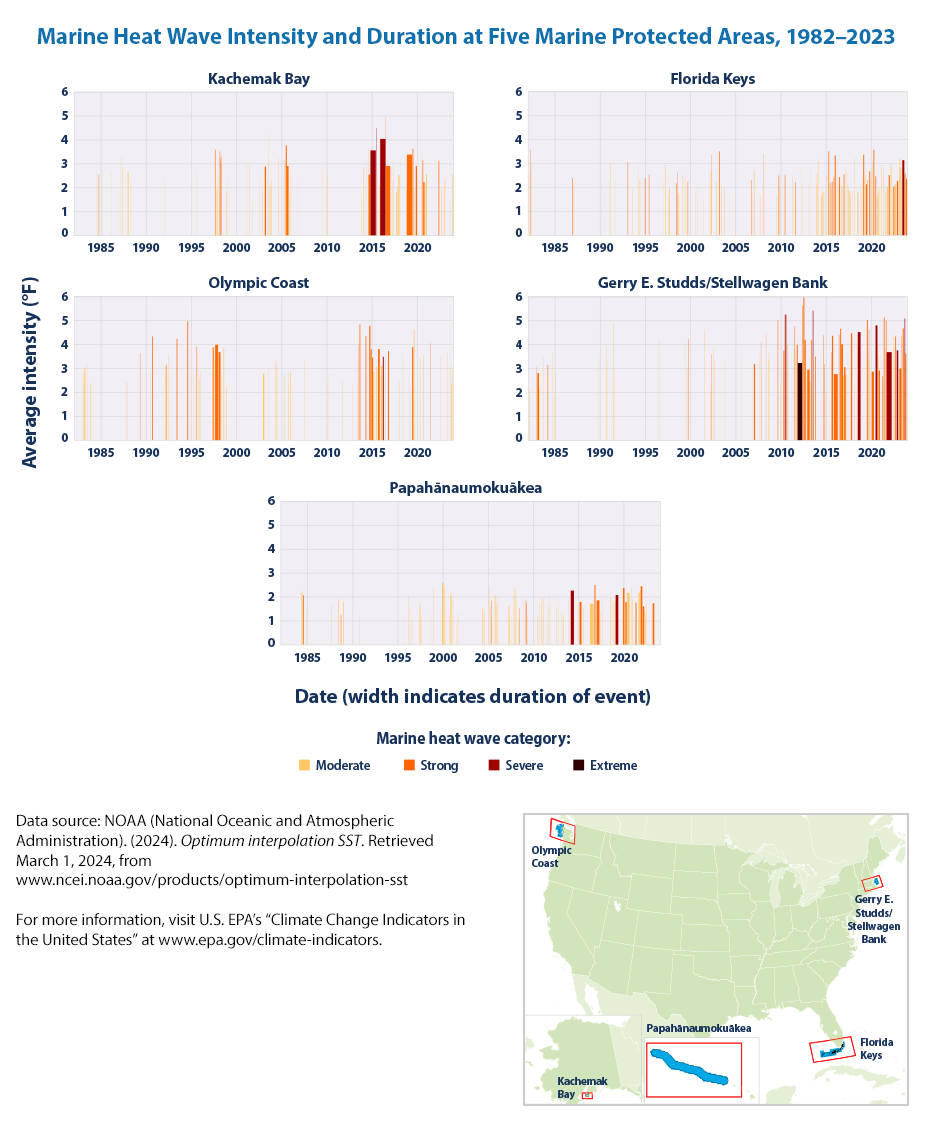
As the EPA mentions
These graphs show a timeline of marine heat wave events for five marine protected areas selected from different parts of the U.S. coastline. The columns in each graph show each individual event’s duration (width of the column), intensity (height), and severity level (color; see definitions in the technical documentation). The distribution of vertical columns reflects the frequency of heat waves. The small map to the right shows the areas analyzed (blue).
The key takeaway highlighted by EPA is
Over the period shown (1982–2023), the annual cumulative intensity of marine heat waves has increased in most coastal U.S. waters, with the largest changes in waters off the northeastern U.S. and Alaskan coasts.
Changes were particularly pronounced in the spring in the Northeast and the summer in Alaska.
Marine heat wave events have become more widespread and more severe in most U.S. coastal regions in recent years.
Region-wide changes in the Northeast and Alaska are particularly evident, as are the location-specific changes in frequency, duration, and intensity at marine protected areas in the Northeast, Alaska, and Hawaii.
10.4 Summary
Oceans are getting warmer!
The main takeaways, per EPA are:
- In four different data analyses, the long-term trend shows that the top 700 meters of the oceans have become warmer since 1955 (see Figure 1).
- All three analyses in Figure 2 show additional warming when the top 2,000 meters of the oceans are included. These results indicate that the heat absorbed by surface waters extends to much lower depths over time
- Although concentrations of greenhouse gases have risen at a relatively steady rate over the past few decades (see the Atmospheric Concentrations of Greenhouse Gases indicator), the rate of change in ocean heat content can vary from year to year (see Figures 1 and 2). Year-to-year changes are influenced by events such as volcanic eruptions and recurring ocean-atmosphere patterns such as El Niño.
Is there a link to more powerful hurricanes?

Source: Virginia Office of the Governor, CC BY 2.0 https://creativecommons.org/licenses/by/2.0, via Wikimedia Commons