Area of the Contiguous 48 States with Unusually Hot Summer Temperatures, 1910–2023
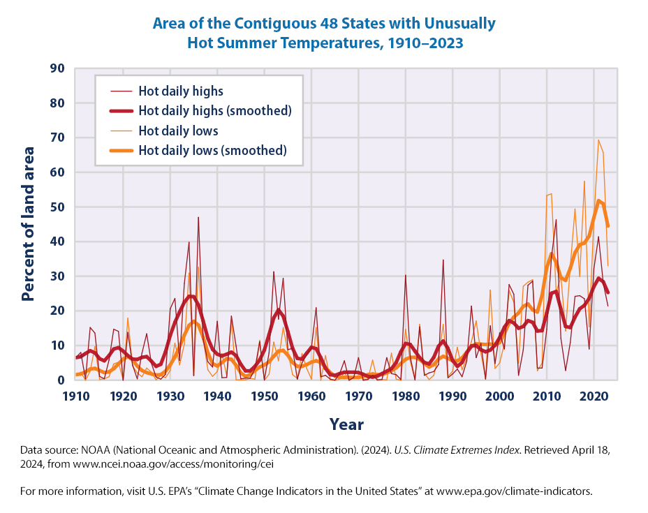
This graph shows the percentage of the land area of the contiguous 48 states with unusually hot daily high and low temperatures during the months of June, July, and August.
Where do the data for these variables sourced from?
EPA states that:
The data come from thousands of weather stations across the United States. National patterns can be determined by dividing the country into a grid and examining the data for one station in each cell of the grid. This method ensures that the results are not biased toward regions that happen to have many stations close together.
Figures 1 and 2 show trends in the percentage of the country’s area experiencing unusually hot temperatures in the summer and unusually cold temperatures in the winter. These graphs are based on daily maximum temperatures, which usually occur during the day, and daily minimum temperatures, which usually occur at night. At each station, the recorded highs and lows are compared with the full set of historical records. After averaging over a particular month or season of interest, the coldest 10 percent of years are considered “unusually cold” and the warmest 10 percent are “unusually hot.” For example, if last year’s summer highs were the 10th warmest on record for a particular location with more than 100 years of data, that year’s summer highs would be considered unusually warm. Data are available from 1910 to 2023 for summer (June through August) and from 1911 to 2024 for winter (December of the previous year through February).
We already know how to get the underlying data from EPA website by following the link.
import pandas as pdimport plotly.express as pxurl ="https://www.epa.gov/system/files/other-files/2024-06/high-low-temps_fig-1.csv"df_hot = pd.read_csv(url, skiprows=6, encoding="ISO-8859-1") df_hot
Year
Hot daily highs
Hot daily lows
Hot daily highs (smoothed)
Hot daily lows (smoothed)
0
1910
0.066
0.016
0.065242
0.016410
1
1911
0.080
0.023
0.067645
0.017984
2
1912
0.004
0.000
0.076617
0.023719
3
1913
0.152
0.026
0.084812
0.031789
4
1914
0.136
0.097
0.078863
0.034363
...
...
...
...
...
...
109
2019
0.090
0.154
0.235777
0.415781
110
2020
0.321
0.462
0.270445
0.469125
111
2021
0.414
0.693
0.293742
0.517918
112
2022
0.280
0.657
0.283707
0.508711
113
2023
0.214
0.330
0.253172
0.444672
114 rows × 5 columns
It is always a good practice to check the data. As we are revising the book, we realized the data link has changed as EPA has updated with new data. Sometimes the variables names and other details may change. So, always check the data structure, variables names.
We can see that from the data
there are 114 rows and 5 variables
The variables are
Year
Hot daily highs Hot daily lows
Hot daily highs (smoothed)
Hot daily lows (smoothed)
Year is from 1910 to 2023
One more sanity check. Let us check the descriptive statistics of the dataset
df_hot.describe()
Year
Hot daily highs
Hot daily lows
Hot daily highs (smoothed)
Hot daily lows (smoothed)
count
114.000000
114.000000
114.000000
114.000000
114.000000
mean
1966.500000
0.105061
0.104930
0.104911
0.104394
std
33.052988
0.115196
0.150037
0.070312
0.121094
min
1910.000000
0.000000
0.000000
0.008871
0.007633
25%
1938.250000
0.013250
0.006250
0.056858
0.028217
50%
1966.500000
0.065000
0.038000
0.084174
0.055982
75%
1994.750000
0.153500
0.145750
0.152854
0.107727
max
2023.000000
0.470000
0.693000
0.293742
0.517918
Note that for each year, these variables represent the percentage of the land area of the contiguous 48 states with unusually hot daily high and low temperatures during the months of June, July, and August.
It appears that on average 10.5% of the contiguous U.S. experiences hot daily highs or hot daily lows during this time period. But the average masks sugnificant variation as we can see the 75th percentile is 15.3% for Hot daily highs and 14.57% for Hot daily lows. Also, there are some very high values as can be seen by the maximum values of 47% for Hot daily highs and 69.3% for Hot daily lows.
It would be good to know whether the percentage of the the contiguous U.S. that experiences hot daily highs and hot daily lows are increasing over time.
Let us dive in!
import plotly.express as pxfig = px.line(df_hot, x="Year", y= ["Hot daily highs", "Hot daily highs (smoothed)", "Hot daily lows", "Hot daily lows (smoothed)"])fig.update_layout(title='Area of the Contiguous 48 States with Unusually Hot Summer Temperatures, 1910–2023', title_x =0.5, xaxis_title="Year", yaxis_title="Percentage of Land Area (%)", legend=dict(x=0.5, y=0.95) ) fig.show()
Notice that we have given all four variables as list to be plotted by writing
This output looks a little messy so let’s update some properties.
Since we are using the percent of land area, it is in decimals. Dowe need to multiply all the values in the highs and lows rows by 100? or is there a easy way?
the x-axis is showing ticks by 20 years. How can we show every 10 years?
One option to get the numbers is multiply all variables by 100
But this seems messy! What if we have more variables. Of course, the plots would be to busy and not clear if we put more variables.
Plotly has a simpler solution without the multiplication. One can update the layout of the y-axis to show that it is percentage.
import plotly.express as pxfig = px.line(df_hot, x="Year", y= ["Hot daily highs", "Hot daily highs (smoothed)", "Hot daily lows", "Hot daily lows (smoothed)"])fig.update_layout(title='Area of the Contiguous 48 States with Unusually Hot Summer Temperatures, 1910–2023', title_x =0.5, xaxis_title="Year", yaxis_title="Percentage of Land Area (%)", legend=dict(x=0.5, y=0.95), xaxis=dict(tickmode='linear', tick0=1910, dtick=10) ) fig.layout.yaxis.tickformat =',.0%'fig.show()
We will focus on the changes that we made in the code as the rest of the code is the same.
xaxis=dict(tickmode=‘linear’, tick0=1910, dtick=10): This line sets the tick settings for the x-axis of the plot. The xaxis property is being assigned a dictionary (denoted by dict()) with three key-value pairs:
tickmode=‘linear’: This specifies that the tick values on the x-axis should be displayed in a linear manner.
tick0=1910: This sets the starting tick value on the x-axis to 1910.
dtick=10: This sets the interval between ticks on the x-axis to 10. In other words, the distance between consecutive tick values will be 10 units.
fig.layout.yaxis.tickformat = ‘,.0%’: This line sets the tick format for the y-axis of the plot. It accesses the yaxis property of the fig.layout object and assigns a tick format to it. The tick format ‘,.0%’ specifies that the tick values on the y-axis should be displayed as percentages with no decimal places. For example, a value of 0.25 will be displayed as “25%”.
Enough with the coding! What do we learn from this graph?
There seems to be an increase in the percentage Area of the Contiguous 48 States with Unusually Hot Summer Temperatures over 1910–2023, especially in the last few decades. There are four variables so it is not very clear.
We recreated the graph simiar to EPA, but we don’t need to! We have the code and data, we can zoom in as we wish!
Let us focus only on two variables
import plotly.express as pxfig = px.line(df_hot, x="Year", y= ["Hot daily highs", "Hot daily lows"])fig.update_layout(title='Area of the Contiguous 48 States with Unusually Hot Summer Temperatures, 1910–2023', title_x =0.5, xaxis_title="Year", yaxis_title="Percentage of Land Area (%)", legend=dict(x=0.5, y=0.95), xaxis=dict(tickmode='linear', tick0=1910, dtick=10) ) fig.layout.yaxis.tickformat =',.0%'fig.show()
We can see that in the last decade or so, most of the contiguous U.S. has experienced an increase in the hot daily highs and hot daily lows! It is getting hotter! But there is a lot of variability from year to year. So let us use the smoother variables.
import plotly.express as pxfig = px.line(df_hot, x="Year", y= ["Hot daily highs (smoothed)", "Hot daily lows (smoothed)"])fig.update_layout(title='Area of the Contiguous 48 States with Unusually Hot Summer Temperatures, 1910–2023', title_x =0.5, xaxis_title="Year", yaxis_title="Percentage of Land Area (%)", legend=dict(x=0.5, y=0.95), xaxis=dict(tickmode='linear', tick0=1910, dtick=10) ) fig.layout.yaxis.tickformat =',.0%'fig.show()
Before we go in to the insights from this graph, how is the smoothing done? We need to dig into the technical documentation provided by the EPA for this indicator.
Page 4 of the document states
…To smooth out some of the year-to-year variability, EPA applied a nine-point binomial filter, which is plotted at the center of each nine-year window. For example, the smoothed value from 2010 to 2018 is plotted at year 2014. NOAA NCEI recommends this approach and has used it in the official online reporting tool for the CEI….
We don’t know the exact technical details of the binomial filters, but EPA seems to smooth the values over nine years to reduce the year to year variability.
It is very clear from this plot that in the last three decades, a higher percentage of the contiguous U.S. is experiencing higher temperatures. We already have seen in the previous chapter that 9 of the top 10 hottest years since 1901 were 1998 and afterwards, with most of them 2015 or after. Only 1934 makes it to the top 10.
The EPA keypoints from this plot are
Nationwide, unusually hot summer days (highs) have become more common over the last few decades (see Figure 1). The occurrence of unusually hot summer nights (lows) has increased at an even faster rate. This trend indicates less “cooling off” at night.
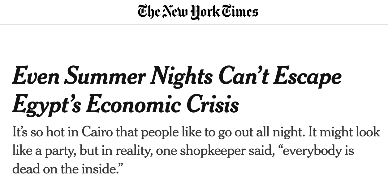
This is a critical issue as poorer households may not be able to afford the energy costs to keep them cool in the night.
The recent article from NYT discusses how nights are so hot in Egypt and how energy problems are making the citizens suffer.
7.1 Area of the Contiguous 48 States with Unusually Cold Winter Temperatures, 1911–2023
Let us look at other figures under this EPA climate indicator
Area of the Contiguous 48 States with Unusually Cold Winter Temperatures, 1911–2024
From EPA
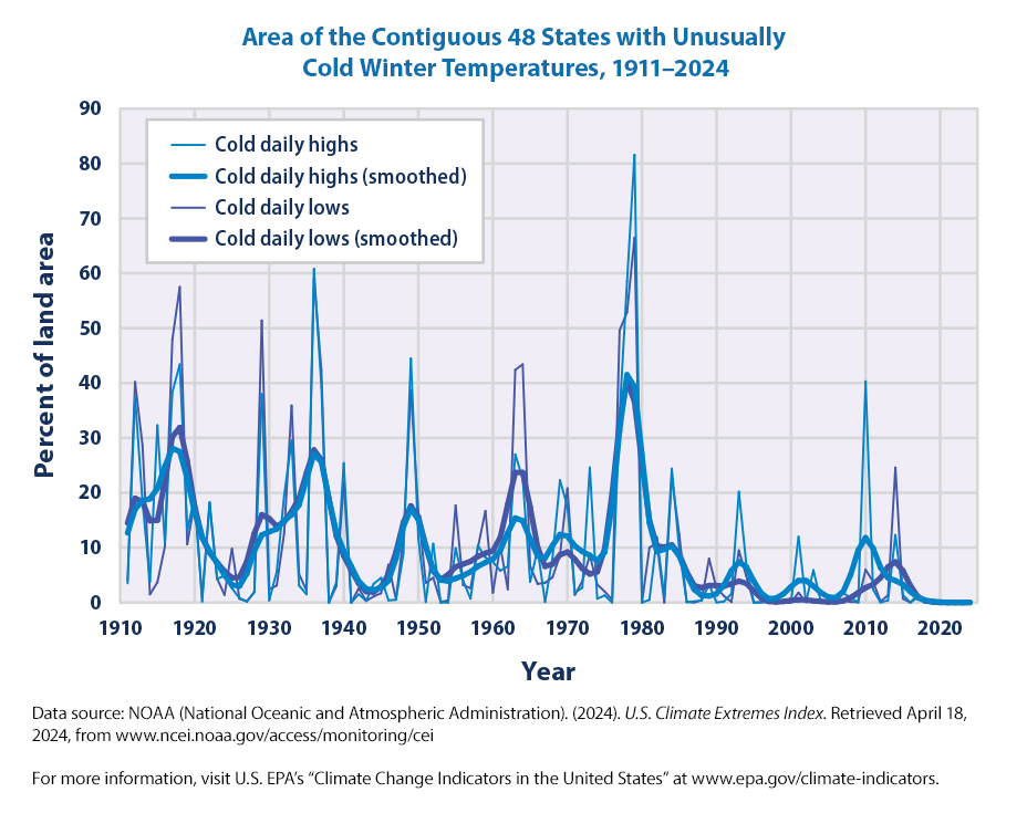
This graph shows the percentage of the land area of the contiguous 48 states with unusually cold daily high and low temperatures during the months of December, January, and February. The thin lines represent individual years, while the thick lines show a nine-year weighted average. Blue lines represent daily highs, while purple lines represent daily lows. The term “unusual” in this case is based on the long-term average conditions at each location.
Let us quickly the data as before, check it and then graph it.
import pandas as pdurl ="https://www.epa.gov/system/files/other-files/2024-06/high-low-temps_fig-2.csv"df_cold = pd.read_csv(url, skiprows=6, encoding="ISO-8859-1") df_cold
Year
Cold Highs
9-pt High
Cold Lows
9-pt Low
0
1911
0.035
0.126672
0.040
0.145301
1
1912
0.374
0.169902
0.402
0.190211
2
1913
0.184
0.185695
0.286
0.184309
3
1914
0.038
0.188910
0.015
0.148504
4
1915
0.323
0.208172
0.037
0.150484
...
...
...
...
...
...
109
2020
0.000
0.000656
0.000
0.000313
110
2021
0.000
0.000164
0.000
0.000039
111
2022
0.000
0.000031
0.000
0.000000
112
2023
0.000
0.000004
0.000
0.000000
113
2024
0.000
0.000000
0.000
0.000000
114 rows × 5 columns
We can see that from the data
there are 114 rows and 5 variables
The variables are
Year
Cold Highs
9-pt High
Cold Lows
9-pt Low
Year is from 1911 to 2024
One more sanity check. Let us check the descriptive statistics of the dataset:
df_cold.describe()
Year
Cold Highs
9-pt High
Cold Lows
9-pt Low
count
114.000000
114.000000
114.000000
114.000000
114.000000
mean
1967.500000
0.096289
0.095814
0.096325
0.095791
std
33.052988
0.149937
0.083733
0.154628
0.089213
min
1911.000000
0.000000
0.000000
0.000000
0.000000
25%
1939.250000
0.002000
0.032429
0.002000
0.030132
50%
1967.500000
0.026500
0.079703
0.026000
0.071404
75%
1995.750000
0.118500
0.129005
0.102750
0.148180
max
2024.000000
0.816000
0.414547
0.665000
0.403469
It appears that approximately 9.5% of the Area of the Contiguous 48 States has Unusually Cold Winter Temperatures during 1911–2024
import plotly.express as pxfig = px.line(df_cold, x="Year", y= ["Cold Highs", "9-pt High", "Cold Lows", "9-pt Low"])fig.update_layout(title='Area of the Contiguous 48 States with Unusually Cold Winter Temperatures, 1911–2024', title_x =0.5, xaxis_title="Year", yaxis_title="Percentage of Land Area (%)", legend=dict(x=0.75, y=0.95), xaxis=dict(tickmode='linear', tick0=1911, dtick=10) ) fig.layout.yaxis.tickformat =',.0%'fig.show()
Notice that as compared to the hot temperatures in the summer, we have
changed the dataframe name to df_cold
changed the variable names
changed the starting year to 2011
Before we get to the climate insights, let us plot a less busy plot with the smoothed temperatures
import plotly.express as pxfig = px.line(df_cold, x="Year", y= ["9-pt High", "9-pt Low"])fig.update_layout(title='Area of the Contiguous 48 States with Unusually Cold Winter Temperatures, 1911–2024', title_x =0.5, xaxis_title="Year", yaxis_title="Percentage of Land Area (%)", legend=dict(x=0.75, y=0.95), xaxis=dict(tickmode='linear', tick0=1911, dtick=10) ) fig.layout.yaxis.tickformat =',.0%'fig.show()
The key points from the EPA for this figure highlight
The 20th century had many winters with widespread patterns of unusually low temperatures, including a particularly large spike in the late 1970s. Since the 1980s, though, unusually cold winter temperatures have become less common—particularly very cold nights (lows).
Bottom line, it appears that over the last three decades or so, it is not as cold as it used to be!
Summers are getting hotter and winters are getting warmer!
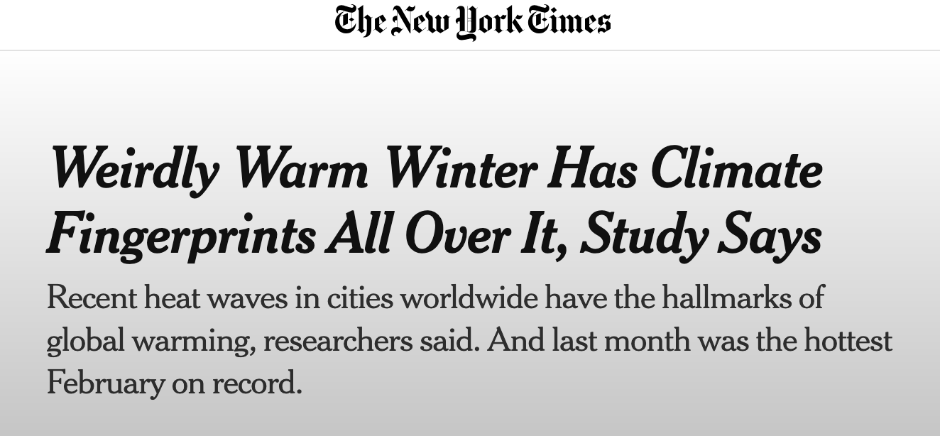
Another recent article from NYT discusses how winters are getting warmer.
The nights are getting warmer, the summers are getting longer, the winters are getting shorter. Given how temperature can have a signifcant impact on health, this is worrisome. The hot temperatures are going to affect the economically vulnerable more.
7.2 Change in Unusually Hot Temperatures in the Contiguous 48 States, 1948–2023
Change in Unusually Hot Temperatures in the Contiguous 48 States, 1948–2023
This map shows trends in unusually hot temperatures at individual weather stations that have operated consistently since 1948. In this case, the term “unusually hot” refers to a daily maximum temperature that is hotter than the 95th percentile temperature during the 1948–2023 period. Thus, the maximum temperature on a particular day at a particular station would be considered “unusually hot” if it falls within the warmest 5 percent of measurements at that station during the 1948–2023 period. The map shows changes in the total number of days per year that were hotter than the 95th percentile. Red upward-pointing symbols show where these unusually hot days are becoming more common. Blue downward-pointing symbols show where unusually hot days are becoming less common.
It seems the data is arranged by latitude and longitude, not climate division or FIPS code as before.
One more sanity check. Let us check the descriptive statistics of the dataset
df.describe()
Lat
Long
Change in 95 percent Days
count
1065.000000
1065.000000
1065.000000
mean
39.464610
-96.158748
-1.047500
std
5.015523
14.442018
12.289820
min
24.556900
-124.353900
-45.365195
25%
35.627800
-106.967200
-9.538538
50%
39.799400
-95.071700
0.000000
75%
43.145000
-84.559200
0.000000
max
48.999400
-66.991900
47.282476
The change in the number of 95 percentile days ranges from -45.36 to 47.28 with an average of -1.04.
How is this number of 95 percentile days calculated? From the data description
…These maps cover about 1,050 weather stations that have operated since 1948. Figure 3 was created by reviewing all daily maximum temperatures from 1948 to 2023 and identifying the 95th percentile temperature (a temperature that one would only expect to exceed in five days out of every 100) at each station. Next, for each year, the total number of days with maximum temperatures higher than the 95th percentile (that is, unusually hot days) was determined. The map shows how the total number of unusually hot days per year at each station has changed over time…
We need to moidfy our previous mapping code slightly to account for latitude and longitude, along with the colors and symbols.
Let us first show the code and then we can explain
import plotly.graph_objects as gofrom plotly.subplots import make_subplotsfig = go.Figure(data=go.Scattergeo( lon = df['Long'], lat = df['Lat'], text = df['Change in 95 percent Days'], mode ='markers', marker=dict( color = df['Change in 95 percent Days'], colorscale ='RdBu', # Change the colorscale to 'RdBu' reversescale =True, colorbar_title ='Change', symbol = ['triangle-up'if val >=0else'triangle-down'for val in df['Change in 95 percent Days']])))fig.update_geos( visible=False, resolution=110, showcountries=True, countrycolor="Black", showsubunits=True, subunitcolor="Black")fig.update_layout( title_text ="Change in Unusually Hot Temperatures", title_x =0.5, showlegend =False, geo =dict( scope ='usa', landcolor ='rgb(217, 217, 217)', ))fig.update_layout(margin={"r":0,"t":50,"l":0,"b":0})fig.show()
Let us break the code step-by-step:
The code begins by importing the necessary modules: plotly.graph_objects and plotly.subplots. These modules provide functions and classes for creating interactive plots and subplots using Plotly.
Next, a new figure object is created using the go.Figure() function. This figure will contain the plot.
Inside the go.Figure() function, a scatter plot on a geographical map is created using the go.Scattergeo() function. This function takes several parameters:
lon and lat: These parameters specify the longitude and latitude coordinates for each data point on the map. They are obtained from the df DataFrame, which is not shown in the provided code snippet.
text: This parameter specifies the text to be displayed when hovering over each data point on the map. It is obtained from the ‘Change in 95 percent Days’ column of the df DataFrame.
mode: This parameter specifies the mode of the scatter plot. In this case, it is set to ‘markers’, which means each data point will be represented by a marker on the map.
marker: This parameter specifies the appearance of the markers on the map. It includes properties such as color, symbol, and colorbar title. The color of each marker is determined by the ‘Change in 95 percent Days’ column of the df DataFrame. The color scale is set to ‘RdBu’, and the colorbar title is set to ‘Change’. The symbol of each marker is determined by whether the corresponding value in the ‘Change in 95 percent Days’ column is greater than or equal to 0.
After creating the scatter plot, the fig.update_geos() function is called to update the layout of the geographical map. The function takes several parameters:
visible: This parameter specifies whether the geographical map should be visible. In this case, it is set to False, which means the map will not be initially visible.
resolution: This parameter specifies the resolution of the geographical map. In this case, it is set to 110.
showcountries: This parameter specifies whether country boundaries should be shown on the map. It is set to True, and the color of the country boundaries is set to black.
showsubunits: This parameter specifies whether subunit boundaries should be shown on the map. It is set to True, and the color of the subunit boundaries is set to black.
The fig.update_layout() function is called to update the overall layout of the figure. It takes several parameters:
title_text: This parameter specifies the title of the plot. In this case, it is set to ‘Change in Unusually Hot Temperatures’.
title_x: This parameter specifies the x-coordinate of the title. In this case, it is set to 0.5, which means the title will be centered horizontally.
showlegend: This parameter specifies whether the legend should be shown. It is set to False, which means the legend will not be shown.
geo: This parameter specifies the properties of the geographical map. The scope property is set to ‘usa’, which means the map will focus on the United States. The landcolor property is set to ‘rgb(217, 217, 217)’, which specifies the color of the land on the map.
Finally, the fig.update_layout() function is called again to update the margin of the figure. The margin is specified using the margin parameter, which sets the right, top, left, and bottom margins to 0, 50, 0, and 0 respectively.
The fig.show() function is called to display the figure.
That’s it! The code creates a scatter plot on a geographical map using Plotly, with markers representing data points and color indicating the change in unusually hot temperatures. The map is initially hidden, and the layout of the figure is customized with a title, legend, and margin settings.
The code and explanation seem long, but by now, we have already created some of these maps. So, it should be easy to follow along. If in doubt, try experimenting with some of the choices and see how the graph changes, for example, the symbols.
What do we learn from this graph. As the key points on the EPA website state
The two maps show where changes in the number of days with unusually hot (above the 95th percentile) and cold (below the 5th percentile) days have occurred since 1948. Based on this way of looking at hot days, unusually high temperatures have increased in the western United States and in several areas along the Gulf and Atlantic coasts but decreased in much of the middle of the country (see Figure 3).
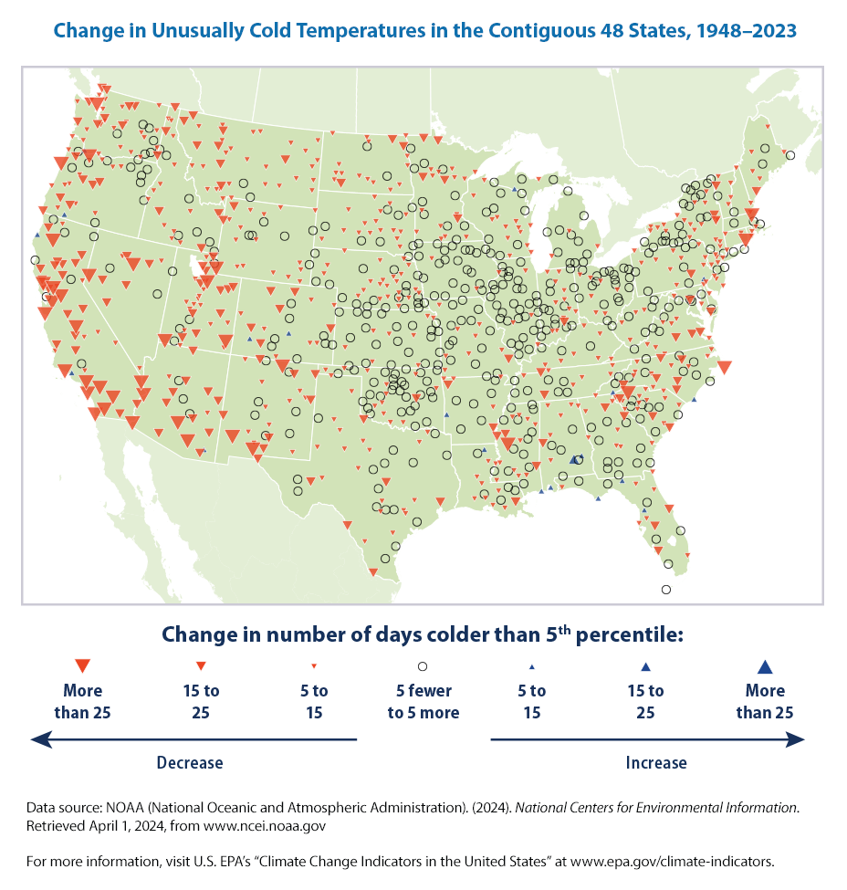
7.2.1 Change in Unusually Cold Temperatures in the Contiguous 48 States, 1948–2023
Let us move on to the next figure under this climate change indicator.
Change in Unusually Cold Temperatures in the Contiguous 48 States, 1948–2023
The description from the EPA website says
This map shows trends in unusually cold temperatures at individual weather stations that have operated consistently since 1948. In this case, the term “unusually cold” refers to a daily minimum temperature that is colder than the 5th percentile temperature during the 1948–2023 period. Thus, the minimum temperature on a particular day at a particular station would be considered “unusually cold” if it falls within the coldest 5 percent of measurements at that station during the 1948–2023 period. The map shows changes in the total number of days per year that were colder than the 5th percentile. Blue upward-pointing symbols show where these unusually cold days are becoming more common. Red downward-pointing symbols show where unusually cold days are becoming less common.
By now, we are getting a hang of it!
All we have to do is
download the new data
check the data (always!)
cut and copy the previous code and make a couple of minor changes
In fact, we could make this a function giving the URL and Title as the input. May be later!
It seems the data is arranged by latitude and longitude as before.
Why 5 percent days instead of 95 percent days before? It makes sense as cold weather means lower or negative temperatures and hot weather means higher temperatures. So, we woudl want to look at the smallest numbers for the unusually cold weather and largest numbers for unusually warmer weather.
One more sanity check. Let us check the descriptive statistics of the dataset
df.describe()
Lat
Long
Change in 5 percent Days
count
1052.000000
1052.000000
1052.000000
mean
39.457208
-96.134106
-7.589711
std
5.007925
14.377561
8.722389
min
24.556900
-124.353900
-51.285195
25%
35.629900
-106.924525
-12.347792
50%
39.792600
-95.091250
-7.814026
75%
43.112625
-84.620625
0.000000
max
48.999400
-66.991900
20.633791
The change in the number of 5 percentile days ranges from -51.28 to 20.63 with an average of -7.59. Winters are indeed less cold or getting warmer!
How is this number of 5 percentile days calculated? From the data description
… unusually cold days, based on the 5th percentile of daily minimum temperatures and reviews daily minimum winter temperatures from 1911 to 2023.
Now that we have the data and checked it, we just need to cut and copy the previous code. The only change is
the variable name, change to Change in 5 percent Days
change symbols
the title
import plotly.graph_objects as gofrom plotly.subplots import make_subplotsfig = go.Figure(data=go.Scattergeo( lon = df['Long'], lat = df['Lat'], text = df['Change in 5 percent Days'], mode ='markers', marker=dict( color = df['Change in 5 percent Days'], colorscale ='RdBu', # Change the colorscale to 'RdBu' reversescale =True, colorbar_title ='Change', symbol = ['triangle-down'if val >=0else'circle'for val in df['Change in 5 percent Days']])))fig.update_geos( visible=False, resolution=110, showcountries=True, countrycolor="Black", showsubunits=True, subunitcolor="Black")fig.update_layout( title_text ="Change in Unusually Cold Temperatures", title_x =0.5, showlegend =False, geo =dict( scope ='usa', landcolor ='rgb(217, 217, 217)', ))fig.update_layout(margin={"r":0,"t":50,"l":0,"b":0})fig.show()
We can see that the number of unusually cold days has generally decreased throughout the country, particularly in the western United States.
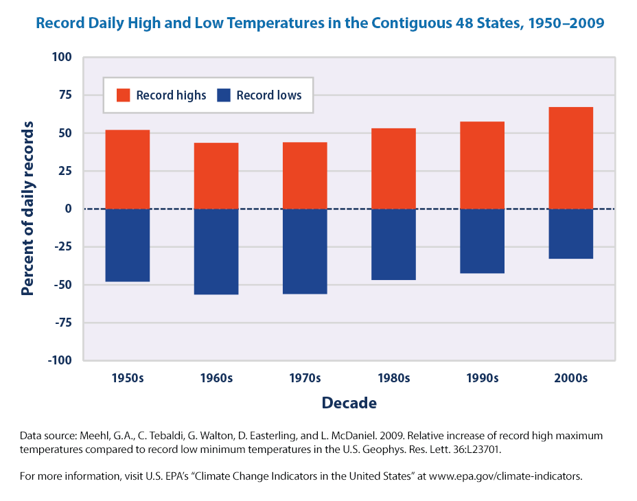
7.2.2 Record Daily High and Low Temperatures in the Contiguous 48 States, 1950–2009
Let us wrap up the chapter on this climate indicator using the Record Daily High and Low Temperatures in the Contiguous 48 States, 1950–2009.
Record Daily High and Low Temperatures in the Contiguous 48 States, 1950–2009
This figure shows the percentage of daily temperature records set at weather stations across the contiguous 48 states by decade. Record highs (red) are compared with record lows (blue).
there are only 6 rows, one for each decade and 2 variables
The variables are
Decade
High%
Low%
The data represent the number of record-setting highs with the number of record-setting lows by decade. These data come from a set of weather stations that have collected data consistently since 1950.
We don’t need to describe the data as theere only 6 observations.
We can plot using a bar plot.
import plotly.express as pxfig = px.bar(df, x='Decade', y = ['High %', 'Low %'])fig.show()
this doesn’t make sense! we skipped the data descripton and sanity check! May be we shouldn’t have :(
df.describe()
Decade
High %
Low %
count
6
6
6
unique
6
6
6
top
1950s
52.07%
-47.93%
freq
1
1
1
Again, this is not what we are expecting! What is happening?
Let us go one step back.
df.dtypes
Decade    object
High %    object
Low %     object
dtype: object
Now, we see the problem. They are each an object and not a floating number that we were expecting. The ‘High %’ and ‘Low %’ columns contain are of object type with a ‘%’ symbol at the end.
These two lines of code are used to clean and transform the ‘High %’ and ‘Low %’ columns in the DataFrame. By removing the ‘%’ symbol and converting the values to floats, the columns canbe used for the plotting.
Notice that we have chained the methods.
df.describe()
High %
Low %
count
6.000000
6.000000
mean
52.903333
-47.096667
std
8.874624
8.874624
min
43.550000
-56.450000
25%
45.957500
-54.042500
50%
52.620000
-47.380000
75%
56.455000
-43.545000
max
67.160000
-32.840000
Now the numbers make sense. Let us plot the high and low for the decades.
import plotly.express as pxfig = px.bar(df, x='Decade', y=['High %', 'Low %'], color_discrete_map={'High %': 'red', 'Low %': 'blue'} )fig.update_layout( title="Record Daily High and Low Temperatures in the Contiguous 48 States, 1950–2009", xaxis_title="Decade", yaxis_title="Percentage of Daily Records", title_x =0.5, legend=dict( x=0.25, y=0.95, orientation='h' ))fig.show()
The key points are from EPA,
If the climate were completely stable, one might expect to see highs and lows each accounting for about 50 percent of the records set. Since the 1970s, however, record-setting daily high temperatures have become more common than record lows across the United States. The decade from 2000 to 2009 had twice as many record highs as record lows.
7.3 Summary
The main climate insights from the chapter as summarized by EPA are:
Nationwide, unusually hot summer days (highs) have become more common over the last few decades (see Figure 1). The occurrence of unusually hot summer nights (lows) has increased at an even faster rate. This trend indicates less “cooling off” at night.
The 20th century had many winters with widespread patterns of unusually low temperatures, including a particularly large spike in the late 1970s (see Figure 2). Since the 1980s, though, unusually cold winter temperatures have become less common—particularly very cold nights (lows).
The two maps show where changes in the number of days with unusually hot (above the 95th percentile) and cold (below the 5th percentile) days have occurred since 1948. Based on this way of looking at hot days, unusually high temperatures have increased in the western United States and in several areas along the Gulf and Atlantic coasts but decreased in much of the middle of the country (see Figure 3). The number of unusually cold days has generally decreased throughout the country, particularly in the western United States (see Figure 4).
If the climate were completely stable, one might expect to see highs and lows each accounting for about 50 percent of the records set. Since the 1970s, however, record-setting daily high temperatures have become more common than record lows across the United States (see Figure 5). The decade from 2000 to 2009 had twice as many record highs as record lows.