flowchart LR
    A[Heat and Temperature] --> B[Ocean Heat]
    B --> C[Glacier and Ice Melting]
    C --> D[Sea Level Rise]
11 Sea Level Rise (SLR)
11.1 Why Does Sea Level Change?
As the CSIRO website mentions,
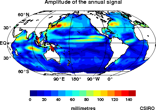
Sea level changes on a range of temporal and spatial-scales. The total volume of the ocean can change as a result of changes in ocean mass (addition of water to the ocean from the land) or expansion/contraction of the ocean water as it warms/cools.
The ocean is not like a bathtub – that is, the level does not change uniformly as water is added or taken away. There can be large regions of ocean with decreasing sea level even when the overall Global Mean Sea Level (GMSL) is increasing. Obviously there must be regions of ocean with trends correspondingly greater than the mean to balance out the regions with trends less than the mean.

Some of the processes that drive short term (hours to days) changes in sea level are tides, surface waves, and storm surges, as well as other events like tsunami.
More information is available at CSIRO website
Longer term, on time scales of months and longer, sea level changes as a result of both changes in ocean mass (addition of water to the ocean from the land) and expansion/contraction of the ocean water as it warms/cools.
Taking the information below directly from the CSIRO website, some of the long term causes are:
Thermal Expansion: Thermal expansion is one of the main contributors to long-term sea level change, as well as being part of regional and short-term changes. Water expands as it warms and contracts as it cools. From 1971-2010 the average contribution from thermal expansion was 0.8 [0.5 to 1.1] mm/yr, and from 1993-2010 it was 1.1 [0.8 to 1.4] mm/yr representing approximately 40% and 34% of the measured global mean rate of sea level rise over these periods (see Church et al., 2013).
Non-polar Glaciers: Non-polar glaciers have also been a major contributor to recent sea level rise. From 1971-2010 melting of these glaciers contributed 0.62 [0.25 to 0.99] mm/yr to sea level rise while over the period 1993-2010 they contributed 0.76 [0.39 to 1.13] mm/yr (see Church el al., 2013).
Greenland and Antarctica: The contributions of Greenland and Antarctica to sea level rise occur mainly as a result of direct melting and flow into the ocean. However, other dynamic processes can contribute and potentially lead to increases in the contribution by these ice sheets to sea level rise. These ‘dynamic processes’ include processes such as collapse of ice shelves into the ocean as the buttressing effects of surrounding sea ice are diminished through ocean warming. Melting of the Greenland ice sheet contributed around 0.33 [0.25 to 0.41] mm/yr to sea level rise over the period 1993-2010 while the Greenland glaciers contributed around 0.10 [0.07 to 0.13] mm/yr to sea level rise over this period. The Antarctic ice sheet contributed around 0.27 [0.16 to 0.38] mm/yr to sea level rise over the period 1993-2010 (see Church et al., 2013).
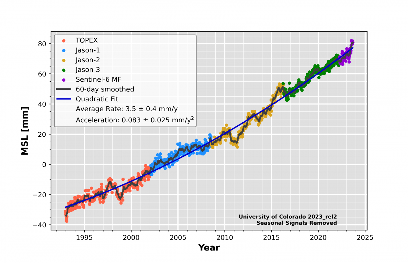
11.2 Sea Level
Next, let us analyze how the sea level is increasing over time. We can use the same function as before. Also, as with most of the EPA datasets, we need to skip the first few rows that have description of the data. It is useful to read these to understand the data sources and variable description. But in order to graph and get the data into the right columns, we can skip it.
More information on the Sea Level Rise (SLR) is available at EPA Climate Indicators
Let us first import a function that we have used before to download data from EPA that will be useful in this chapter.
from io import StringIO
import pandas as pd
import requests

def url_data_request(url, skiprows):
    headers = {
        "User-Agent": "Mozilla/5.0 (X11; Ubuntu; Linux x86_64; rv:109.0) Gecko/20100101 Firefox/118.0",
    }
    f = StringIO(requests.get(url, headers=headers).text)
    df_url = pd.read_csv(f, skiprows = skiprows)
    return df_url
import pandas as pd
url = "https://www.epa.gov/system/files/other-files/2022-07/sea-level_fig-1.csv"
df = url_data_request(url, 6)
df.head()| Year | CSIRO - Adjusted sea level (inches) | CSIRO - Lower error bound (inches) | CSIRO - Upper error bound (inches) | NOAA - Adjusted sea level (inches) | |
|---|---|---|---|---|---|
| 0 | 1880 | 0.000000 | -0.952756 | 0.952756 | NaN |
| 1 | 1881 | 0.220472 | -0.732283 | 1.173228 | NaN |
| 2 | 1882 | -0.440945 | -1.346457 | 0.464567 | NaN |
| 3 | 1883 | -0.232283 | -1.129921 | 0.665354 | NaN |
| 4 | 1884 | 0.590551 | -0.283465 | 1.464567 | NaN |
It appears that the NOAA data is the one available for the recnt years, but the CSIRO data goes back to 1880. So, we can use it first.
We see that there is data from CSIRO measuring the sea level rise in inches. 1880, the starting year is set to 0. We also see lower and upper error bounds. Let us shade them as we have done for the sea surface temperature.
import plotly.graph_objs as go

fig = go.Figure([
    go.Scatter(
        name='Adjusted Sea Level',
        x=df['Year'],
        y=df['CSIRO - Adjusted sea level (inches)'],
        mode='lines',
        line=dict(color='rgb(31, 119, 180)'),
    ),
    go.Scatter(
        name='Upper Bound',
        x=df['Year'],
        y= df['CSIRO - Upper error bound (inches)'],
        mode='lines',
        marker=dict(color="#444"),
        line=dict(width=0),
        showlegend=False
    ),
    go.Scatter(
        name='Lower Bound',
        x=df['Year'],
        y= df['CSIRO - Lower error bound (inches)'],
        marker=dict(color="#444"),
        line=dict(width=0),
        mode='lines',
        fillcolor='rgba(68, 68, 68, 0.3)',
        fill='tonexty',
        showlegend=False
    )
])
fig.update_layout(
    yaxis_title='Sea Level (inches)',
    title='Global Average Absolute Sea Level Change, 1880–2021 ',
    hovermode="x",
    legend=dict(x=0.5,y=1)
)
fig.show()
It is clear from the graph that relative to 1880, the sea level rise rose by almost 9 inches!.
CSIRO data is available from 1880 to 2013. This is based on tide gauge data that have been adjusted to show absolute global trends through calibration with recent satellite data. NOAS satellite data are available from 1993-2021.
Let’s use the NOAA measurement now. We can do a simpler graph because there are no error bands to plot. We can remove all the missing observation as NOAA data is available only from 1993.
import plotly.express as px
fig = px.line(df[['Year', 'NOAA - Adjusted sea level (inches)']].dropna(), x='Year', y= 'NOAA - Adjusted sea level (inches)')

fig.update_layout(
    yaxis_title='Sea Level (inches)',
    title='Global Average Absolute Sea Level Change, 1993–2021 ',
    hovermode="x",
    legend=dict(x=0.5,y=1)
)
fig.show()
The NOAA data also show that in 2013, the sea level rose by approximately 9.8 inches.
We can reach a similar conclusion using NASA satellite data updated till the end of 2023. Unfortunately, the data seem to need registration to download and use. But it is straigh forward using the code we have used so far.
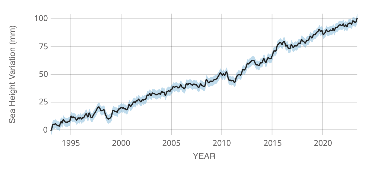
As NASA website mentions
global mean sea level is the average height of the entire ocean surface. Global mean sea level rise is caused primarily by two factors related to global warming: the added water from melting land-based ice sheets and glaciers and the expansion of seawater as it warms.
11.2.1 How about the relative sea level rise for the U.S.?
Let us get information on https://www.epa.gov/climate-indicators/climate-change-indicators-sea-level.
Cumulative changes in relative sea level from 1960 to 2021 at tide gauge stations along U.S. coasts. Relative sea level reflects changes in sea level as well as land elevation.
From the EPA website:
- Relative sea level change refers to how the height of the ocean rises or falls relative to the land at a particular location.
- In contrast, absolute sea level change refers to the height of the ocean surface above the center of the earth, without regard to whether nearby land is rising or falling.
we can again read data from the EPA dataset
url = "https://www.epa.gov/system/files/other-files/2022-07/sea-level_fig-2.csv"

df_rslr = url_data_request(url, 6)

df_rslr

df_rslr.describe()| Lat | Long | Relative sea level change | |
|---|---|---|---|
| count | 67.000000 | 67.000000 | 67.000000 |
| mean | 36.377955 | -91.814000 | 4.623211 |
| std | 10.151506 | 55.596251 | 9.008570 |
| min | 8.737000 | -177.360000 | -43.228346 |
| 25% | 30.063500 | -122.401500 | 4.154724 |
| 50% | 37.772000 | -81.465000 | 5.835827 |
| 75% | 41.514000 | -74.769000 | 8.261417 |
| max | 59.450000 | 167.738000 | 22.046457 |
We have the latitude and longitude to accurately map, based on the station. But to keep things simple, let us just use the state information.
We can see on the world map where the stations are.
df_rslr['State'].value_counts()

df_rslr.nlargest(5, 'Relative sea level change')

df_rslr.nsmallest(5, 'Relative sea level change')| Lat | Long | Station Name | State | Relative sea level change | |
|---|---|---|---|---|---|
| 63 | 59.450 | -135.327 | Skagway | Alaska | -43.228346 |
| 62 | 58.298 | -134.412 | Juneau | Alaska | -32.133071 |
| 65 | 53.880 | -166.537 | Unalaska | Alaska | -10.903150 |
| 64 | 51.863 | -176.632 | Adak Island | Alaska | -6.051968 |
| 61 | 57.052 | -135.342 | Sitka | Alaska | -5.931890 |
11.3 Coastal Flooding
There is increased flooding globally! Is it correlation on causation with climate change?
Why does it matter and why do we care?
NASA Sealevel website highlights that
“…Among the hardest hit will be tropical and sub-tropical river deltas – broad fans of sediment and waterways where rivers meet the sea. Because such deltas often are the sites of port cities, large human populations will be exposed to significantly higher risk. Hot spots include the U.S. East Coast and Gulf Coast, Asia, and islands…”
“…The risk comes not only from rising sea levels due to ice-melt, and the expansion of ocean water as it warms, but to increasing storm surges and high-tide flooding…””
Sea level rise has a big impact on coastal communities and islands across the world. Many low lying areas and islands can be submerged under various likely climate scenarios for the future. With the sea level rise, high tide flooding may occur more frequently. High tide flooding occurs when sea level rise combines with local factors to push water levels above the normal high tide mark.
For example, there is a significant increase in flooding across the U.S. over the past two decades (source: NOAA High Tide Flooding Report) and this is also the time period when there is a rapid increase in mean sea level as we have seen in the graphs that we plotted earlier.
We can see the flooding frequency from the EPA website
import pandas as pd
url = "https://www.epa.gov/system/files/other-files/2023-09/coastal-flooding_fig-2.csv"
df = url_data_request(url, 6)

df.rename({'Unnamed: 0': 'U.S. Coastal Site'}, axis = 1, inplace=True)
df| U.S. Coastal Site | 1950-1969 | 1970-1989 | 1990-2009 | 2010-2022 | |
|---|---|---|---|---|---|
| 0 | Bar Harbor, ME | 2.05263 | 5.27778 | 4.62500 | 11.07692 |
| 1 | Portland, ME | 2.16667 | 3.10526 | 3.40000 | 9.00000 |
| 2 | Boston, MA | 2.75000 | 2.70000 | 4.15000 | 13.00000 |
| 3 | Newport, RI | 1.27778 | 1.44444 | 1.90000 | 4.76923 |
| 4 | New London, CT | 1.52632 | 1.52941 | 2.25000 | 4.00000 |
| 5 | Montauk, NY | 1.16667 | 0.93750 | 2.27778 | 4.30769 |
| 6 | Kings Point, NY | 3.57895 | 3.11111 | 5.00000 | 8.69231 |
| 7 | The Battery, NY | 1.89474 | 1.84211 | 4.29412 | 10.00000 |
| 8 | Sandy Hook, NJ | 1.75000 | 2.05263 | 4.15000 | 10.46154 |
| 9 | Atlantic City, NJ | 0.68421 | 1.81250 | 5.21053 | 10.07692 |
| 10 | Philadelphia, PA | 1.00000 | 1.60000 | 2.55000 | 5.15385 |
| 11 | Lewes, DE | 1.43750 | 1.72222 | 4.20000 | 8.38462 |
| 12 | Baltimore, MD | 0.75000 | 1.10000 | 1.90000 | 6.30769 |
| 13 | Annapolis, MD | 0.66667 | 0.78947 | 1.42105 | 7.30769 |
| 14 | Washington, DC | 0.90000 | 1.90000 | 2.38889 | 7.15385 |
| 15 | Sewells Point, VA | 1.45000 | 1.95000 | 5.05000 | 10.53846 |
| 16 | Wilmington, NC | 0.05263 | 0.05000 | 0.45000 | 3.07692 |
| 17 | Charleston, SC | 0.21053 | 0.63158 | 1.05000 | 5.92308 |
| 18 | Fort Pulaski, GA | 0.15000 | 0.75000 | 1.65000 | 6.30769 |
| 19 | Fernandina Beach, FL | 0.61111 | 0.89474 | 1.72222 | 4.30769 |
| 20 | Mayport, FL | 0.10000 | 0.05000 | 0.30000 | 2.61538 |
| 21 | St. Petersburg, FL | 0.33333 | 0.40000 | 1.00000 | 1.69231 |
| 22 | Cedar Key, FL | 0.70000 | 0.65000 | 1.16667 | 4.46154 |
| 23 | Pensacola, FL | 0.22222 | 0.50000 | 1.52632 | 3.30769 |
| 24 | Galveston Pier 21, TX | 0.40000 | 0.70588 | 2.50000 | 9.30769 |
| 25 | Port Isabel, TX | 0.15000 | 0.40000 | 0.85000 | 2.84615 |
| 26 | San Diego, CA | 0.15789 | 1.05263 | 1.45000 | 5.38462 |
| 27 | La Jolla, CA | 0.11111 | 0.94118 | 1.85000 | 1.46154 |
| 28 | Los Angeles, CA | 0.30000 | 1.36842 | 1.05000 | 2.00000 |
| 29 | Port San Luis, CA | 0.62500 | 1.36842 | 0.50000 | 0.53846 |
| 30 | San Francisco, CA | 0.05000 | 0.66667 | 0.70000 | 0.07692 |
| 31 | Seattle, WA | 1.30000 | 1.55000 | 1.75000 | 3.30769 |
| 32 | Friday Harbor, WA | 3.23529 | 2.90000 | 2.55000 | 4.23077 |
We can see from the data that for each site, the columns list the average number of days per year in which coastal waters rose above a local threshold for each time period.
We can graph a simple bar chart here. We were already getting tired of the line plots anyway!
import plotly.express as px

fig = px.bar(df, x = 'U.S. Coastal Site', y = ['1950-1969', '1970-1989','1990-2009', '2010-2022'])

fig.update_layout(
    yaxis_title='Number of Flood Events per Year',
    title='Average Number of Coastal Flood Events per Year, 1950–2022 ',
    hovermode="x",
    legend=dict(x=0.6,y=1)
)
fig.update_layout(legend={'title_text':''})
fig.show()
As we can see, in almost all of the 33 U.S. coastal sites, the number of flooding events per year is increasing over time, with the 2010-2022 experiencing the most number of flooding events.
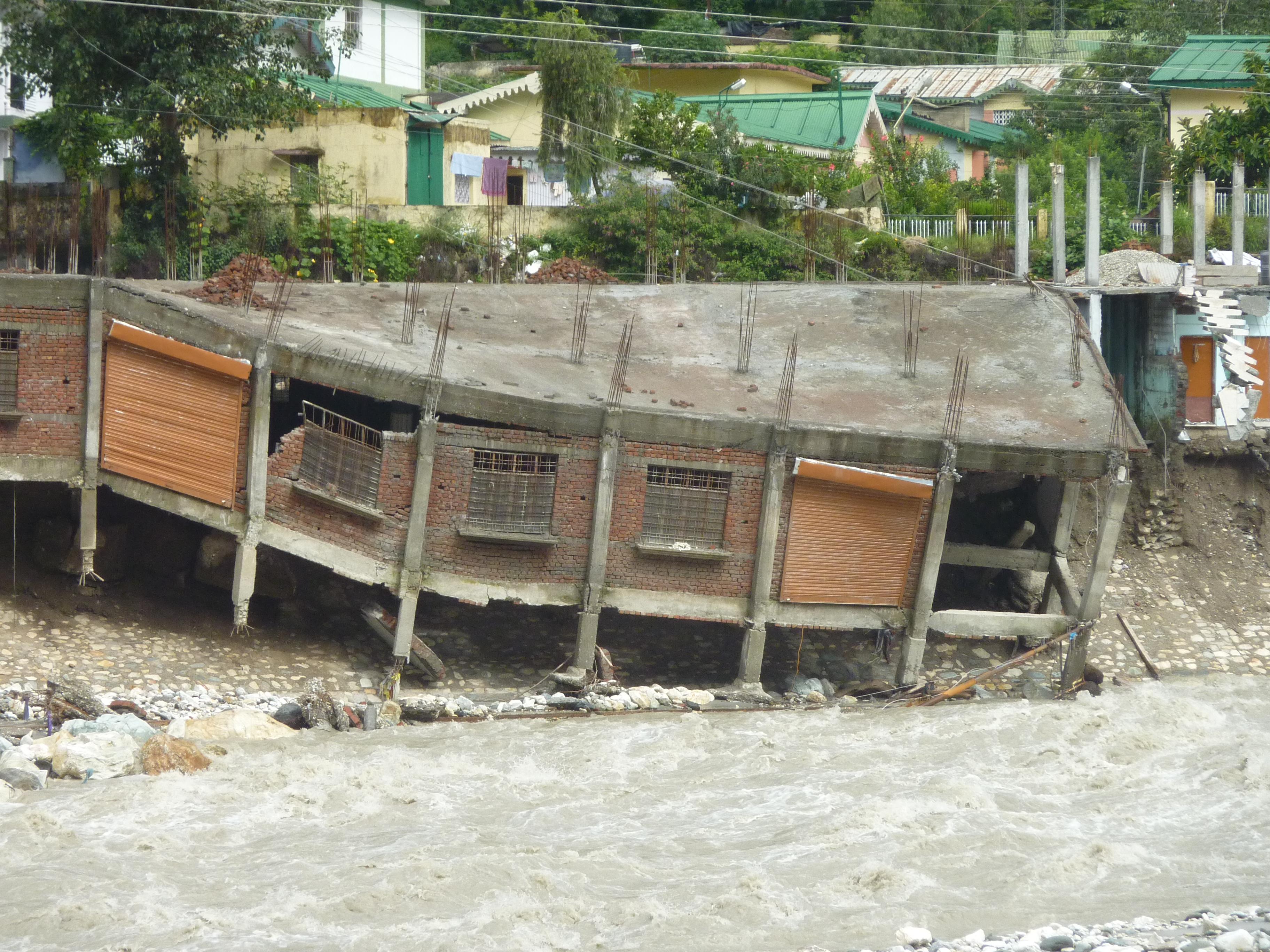
It is one thing to look at the number of the flooding events. But the real human impact can be gauged from a couple of real pictures of the communities that are affected.

Source: Jacek Halicki, CC BY-SA 4.0 https://creativecommons.org/licenses/by-sa/4.0, via Wikimedia Commons
Unfortunately, we don’t lack pictures of distressing flooding. It seems to become more and frequent.

or
source: European Commission DG ECHO, CC BY-SA 2.0 https://creativecommons.org/licenses/by-sa/2.0, via Wikimedia Commons
We will analyze the future impact in more detail in another chapter later in the book.
The key highlights from EPA for this indicator are
Flooding is becoming more frequent along much of the U.S. coastline. Most sites measured have experienced an increase in coastal flooding since the 1950s (Figure 1).
Over the last decade (i.e., since 2014), Hilo, Hawai‘i, has exceeded the flood threshold most often—an average of 18 days per year—followed by Galveston, Texas, and Sewells Point, Virginia (Figure 1). At more than half of the locations shown, floods are now at least five times more common than they were in the 1950s.
The average number of flood events per year has progressively accelerated across decades since 1950. The rate of increase of flood events per year is the largest at most locations in Hawai‘i and along the East and Gulf Coasts (Figure 2).
Flooding has increased less dramatically in places where relative sea level has not risen as quickly as it has elsewhere in the United States (as shown by the Sea Level indicator). Two sites in Alaska and three sites along the West Coast have experienced a decrease in coastal flooding (Figures 1 and 2), coinciding with decreasing relative sea level as the land itself is rising.
11.4 Land Loss along the Atlantic Coast
EPA takes a close look at the landloss along the Atlantic coast.
We can try to recreate and learn from the EPA figure available at https://www.epa.gov/climate-indicators/atlantic-coast
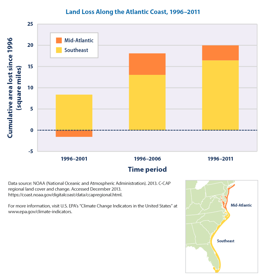
This graph shows the net amount of land converted to open water along the Atlantic coast during three time periods: 1996–2001, 1996–2006, and 1996–2011. The results are divided into two regions: the Southeast and the Mid-Atlantic (see locator map). Negative numbers show where land loss is outpaced by the accumulation of new land.
url = "https://www.epa.gov/sites/default/files/2016-08/land-loss_fig-1.csv"
df_landloss =  url_data_request(url, 6)

df_landloss_long = pd.melt(df_landloss,
             id_vars=['Area'],
             value_vars= ['1996-2001','1996-2006','1996-2011'],
             var_name='time period',
             value_name='Cumulative Land Loss Since 1996, sq. miles')

fig = px.bar(df_landloss_long, x = 'time period',
            y = 'Cumulative Land Loss Since 1996, sq. miles',
            color = 'Area', barmode = 'stack', height=400, text_auto=True,color_discrete_map={
                "Negative": "indianred",
                "Positive": "seagreen"})

fig.show()
11.4.1 Land Submergence Along the Atlantic Coast, 1996–2011
url = "https://www.epa.gov/sites/default/files/2016-08/land-loss_fig-2.csv"
df_landloss = url_data_request(url, 6)
df_landloss

df_landloss_long = pd.melt(df_landloss,
             id_vars=['Area'],
             value_vars= ['1996-2001','1996-2006','1996-2011'],
             var_name='time period',
             value_name='Cumulative Land Loss Since 1996, sq. miles')

fig = px.bar(df_landloss_long, x = 'time period',
            y = 'Cumulative Land Loss Since 1996, sq. miles',
            color = 'Area', barmode = 'stack', height=400, text_auto=True)

fig.show()
What are the key points. Per EPA:
Roughly 20 square miles of dry land and wetland were converted to open water along the Atlantic coast between 1996 and 2011. (For reference, Manhattan is 33 square miles.) More of this loss occurred in the Southeast than in the Mid-Atlantic (see Figure 1).
The data suggest that at least half of the land lost since 1996 has been tidal wetland. The loss of dry land appears to be larger than the loss of non-tidal wetland (see Figure 2).
11.5 Future Sea Level Rises
Check out https://research.csiro.au/slrwavescoast/sea-level/future-sea-level-changes/ for more information.
The IPCC projections of sea level include estimates of contributions from:
- Ocean thermal expansion
- Glacier mass loss
- Greenland and Antarctic ice sheet surface mass balance (net change from the addition of mass through precipitation and loss through melting) and dynamic processes such as collapse of ice shelves
- Changes in land water storage (dams and ground water storage)
11.6 Takeaways from the Chapter
- There is a significant increase in Ocean temperatures in the recent decades
- There is evidence of more Glacier and Ice sheets melting in the recent decades
- Flooding is becoming more frequent along the U.S. coastlines. As we are finishing the book, Hurricane Helene is followed by Hurricane Melton even before Florida could finish the cleanup!
11.7 Exercises
Some exercise that you can try to code yourself
- Which states are more susceptible to floods?
- What are the changes over the past few decades?
- Can you plot the changes over time?
- Can you plot the changes on the U.S. map?
11.8 References and Additional Resources
- https://sealevel.nasa.gov/understanding-sea-level/key-indicators/global-mean-sea-level
- https://www.epa.gov/climate-indicators/climate-change-indicators-sea-level
- https://climate.nasa.gov/vital-signs/ocean-warming/
- https://www.ncei.noaa.gov/resources/education
- https://tidesandcurrents.noaa.gov/high-tide-flooding/annual-outlook.html
- https://mycoast.org/
- https://sealevel.colorado.edu/