import plotly.express as px
import pandas as pd
import os
import io
import zipfile

# we need to take care of unverified https error. either install certificates command on mac or
import ssl
ssl._create_default_https_context = ssl._create_unverified_context

# let us get the data for all the years since 1990
# The ASCII data files tabulate extent and area (in millions of square kilometers) by year for a given month

# create an empty data frame
df_north = pd.DataFrame()

# Months that are between 1 and 12, we put 13 because it always ends at one less than the end number
for month in range(1,13):

# If the month is between 1 and 9 add 0 to the number. For example, 1 would now be 01.
    if month <10:
        month = '0' + str(month)

    url = f"https://masie_web.apps.nsidc.org/pub/DATASETS/NOAA/G02135/north/monthly/data/N_{month}_extent_v3.0.csv"
    df_north_month = pd.read_csv(url)

    # let us concatenate the monthly files

    # we are adding all the files together because there are seperate files for each month.

    df_north = pd.concat([df_north,df_north_month], axis=0)

#rename variables
df_north.columns = df_north.columns.str.replace(' ', '')
df_north.rename({'mo': 'month'}, axis = 1, inplace=True)9 Arctic and Antarctic Ice
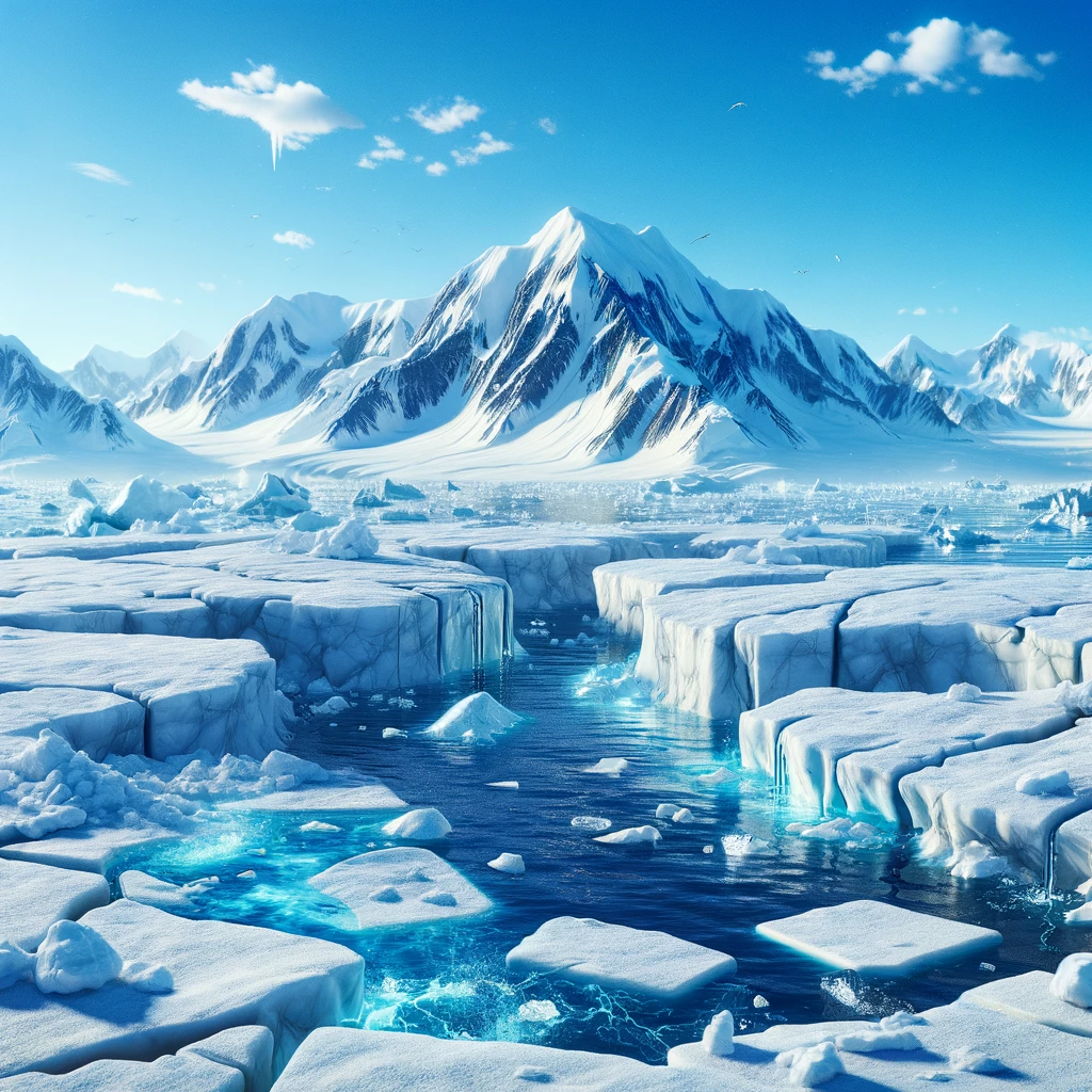
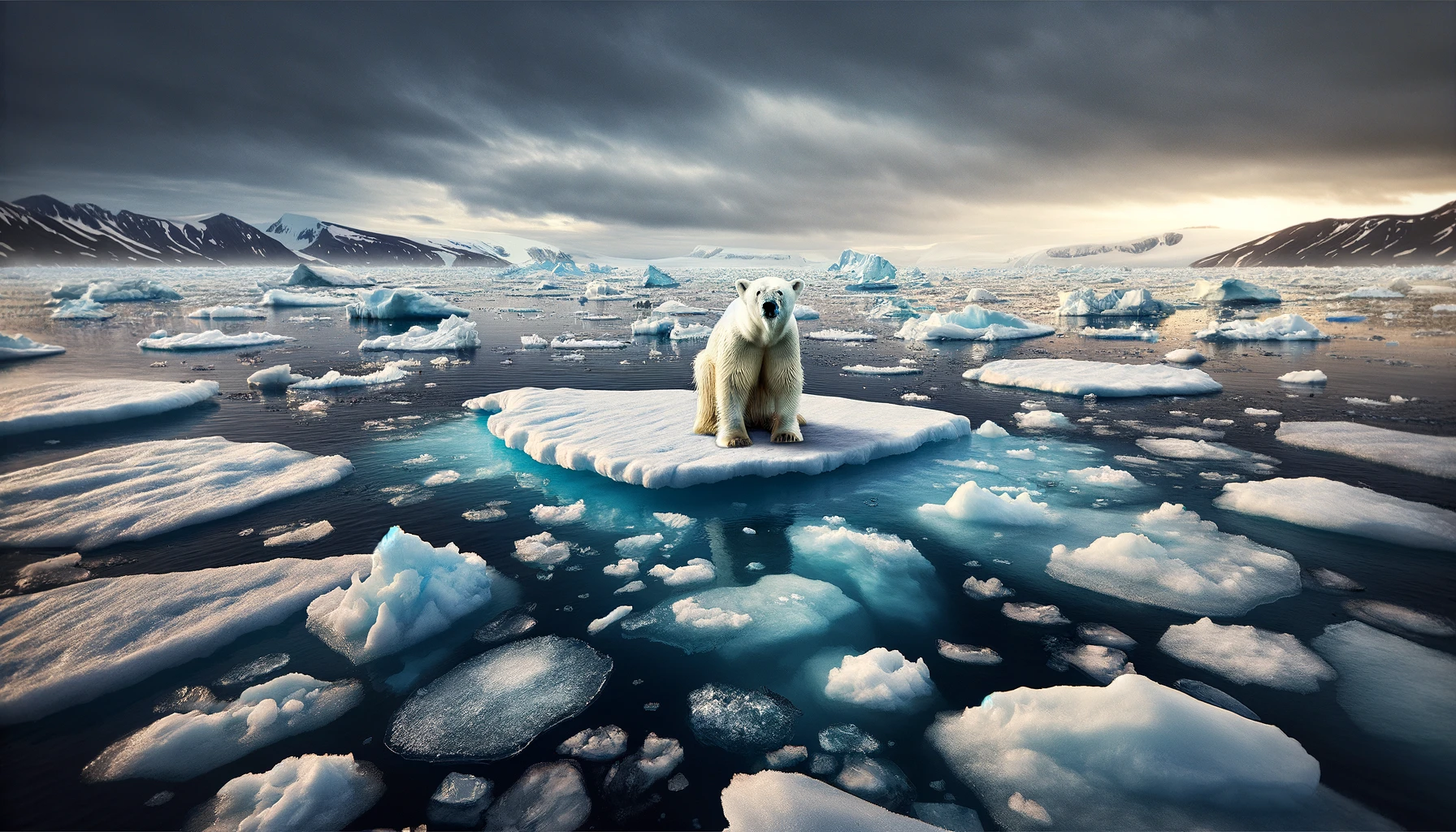
(the Dalle prompt that we used to create the above image!) DALL·E 2024-02-17 23.49.12 - Create a moving and impactful scene that starkly illustrates the devastating effects of climate change on the Arctic landscape, focusing on stranded a polar bear
In this chapter, let us try to understand how Ice over the Arctic Circle is changing over time.
But first, why is Arctic Ice important and why should we care about it?
According to the EPA,
“The extent of area covered by Arctic sea ice is an important indicator of changes in global climate because warmer air and water temperatures are reducing the amount of sea ice present. Because sea ice is light-colored, it reflects more sunlight (solar energy) back to space than liquid water, thereby playing an important role in maintaining the Earth’s energy balance and helping to keep polar regions cool.”
Learning Objectives: Climate
The learning objectives are
Understand how the extent of arctic ice is changing over time
Is the extent of Arctic Ice increasing over the years?
Is the extent of Arctic Ice increasing or decreasing in the winter months?
What months are there usually an increase in Arctic Ice and what months are there a decrease in Arctic Ice?
Climate Terms of Interest
- Arctic Ice
- Sea ice
- Polar regions
Let us look at some images first, the extent of Ice at Arctic and Antarctic regions


While it is not very clear from the pictures, it seems that sea ice extent in Dec 2022 (11.9 million square km) is 1.8 million square km less than Dec 1979 (13.7 million square km).


Similarly, the sea ice extent in December 2022 (8.8 million square km) is 1.6 million sq km lower than that in December 1978 (10.4 million square km).
We chose December 1978 and December 2022 as they are the earliest and latest data available as of our writing this chapter.
It seems that the total reduction in the extent of sea ice from 1978-2022 is 3.4 million square km. Is it small or large?
- One way to put it in context that we understand is the size of landmass of the United States is 9.15 million square kilometers (source: World Bank). Put it another way,
- the loss of sea ice accounts for more than a third of the U.S. landmass or three Texas and three Californias put together!
- The loss is even bigger than India, the country with the seventh largest land area at 2.97 million square km!
You can find more fun facts on Glaciers
Let us a dig a bit deeper in to the actual data for the extent of sea ice in the Arctic and Antarctic regions.
9.0.1 Extent of Sea Ice Data
We can get the data on millions of square kilometers of ice in the Arctic circle for a given month and year.
The north directory contains all of the Arctic data and images and the south directory contains all of the Antarctic data
The data is from NOAA.
This is how the directories looks like
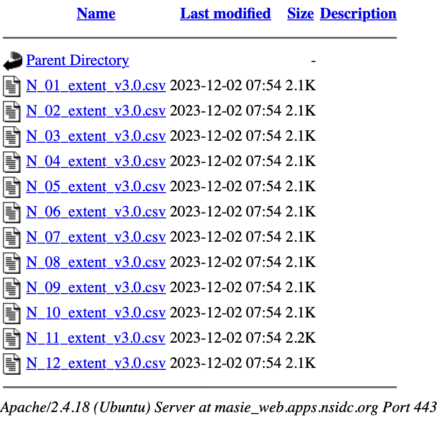
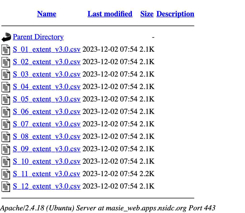
From looking at the list of files in the directory, we can observe
- the data is updated as of December 2023.
- there is a file for each month.
However, the format of all the files are the same. It is always a good idea to open the file in the browser or excel and check out how the data and variables are displayed. It is also a good idea to read the notes about the data as the notes can contain valuable information about the variables and how they are constructed, if there are any issues with the variables, sources of the data etc.
Let us write the code to get all the datasets programmatically i.e. instead of downloading the data and saving them on our own computer (which may not be the latest available data), we can run the code and get the latest version of the data available as of the date we run the code.
If you get an error with the code above, you maybe working on Windows or a different OS than the Mac that we were on.
You can try slight modifications to the code as listed below
import plotly.express as px
import pandas as pd
import os
import io
import zipfile
import urllib ## NEW LINE 1 ##

# we need to take care of unverified https error. either install certificates command on mac or
import ssl
# ssl._create_default_https_context = ssl._create_unverified_context  ## COMMENTED OUT 1 ##
context = ssl._create_unverified_context()  ## NEW LINE 2 ##

# let us get the data for all the years since 1990
# The ASCII data files tabulate extent and area (in millions of square kilometers) by year for a given month

# create an empty data frame
df_north = pd.DataFrame()

# Months that are between 1 and 12, we put 13 because it always ends at one less than the end number
for month in range(1,13):

# If the month is between 1 and 9 add 0 to the number. For example, 1 would now be 01.
    if month <10:
        month = '0' + str(month)

    url = f"https://masie_web.apps.nsidc.org/pub/DATASETS/NOAA/G02135/north/monthly/data/N_{month}_extent_v3.0.csv"
    #df_north_month = pd.read_csv(url)   ## COMMENTED OUT 2 ##
    temp_data = urllib.request.urlopen(url, context=context) ## NEW LINE 3 ##
    df_north_month = pd.read_table(temp_data, sep=',')  ## NEW LINE 4 ##

    # let us concatenate the monthly files

    # we are adding all the files together because there are seperate files for each month.

    df_north = pd.concat([df_north,df_north_month], axis=0)

#rename variables
df_north.columns = df_north.columns.str.replace(' ', '')
df_north.rename({'mo': 'month'}, axis = 1, inplace=True)
Let us unpack the code step-by-step.
- First, in lines 1-5, we imported the various packages that we need including some that we don’t regulalry use such as as os, io and zipfile
- We may not need lines 8-9, but sometimes we get a SSL certficate error on a mac from the website. So, we can import ssl and execute the command to address it
- On line 15, we created a empty data frame to hold the data
- On line 18, we start a for loop to get all the months in the year from 1 to 12
- by looking at the directory structure, wenote that we need to add a ‘0’ to the months which are single digits. So, lines 21 and 22 pad the months from 1-9 with a ‘0’ so that we have two-digit months
- We define the base URL on line 24. Note that we included {month} variable so that everytime the for loop changes the value of the month, the URL changes, corresponding to the files in the directory
- On line 25, we read the CSV file into a dataframe df_north_month to hold the data for that month
- Note that we are still in hte loop. We need to add this monthly file to the empty dataset that we created. That is when the value of the month is 1, line 35 adds the data for January to the empty dataset so that df_north dataset now has January data
- When the month takes 2, the February data is stacked below the January data (that is now in the df_north dataset) and so forth
- On lines 28 and 29, we rename the variables. On line 28, we remove the empty spaces in the columns of the dataset. On line 29, we rename the variable “mo” to “month” so that it is more descriptive
Before we start graphing and answering our questions, let us check if the data is imported and concateneated correctly. It is always a good practice to check the dataset before we start analyzing or graphing it.
nrows, ncols = df_north.shape
print(f'the data set has {nrows} observations and {ncols} of columns or variables')
the data set has 551 observations and 6 of columns or variablesLet us check the variable names and the type of the variables (numbers, strings etc.)
year           int64
month          int64
data-type     object
region        object
extent       float64
area         float64
dtype: object
What are the variables in this dataset? It is always a good idea to check the documentation for any dataset. The documentation for this NOAA dataset is available at Arctic Ice Documentation.
Page 16 of the user documentation mentions, the variables are 1. Year: 4-digit year 2. mo (note, we renamed to month): 1- or 2-digit month 3. data_type: indicates what the input data set. It is either Goddard: Sea Ice Concentrations from Nimbus-7 SMMR and DMSP SSM/I-SSMIS Passive Microwave Data or NRTSI-G: Near-Real-Time DMSP SSMIS Daily Polar Gridded Sea Ice Concentrations 4. region: Hemisphere that this data covers. 1. N: Northern 2. S: Southern 5. extent: Sea ice extent in millions of square km 6. area Sea ice area in millions of square km
As we can see, we have year and month, both are integers as they should be. Other relevant variables are region=“N”, the extent and area of the ice in millions of square miles.
We can describe the data to get an overview of the variables. Note that htis will only give the descriptive statistics of numerical variables in the dataset.
| year | month | extent | area | |
|---|---|---|---|---|
| count | 551.000000 | 551.000000 | 551.000000 | 551.000000 |
| mean | 2001.292196 | 6.493648 | -24.996261 | -45.239365 |
| std | 13.270059 | 3.455096 | 602.558501 | 737.150626 |
| min | 1978.000000 | 1.000000 | -9999.000000 | -9999.000000 |
| 25% | 1990.000000 | 3.500000 | 8.465000 | 6.135000 |
| 50% | 2001.000000 | 6.000000 | 12.020000 | 9.910000 |
| 75% | 2013.000000 | 9.000000 | 14.245000 | 12.285000 |
| max | 2024.000000 | 12.000000 | 16.340000 | 13.900000 |
The data seems to start in 1978 and continues to 2024 (as can be seen from the min and max for the variable year)
Notice that the minimum for extent is -9999. We can infer that -9999 are cases where there were no observations made. We need to replace this with a missing value. Otherwise, it could mess up our averages and also the graphs.
| year | month | extent | area | |
|---|---|---|---|---|
| count | 551.000000 | 551.000000 | 549.000000 | 548.000000 |
| mean | 2001.292196 | 6.493648 | 11.338907 | 9.252026 |
| std | 13.270059 | 3.455096 | 3.279964 | 3.267431 |
| min | 1978.000000 | 1.000000 | 3.570000 | 2.410000 |
| 25% | 1990.000000 | 3.500000 | 8.480000 | 6.182500 |
| 50% | 2001.000000 | 6.000000 | 12.030000 | 9.950000 |
| 75% | 2013.000000 | 9.000000 | 14.270000 | 12.292500 |
| max | 2024.000000 | 12.000000 | 16.340000 | 13.900000 |
Notice that it looks like the variable area has two extra spaces. If we were to graph it and use the variable area we would always have to include the two spaces. To make it easier let us remove the two spaces. If there are also other variables with spaces lets go ahead and remove them.
To start graphing let us look at the months that have the most and least extent of ice over time.
We can’t use the variable area, because the data for area is not constant whereas the extent is.
| year | month | data-type | region | extent | area | |
|---|---|---|---|---|---|---|
| 0 | 1979 | 3 | Goddard | N | 16.34 | 13.21 |
| 0 | 1979 | 2 | Goddard | N | 16.18 | 13.18 |
| 4 | 1983 | 3 | Goddard | N | 16.09 | 12.93 |
| 8 | 1987 | 2 | Goddard | N | 16.05 | 13.02 |
| 1 | 1980 | 3 | Goddard | N | 16.04 | 12.99 |
We can immediately notice that, though the data is from 1978-2023, the meximum extent of the ice coverage seems to be in 1979. The latest year which ranks in the top 5 spot for extent of ice is 1987.
We can also see that the month that was the largest extent of ice was 3 (March) or 2 (February). We expect that there would be months when ice accumulates and months when ice decreases in a given year. We are more concerned with how the extent of ice is varying over years.
We can graph the extent of the ice for February and March over the years later. Now let’s check for the smallest:
| year | month | data-type | region | extent | area | |
|---|---|---|---|---|---|---|
| 33 | 2012 | 9 | Goddard | N | 3.57 | 2.41 |
| 41 | 2020 | 9 | Goddard | N | 4.00 | 2.83 |
| 28 | 2007 | 9 | Goddard | N | 4.27 | 2.82 |
| 40 | 2019 | 9 | Goddard | N | 4.36 | 3.17 |
| 44 | 2023 | 9 | NRTSI-G | N | 4.37 | 2.79 |
The smallest month is month 9 in all the lowest five spots.
| year | month | data-type | region | extent | area | |
|---|---|---|---|---|---|---|
| 33 | 2012 | 9 | Goddard | N | 3.57 | 2.41 |
| 41 | 2020 | 9 | Goddard | N | 4.00 | 2.83 |
| 28 | 2007 | 9 | Goddard | N | 4.27 | 2.82 |
| 40 | 2019 | 9 | Goddard | N | 4.36 | 3.17 |
| 44 | 2023 | 9 | NRTSI-G | N | 4.37 | 2.79 |
| 45 | 2024 | 9 | NRTSI-G | N | 4.38 | 2.89 |
| 37 | 2016 | 9 | Goddard | N | 4.53 | 2.91 |
| 32 | 2011 | 9 | Goddard | N | 4.56 | 3.21 |
| 36 | 2015 | 9 | Goddard | N | 4.62 | 3.42 |
| 29 | 2008 | 9 | Goddard | N | 4.69 | 3.26 |
It seems except in one year, 2012, all the other lowest 11 ice extent in the North Arctic is in September. We can plot this over time also.
Can we say that the extent of ice in the north arctic is lower in significantly smaller than it was in the 80’s? It may be but not from this table. We need to compare apples to apples and compare for the same month over time. Alternately, we can take averages over the years.
Since we now have the information that we need, let’s start graphing.
fig = px.scatter(df_north.loc[df_north.month==3], x='year', y='extent')
fig.show()
fig.write_image("../../images/ArcticIce/fig1.png")
We saved the image that we generated to a file using fig.write_image. We can display the saved image now.
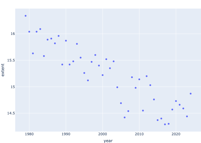
Why did we use loc? We used loc because we are specifying that we only want observations where the month has a value of 3. We only want to look at the extent from month 3 over the years so that we can compare the extent of the ice better.
We can see from the scatter plot that the extent of the Arctic Ice, from the month March, is decreasing over the years. The graph starts from the year 1979 and in 1979 the extent of the Arctic Ice was 16.34 million square miles. The graph ends at the year 2023 and the extent is 14.44 million square miles. It seems there is almost 2 million square miles of ice extent lost over the years.
What if we do for the entire year?
We can’t comprehend anything from this graph because the lines are scattered and we can’t understand where it is decreasing and increasing. Let’s specify a month.
fig = px.line(df_north.loc[df_north.month==3], x='year', y='extent', title="Extent of arctic Ice in March")
fig.show()
Now let’s start plotting Februrary.
fig = px.line(df_north.loc[df_north.month==2], x='year', y='extent', title="Extent of arctic Ice in Feburary")
fig.show()
We can see that the extent of arctic Ice in February has more steep decreases than the extent of arctic Ice in March. Overall, February and March were the months with the most extent of arctic Ice and it has been slowly decreasing over the years.
Let’s start graphing the months with the smallest extent. We only have to graph for the month September.
fig = px.line(df_north.loc[df_north.month==9], x='year', y='extent', title="Extent of arctic Ice in September")
fig.show()
September is the month with the smallest extent of arctic Ice. Sadly, it is still significantly decreasing over the years.
Let us check the average for each year and plot it over the years.
year
1978    12.660000
1979    12.350000
1980    12.348333
1981    12.146667
1982    12.467500
Name: extent, dtype: float64
We can see the averages for each year. We see a general decline but appears that in 2023 there is highest amount of the ice extent? Is this correct? What are we missing? Notice that we are still in July and the data stops in June. The highest months for the ice extent are Feb and March and the lowest are in the second half. We don’t have data yet. So it is better to keep only years with full data for graphing purposes.
we can see that the mean values are stored in a column “extentmean” that we can use
fig = px.line(df_year, x='year', y='extentmean', title="Annual Mean Extent of arctic Ice (N)")
fig.show()
From the graph, the sharp uptick in 2023 reminds us that we only have partial year data for 2023. We need to remove this for the annual average graph:
fig = px.line(df_year[df_year['year']!=2024], x='year', y='extentmean', title="Annual Mean Extent of arctic Ice (N) 1979-2023")
fig.show()
We can clearly see a decrease in the extent of arctic ice over the last thirty years. The annual mean for 1978 is 12.66 million square miles (btw, we may need to drop 1978 also. We also need to check whether we have full data for 1978.) and the average for 2022 is 10.69 million square miles. A decrease of almost 2 million square miles or \[ (10.69 - 12.66) / 12.66 \], a 15.56% decrease. While this is a cause for concern and may be due to climate change, we need to be cautious in drawing conclusions as the data is only for three decades. However, there are measurements over longer time period, based on Antarctic ice core, that suggests a cause for alarm.
We can also use similar code to compute the min and maximum over the years and plot them together.
fig = px.line(df_year.loc[df_year.year!=2024], x='year', y=['extentmean', 'extentmin', 'extentmax'], title="Extent of arctic Ice in September")
fig.show()
Notice that we use .loc to filter the data to get the same output as before and we used three y variables. More importantly, this graph can illustrate a couple of points.
note the extentmean seems much more flatter than in the graph before. However, if you hover over the graph, you can see the values for each year for the average are the same as before i.e. 12.66 million sq. miles for 1978 and 10.69 sq miles for 2022. How come the graphs look so different then? If you notice more carefully, you will see the y-axis started much lower here, around 4 mn aq miles as opposed to 10.5 mn sq miles in the previous graph, as we included the minimum per year also in the same graph. This illustrates that one needs to be careful with how the graphs are presented as one can easily change large differences visually by changing the scale of the graphs.
On the other hand, we need to be carful about interpreting flat minimum, mean and maximum as they may happen at different times of the year.
9.1 South Data:
So far we have analyzed the data for the North pole / Arctic Ice.
Let’s analyze the south pole or Antarctic ice data. The code should be very simlar except we might have to make a few changes.
import plotly.express as px
import pandas as pd
import os
import io
import zipfile

# we need to take care of unverified https error. either install certificates command on mac or
import ssl
ssl._create_default_https_context = ssl._create_unverified_context

# let us get the data for all the years since 1990
# The ASCII data files tabulate extent and area (in millions of square kilometers) by year for a given month

# create an empty data frame
df_south = pd.DataFrame()

# Months that are between 1 and 12, we put 13 because it always ends at one less than the end number
for month in range(1,13):

# If the month is between 1 and 9 add 0 to the number. For example, 1 would now be 01.
    if month <10:
        month = '0' + str(month)

    url = f"https://masie_web.apps.nsidc.org/pub/DATASETS/NOAA/G02135/south/monthly/data/S_{month}_extent_v3.0.csv"
    df_south_month = pd.read_csv(url)

    # let us concatenate the monthly files

    # we are adding all the files together because there are seperate files for each month.

    df_south = pd.concat([df_south,df_south_month], axis=0)

#rename variables
df_south.columns = df_south.columns.str.replace(' ', '')
df_south.rename({'mo': 'month'}, axis = 1, inplace=True)
Let us use copilot to give us the documentation for the code that we wrote above
The provided code snippet is written in Python and is used to fetch, process, and concatenate monthly sea ice extent data for the Southern Hemisphere from the National Snow and Ice Data Center (NSIDC). Let’s break down the code step by step:
- First, the necessary libraries are imported. plotly.express is used for data visualization, pandas for data manipulation, os and io for handling file operations, and zipfile for working with zip files.
- Additionally, the ssl library is imported to handle HTTPS context settings, which is necessary to avoid unverified HTTPS errors when fetching data from the web.
- The line ssl._create_default_https_context = ssl._create_unverified_context ensures that the HTTPS context is set to an unverified mode, allowing the script to bypass SSL certificate verification.
An empty DataFrame named df_south is created to store the concatenated data for all months.
The script then iterates over a range of months from 1 to 12 using a for loop. For each month, if the month number is less than 10, a leading zero is added to ensure the month is formatted as a two-digit string (e.g., ‘01’ for January).
Within the loop, a URL is constructed for each month’s data file using an f-string. The URL points to the CSV file containing the sea ice extent data for the specified month.
The pd.read_csv(url) function is used to read the CSV file from the URL into a DataFrame named df_south_month.
The script then concatenates the monthly DataFrame df_south_month with the main DataFrame df_south using the pd.concat function.
This process is repeated for each month, resulting in a single DataFrame that contains data for all months from January to December.
After all the monthly data has been concatenated, the script cleans up the DataFrame by removing any spaces from the column names using df_south.columns.str.replace(’ ‘,’‘). Additionally, the column named ’mo’ is renamed to ‘month’ using the df_south.rename function with the axis=1 parameter to specify that the renaming should be applied to the columns.
Overall, this code efficiently fetches and processes monthly sea ice extent data from the NSIDC, concatenates it into a single DataFrame, and cleans up the column names for further analysis or visualization.
Wow! The documentation is correct and it seems to be better than the documentation that we wrote for the North part of the data. We first wrote the North data analysis a couple of years ago when we didn’t have access to ChatGPT or Github CoPilot.
In fact, while revising the book, we realized that we could write some of the code in this book more efficiently. But we didn’t change it as that is how we learned and we wanted to showcase the process of our learning. We started using Copilot for documentation though as it gives more detailed documentation that we normally write (and better language too, though a bit more verbose than us)!
If the above code doesn’t work for you because you are using a different OS, try the following code.
import plotly.express as px
import pandas as pd
import os
import io
import zipfile
import urllib ## NEW LINE 1 ##

# we need to take care of unverified https error. either install certificates command on mac or
import ssl
# ssl._create_default_https_context = ssl._create_unverified_context  ## COMMENTED OUT 1 ##
context = ssl._create_unverified_context()  ## NEW LINE 2 ##

# let us get the data for all the years since 1990
# The ASCII data files tabulate extent and area (in millions of square kilometers) by year for a given month

# create an empty data frame
df_south = pd.DataFrame()

# Months that are between 1 and 12, we put 13 because it always ends at one less than the end number
for month in range(1,13):

# If the month is between 1 and 9 add 0 to the number. For example, 1 would now be 01.
    if month <10:
        month = '0' + str(month)

    url = f"https://masie_web.apps.nsidc.org/pub/DATASETS/NOAA/G02135/south/monthly/data/S_{month}_extent_v3.0.csv"
    #df_south_month = pd.read_csv(url)   ## COMMENTED OUT 2 ##
    temp_data = urllib.request.urlopen(url, context=context) ## NEW LINE 3 ##
    df_south_month = pd.read_table(temp_data, sep=',')  ## NEW LINE 4 ##
    # let us concatenate the monthly files

    # we are adding all the files together because there are seperate files for each month.

    df_south = pd.concat([df_south,df_south_month], axis=0)

#rename variables
df_south.columns = df_south.columns.str.replace(' ', '')
df_south.rename({'mo': 'month'}, axis = 1, inplace=True)
Let us look at the data more closely:
| year | month | extent | area | |
|---|---|---|---|---|
| count | 551.000000 | 551.000000 | 551.000000 | 551.00000 |
| mean | 2001.292196 | 6.493648 | -24.825118 | -27.59755 |
| std | 13.270059 | 3.455096 | 602.585746 | 602.40990 |
| min | 1978.000000 | 1.000000 | -9999.000000 | -9999.00000 |
| 25% | 1990.000000 | 3.500000 | 5.745000 | 4.01500 |
| 50% | 2001.000000 | 6.000000 | 11.850000 | 9.03000 |
| 75% | 2013.000000 | 9.000000 | 16.790000 | 13.31000 |
| max | 2024.000000 | 12.000000 | 19.760000 | 15.75000 |
Notice that we have the same problem that was in the North Data Set here too. The minimum for extent is -9999. So, once again let’s replace it.
| year | month | extent | area | |
|---|---|---|---|---|
| count | 551.000000 | 551.000000 | 549.000000 | 549.000000 |
| mean | 2001.292196 | 6.493648 | 11.510674 | 8.728142 |
| std | 13.270059 | 3.455096 | 5.586368 | 4.592586 |
| min | 1978.000000 | 1.000000 | 1.910000 | 1.150000 |
| 25% | 1990.000000 | 3.500000 | 5.840000 | 4.070000 |
| 50% | 2001.000000 | 6.000000 | 11.930000 | 9.100000 |
| 75% | 2013.000000 | 9.000000 | 16.800000 | 13.310000 |
| max | 2024.000000 | 12.000000 | 19.760000 | 15.750000 |
As before, we replace all occurrences of the value -9999 in the DataFrame df_south with np.nan, which represents a missing value (NaN stands for “Not a Number”).
This is a common data cleaning step, as -9999 is often used as a placeholder for missing or invalid data in datasets.
By converting these placeholders to np.nan, subsequent data analysis and processing can handle these missing values appropriately.
Learning from the North data, let us create a new variable that can give us monthly data
The new yearmonth column is generated by combining the values from the year and month columns. Specifically, it multiplies the year value by 100 and then adds the month value. This operation effectively concatenates the year and month into a single integer. For example, if the year is 2023 and the month is 10, the resulting yearmonth value would be 202310.
This approach is useful for creating a unique identifier for each year-month combination, which can be particularly helpful for time series analysis or when you need to group data by specific periods. By converting the year and month into a single integer, it simplifies sorting and filtering operations based on these combined time periods.
This doesn’t look that good!
The variable area doesn’t have two extra spaces as it was in the North dataset. This again shows the importance of looking at the data and cleaning the data. In real world, 80% of the time is spent on cleaning the data before using it :(
Now, we basically have to do the same code as we did in the North Data Set in order to compare.
| year | month | data-type | region | extent | area | yearmonth | |
|---|---|---|---|---|---|---|---|
| 35 | 2014 | 9 | Goddard | S | 19.76 | 15.75 | 201409 |
| 34 | 2013 | 9 | Goddard | S | 19.39 | 15.28 | 201309 |
| 33 | 2012 | 9 | Goddard | S | 19.21 | 15.41 | 201209 |
| 27 | 2006 | 9 | Goddard | S | 19.09 | 15.18 | 200609 |
| 34 | 2013 | 10 | Goddard | S | 19.02 | 15.13 | 201310 |
| year | month | data-type | region | extent | area | yearmonth | |
|---|---|---|---|---|---|---|---|
| 44 | 2023 | 2 | NRTSI-G | S | 1.91 | 1.15 | 202302 |
| 45 | 2024 | 2 | NRTSI-G | S | 2.14 | 1.51 | 202402 |
| 43 | 2022 | 2 | Goddard | S | 2.21 | 1.38 | 202202 |
| 38 | 2017 | 2 | Goddard | S | 2.29 | 1.64 | 201702 |
| 39 | 2018 | 2 | Goddard | S | 2.33 | 1.63 | 201802 |
Oh, this is interesting. The month with the smallest extent in the North Data Set is September and the month with the largest extent in the South Data Set is September. The months with the smallest extent in the North Data set are March and February. The month with the smallest extent in the South Data Set is February.
fig = px.line(df_south.loc[df_south.month==9], x='year', y='extent', title="Extent of arctic Ice in September(South)")
fig.show()

fig = px.line(df_south.loc[df_south.month==2], x='year', y='extent', title="Extent of arctic Ice in Feburary(South)")
fig.show()
For the first graph, we can see that recently the extent of arctic Ice is decreasing by a significant amount. In the second graph, there are a numerous sharp increases and decreases and as of now it is still decreasing.
9.1.1 Annual Data Analysis
We can use the annual data from NOAA as National Snow and Ice Data Center computes it more accurately. Specifically, the documentation mentions that “…the Excel workbook contains four spreadsheets with monthly average sea ice extent and area, plus weighted average monthly extent and area for each year, from 1979 to the most recent month, for both the Northern Hemisphere (NH) and the Southern Hemisphere (SH), in millions of square kilometers…”
For more details see
Fetterer, F., K. Knowles, W. N. Meier, M. Savoie, and A. K. Windnagel. (2017). Sea Ice Index, Version 3 [Data Set]. Boulder, Colorado USA. National Snow and Ice Data Center. https://doi.org/10.7265/N5K072F8. Date Accessed 12-25-2023.
the Sea Ice Index product landing page (https://nsidc.org/data/g02135)
This will also give us some experience working with reading Excel sheets into a pandas DataFrame.
import pandas as pd

# we need to take care of unverified https error. either install certificates command on mac or
import ssl
ssl._create_default_https_context = ssl._create_unverified_context

seaice_year = pd.ExcelFile("https://masie_web.apps.nsidc.org/pub/DATASETS/NOAA/G02135/seaice_analysis/Sea_Ice_Index_Monthly_Data_by_Year_G02135_v3.0.xlsx")
If the above code doesn’t work due to differences in OS, try instead:
import pandas as pd
import urllib ## NEW LINE 1 ##

# we need to take care of unverified https error. either install certificates command on mac or
import ssl
# ssl._create_default_https_context = ssl._create_unverified_context  ## COMMENTED OUT 1 ##
context = ssl._create_unverified_context()  ## NEW LINE 2 ##

# seaice_year = pd.ExcelFile("https://masie_web.apps.nsidc.org/pub/DATASETS/NOAA/G02135/seaice_analysis/Sea_Ice_Index_Monthly_Data_by_Year_G02135_v3.0.xlsx") ## COMMENTED OUT 2 ##
temp_data = urllib.request.urlopen("https://masie_web.apps.nsidc.org/pub/DATASETS/NOAA/G02135/seaice_analysis/Sea_Ice_Index_Monthly_Data_by_Year_G02135_v3.0.xlsx"
                        , context=context).read() ## NEW LINE 3 ##
seaice_year = pd.ExcelFile(temp_data) ## NEW LINE 4##
It is always a good idea to check the sheets in the excel files
It looks like there are five sheets within this excel spreadsheet. From the names, we can tell that they are for northern hemisphere sea ice extent, northern hemisphere sea ice area, south sea ice extent and south sea ice area along with a documentation sheet.
If we open the sheets, we can see that first column is year, then there is separate column for each month, from January to December, and then an annual column.
We can list the columns directly
seaice_nh_df = pd.read_excel(seaice_year, sheet_name='NH-Extent')
print(seaice_nh_df.columns.tolist())
['Unnamed: 0', 'January', 'February', 'March', 'April', 'May', 'June', 'July', 'August', 'September', 'October', 'November', 'December', 'Unnamed: 13', 'Annual']As we can see from the spreadsheet, the ‘Unnamed:0’ column is year. Our interest is in year and Annual columns
We can do the same for Southern hemisphere
We can follow the same sea ice extent analysis as before
import plotly.express as px
fig = px.line(seaice_sh_df, x= 'year', y= 'Annual Area', title="Extent of Antarctic Ice: Annual")
fig.show()
import plotly.express as px
fig = px.line(seaice_nh_df, x= 'year', y= 'Annual Area', title="Extent of Arctic Ice: Annual")
fig.show()By the way, do you see any sudden increases or drops towards the end? We always need to be careful to see if the data is available for the entire year. Otherwise, as some months can have a lower or higher value, the graphs can be misleading!
Let us drop 2024 as we don’t have full data for the entire year.
import plotly.express as px
fig = px.line(seaice_sh_df.loc[seaice_sh_df.year!=2024], x= 'year', y= 'Annual Area', title="Extent of Antarctic Ice: Annual")
fig.show()
The pattern remains the same as before for the Antarctic Ice.
How about Arctic Ice?
import plotly.express as px
fig = px.line(seaice_nh_df.loc[seaice_nh_df.year!=2024], x= 'year', y= 'Annual Area', title="Extent of Arctic Ice: Annual")
fig.show()
We see that the last year, the upward trend is removed as we consider only full years of data (that is stop in 2023)
As before, with a refined annual sea ice extent, we still see a significant decrease in the extent of sea ice, both in the southern hemisphere and northern hemisphere.
9.2 Ice and Snow Indicators from EPA
Recently, EPA has started putting together a number of climate indicators, including on Snow and Ice.
Let us make use of the data underlyng the EPA charts
9.2.1 Arctic Ice

We can create the graph ourlselves using the data from the EPA website
```{python}
import pandas as pd

url = "https://www.epa.gov/system/files/other-files/2023-11/arctic-sea-ice_fig-3.csv"

df = pd.read_csv(url)
```
Unfortunately, we get a HTTP Error 403: Forbidden error. It seems that the server doesn’t want to accept our request.
We have two options. We can either download the data into a local CSV file and then read it. As we would like to update the data whenever it gets updated on EPA, we may want to find a programmatic solution.
We turn to our best friend Google and Stack Overflow. Luckily some one has addressed this issue before. See Stack overflow.
We can adapt their code.
from io import StringIO
import pandas as pd

import requests

headers = {
    "User-Agent": "Mozilla/5.0 (X11; Ubuntu; Linux x86_64; rv:109.0) Gecko/20100101 Firefox/118.0",
}
url = "https://www.epa.gov/system/files/other-files/2023-11/arctic-sea-ice_fig-3.csv"

f = StringIO(requests.get(url, headers=headers).text)

df_arcticice = pd.read_csv(f,  skiprows=6)
df_arcticice.head()| Year | Start date | Duration | End date | |
|---|---|---|---|---|
| 0 | 1979 | 169.275 | 88.412 | 257.687 |
| 1 | 1980 | 166.438 | 91.913 | 258.351 |
| 2 | 1981 | 164.909 | 91.975 | 256.884 |
| 3 | 1982 | 168.775 | 87.800 | 256.575 |
| 4 | 1983 | 169.446 | 87.883 | 257.329 |
It seems, we need to 1. use requests to get the CSV file 2. use StringIO to parse the file 3. we skip the first 6 rows as it has text details about the columns
fig = px.bar(df_arcticice, x = 'Year', y = 'Duration', color = 'Year')
fig.show()

fig = px.line(df_arcticice, x ='Year', y = 'Duration',
    title = 'Arctic Sea Ice Duration',
)
fig.update_layout(title={'x':0.75})
fig.show()
by the way, we centered the tile using fig.update_layout(title={‘x’:0.5}). 0.5 centers. how about 0.75?
Let us look at the largest values of duration of the arctic ice melting.
| Year | Start date | Duration | End date | |
|---|---|---|---|---|
| 28 | 2007 | 157.275 | 131.019 | 288.294 |
| 37 | 2016 | 159.160 | 128.902 | 288.063 |
| 33 | 2012 | 157.354 | 128.453 | 285.807 |
| 40 | 2019 | 158.310 | 127.937 | 286.247 |
| 41 | 2020 | 162.057 | 126.871 | 288.928 |
Duration stands for how long arctic Ice has been melting. arctic Ice can melt for many months. As we can see from the code above, the biggest duration of arctic Ice melting was in 2007. It has decreased over the past years but not by a great amount. We can also see this in the graph. Around the 80s and 90’s it was a bit stable going up and down but around the 2000’s the duration started going up.
Using this graph and from what we know, we can make a connection to the other data set. If the duration increases over the years then the extent or area of the arctic ice starts decreasing.
9.2.2 Antarctic Ice
EPA shows a nice figure on Antarctic Ice similar to what we have shown from NSIDC data before.
Let us chart it ourselves using the excel data provided by EPA. It is not that difficult as it is just reading the data and plotting it.
from io import StringIO
import pandas as pd

import requests

headers = {
    "User-Agent": "Mozilla/5.0 (X11; Ubuntu; Linux x86_64; rv:109.0) Gecko/20100101 Firefox/118.0",
}
url = "https://www.epa.gov/system/files/other-files/2022-07/antarctic-sea-ice-fig-1.csv"

f = StringIO(requests.get(url, headers=headers).text)

df_antice = pd.read_csv(f,  skiprows=6)
df_antice.head()| Year | February | September | |
|---|---|---|---|
| 0 | 1979 | 1.212361 | 7.027059 |
| 1 | 1980 | 1.088808 | 7.266443 |
| 2 | 1981 | 1.108113 | 7.181500 |
| 3 | 1982 | 1.208500 | 7.084975 |
| 4 | 1983 | 1.185334 | 7.177639 |
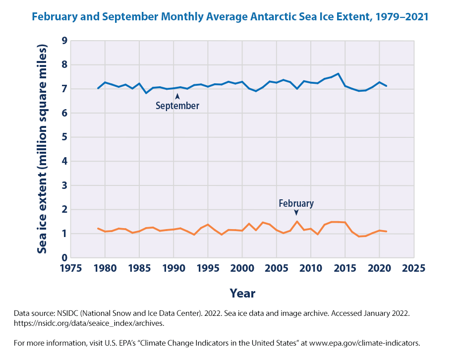
fig = px.line(df_antice, x='Year', y=['February', 'September'], title = "February and September Monthly Average Antarctic Sea Ice Extent, 1979–2021").update_layout(yaxis_title="Sea Ice Extent (mn sq miles)", legend={'title_text':''})

fig.show()
We don’t seem to see much change in the sea ice extent in the peak month (September) and lowest month (February). One thing to note from our graphs using the data directly from NSIDC is that we originally plotted the data in millions of square km and the EPA data are in millions of square miles.
The annual averages and the length of the melting season informs us more than the data in any single month.
We can see that in recent years, both the arctic and antarctic sea extent has been decreasing when measured over the year.
9.2.3 Ice Sheets
As noted by NSIDC,
Earth has just two ice sheets, one covers most of Greenland, the largest island in the world, and the other spans across the Antarctic continent.
Together, the Antarctic and Greenland Ice Sheets contain more than 99 percent of the freshwater ice on Earth. The amount of fresh water stored in both the Antarctic and Greenland Ice Sheets total over 68 percent of the fresh water on Earth.
The Antarctic Ice Sheet extends almost 14 million square kilometers (5.4 million square miles), roughly the area of the contiguous United States and Mexico combined.
The Greenland Ice Sheet extends about 1.7 million square kilometers (656,000 square miles), covering 80 percent of the world’s largest island, and is equivalent to about three times the size of Texas.
Both ice sheets measure on average about 3.2 kilometers (2 miles) thick.
We next move on to another indicator, Ice Sheets.
We are not going to plot it as it is a repetition of the code that we have done before. If we would like, we need to 1. read the CSV data, making sure that we don’t get a 403 error 2. plot the data and adjust the legends and labels as necessary
from io import StringIO
import pandas as pd

import requests

headers = {
    "User-Agent": "Mozilla/5.0 (X11; Ubuntu; Linux x86_64; rv:109.0) Gecko/20100101 Firefox/118.0",
}
url = "https://www.epa.gov/sites/default/files/2021-04/ice_sheets_fig-1.csv"

f = StringIO(requests.get(url, headers=headers).text)

df_icesheets = pd.read_csv(f, skiprows = 6)

df_icesheets| Year | NASA - Antarctica land ice mass | NASA - Greenland land ice mass | IMBIE - Antarctica cumulative ice mass change | IMBIE - Antarctica cumulative ice mass change uncertainty | IMBIE - Greenland cumulative ice mass change | IMBIE - Greenland cumulative ice mass change uncertainty | |
|---|---|---|---|---|---|---|---|
| 0 | 1992.000000 | NaN | NaN | 418.310350 | 7.221207 | 395.365526 | 16.281278 |
| 1 | 1992.083333 | NaN | NaN | 425.377021 | 50.029991 | 401.965526 | 23.025204 |
| 2 | 1992.166667 | NaN | NaN | 433.552016 | 53.064819 | 408.565526 | 28.200000 |
| 3 | 1992.250000 | NaN | NaN | 424.496837 | 59.023007 | 415.165526 | 32.562555 |
| 4 | 1992.333333 | NaN | NaN | 423.362721 | 65.012377 | 421.765526 | 36.406043 |
| ... | ... | ... | ... | ... | ... | ... | ... |
| 512 | 2020.710000 | -2437.63 | -4996.08 | NaN | NaN | NaN | NaN |
| 513 | 2020.790000 | -2537.64 | -4928.75 | NaN | NaN | NaN | NaN |
| 514 | 2020.870000 | -2587.65 | -4922.26 | NaN | NaN | NaN | NaN |
| 515 | 2020.960000 | -2746.00 | -4899.46 | NaN | NaN | NaN | NaN |
| 516 | NaN | NaN | NaN | NaN | NaN | NaN | NaN |
517 rows × 7 columns
#listcol = df_icesheets.columns.tolist()
#fig = px.line(df_icesheets, x='Year', y=listcol)
#y = ['IMBIE - Antarctica cumulative ice mass change', 'IMBIE - Antarctica cumulative ice mass change uncertainty', 'IMBIE - Greenland cumulative ice mass change', 'IMBIE - Greenland cumulative ice mass change uncertainty']
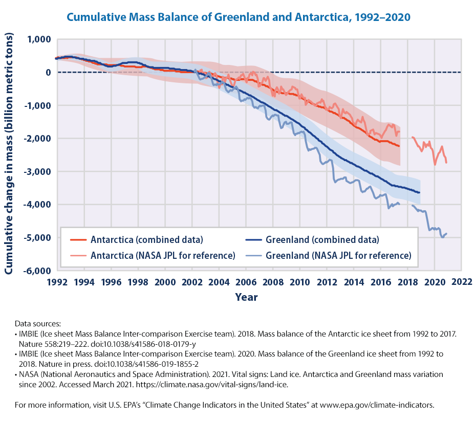
fig = px.line(df_icesheets, x = 'Year', y = ['IMBIE - Antarctica cumulative ice mass change', 'IMBIE - Greenland cumulative ice mass change'])
fig.update_layout(
yaxis_title='Cumulative Mass Change (Billions of Tonnes)',
title='Cumulative Mass Balance of Antarctica and Greenland, 1992-2020 ',
hovermode="x",
legend=dict(x=0.1,y=0.2)
)
fig.update_layout(legend={'title_text':''})
fig.show()Why doesn’t the graph look similar to the graph that we downloaded from EPA directly.
Real world data is never clean and we need to understand the changes. By browsing through the excel spreadsheet, it appears that around 2002 once the NASA data is available, the frequency of data seems to have changed and there are missing values.
nrows, ncols = df_icesheets.shape
print(f'the data set has {nrows} observations and {ncols} of columns or variables')
the data set has 517 observations and 7 of columns or variablesWhat did we do? Copilot to the rescue :)
We first extracted the number of rows and columns from the DataFrame df_icesheets. The shape attribute of a DataFrame returns a tuple containing two values: the number of rows and the number of columns. By assigning df_icesheets.shape to nrows, ncols, the code unpacks this tuple into two separate variables: nrows for the number of rows and ncols for the number of columns.
Let us remove the missing values and plot again
nrows, ncols = df.shape
print(f'the data set has {nrows} observations and {ncols} of columns or variables')
the data set has 306 observations and 7 of columns or variableswe can see that around 211 observations are dropped.
fig = px.line(df, x='Year', y = ycols, title = "Cumulative Mass Balance of Greenland and Antarctica, 1992–2020").update_layout(yaxis_title="Cumulative change in Mass (bn metric tonnes)", legend={'title_text':''})
fig.update_layout(
yaxis_title='Cumulative Mass Change (Billions of Tonnes)',
title='Cumulative Mass Balance of Antarctica and Greenland, 1992-2020 ',
hovermode="x",
legend=dict(x=0.1,y=0.2)
)
fig.update_layout(legend={'title_text':''})
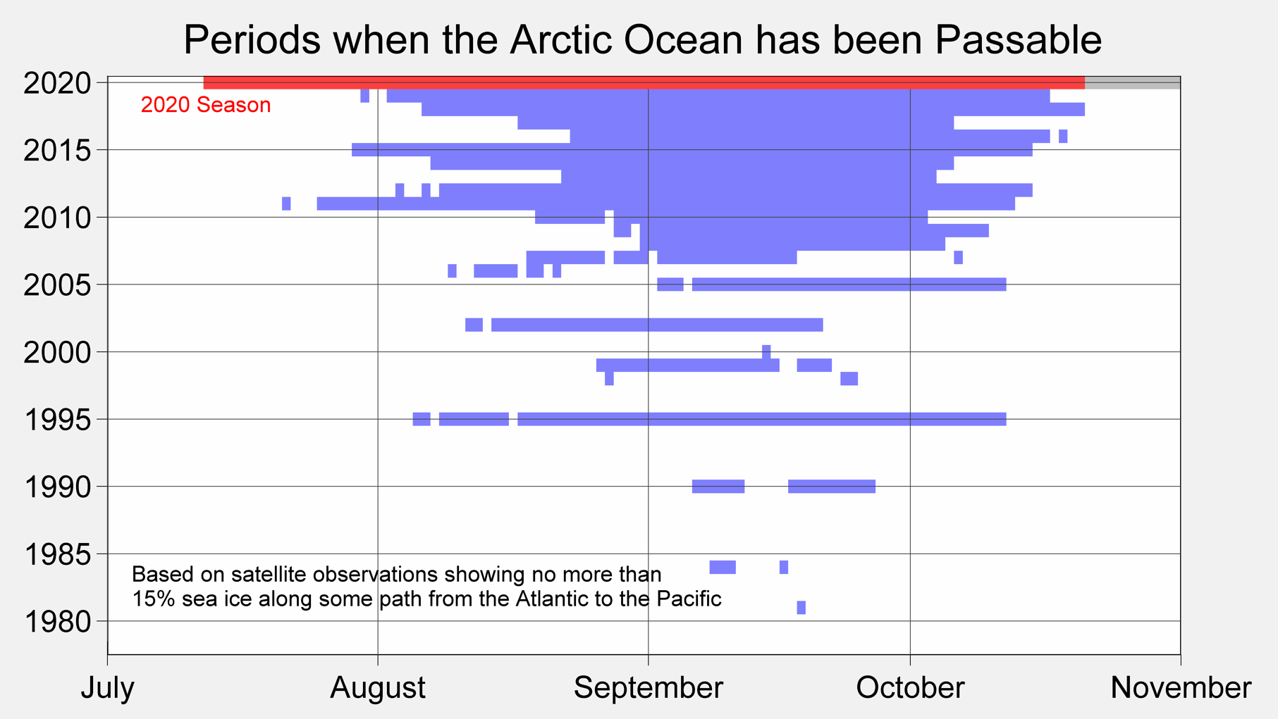
fig.show()By the way, we can go back to Berkeley Earth and highlight a figure that they mention as
A representation of the length of time during which sea ice levels in the Arctic Ocean were at 15% or less, allowing for clear passage through the Arctic Ocean.
Arctic Passable. Source: Berkeley Earth https://berkeleyearth.org/dv/periods-when-the-arctic-ocean-has-been-passable/
9.2.4 Glaciers
As noted by NSIDC
A glacier is an accumulation of ice and snow that slowly flows over land. At higher elevations, more snow typically falls than melts, adding to its mass. Eventually, the surplus of built-up ice begins to flow downhill. At lower elevations, there is usually a higher rate of melt or icebergs break off that removes ice mass.
There are two broad categories of glaciers: alpine glaciers and ice sheets.
Alpine glaciers are frozen rivers of ice, slowly flowing under their own weight down mountainsides and into valleys.
More information on Glaciers is available at https://wgms.ch/global-glacier-state/
Glaciologists assess the state of a glacier by measuring its annual mass balance as the combined results of snow accumulation (mass gain) and melt (mass loss) during a given year. The mass balance reflects the atmospheric conditions over a (hydrological) year and, if measured over a long period and displayed in a cumulative way, trends in mass balance are an indicator of climate change. Seasonal melt contributes to runoff and the annual balance (i.e. the net change of glacier mass) contributes to sea level change.

The data is available at http://wgms.ch/data/faq/mb_ref.csv
from io import StringIO
import pandas as pd
import requests

def url_data_request(url, skiprows):
    headers = {
        "User-Agent": "Mozilla/5.0 (X11; Ubuntu; Linux x86_64; rv:109.0) Gecko/20100101 Firefox/118.0",
    }
    f = StringIO(requests.get(url, headers=headers).text)
    df_url = pd.read_csv(f, skiprows = skiprows)
    return df_url

url = "http://wgms.ch/data/faq/mb_ref.csv"
df = url_data_request(url,0)
df| Year | MB_REF_count | REF_regionAVG | REF_regionAVG_cum-rel-1970 | |
|---|---|---|---|---|
| 0 | 1950 | 5 | -1142 | 5392 |
| 1 | 1951 | 4 | -345 | 5047 |
| 2 | 1952 | 4 | -561 | 4486 |
| 3 | 1953 | 8 | -562 | 3924 |
| 4 | 1954 | 7 | -420 | 3504 |
| ... | ... | ... | ... | ... |
| 69 | 2019 | 61 | -994 | -22144 |
| 70 | 2020 | 61 | -883 | -23027 |
| 71 | 2021 | 61 | -677 | -23704 |
| 72 | 2022 | 60 | -1090 | -24794 |
| 73 | 2023 | 53 | -1229 | -26023 |
74 rows × 4 columns
The dataset has 4 columns. Let us plot the cumulative mass change of glaciers where 1970 is set as zero.
import plotly.express as px
fig = px.line(df, x= 'Year', y = 'REF_regionAVG_cum-rel-1970',
    labels={"REF_regionAVG_cum-rel-1970": "Cumulative Mass Change in m w.e "},
    title = 'Global Cumulative Change of Glaciers'
    )
fig.show()
Some useful references to get further information are:
WGMS (2021, updated, and earlier reports). Global Glacier Change Bulletin No. 4 (2018-2019). Zemp, M., Nussbaumer, S. U., Gärtner-Roer, I., Bannwart, J., Paul, F., and Hoelzle, M. (eds.), ISC(WDS)/IUGG(IACS)/UNEP/UNESCO/WMO, World Glacier Monitoring Service, Zurich, Switzerland, 278 pp., publication based on database version: doi:10.5904/wgms-fog-2021-05.
They state that
“…In the hydrological years 2020/21 and 2021/22, observed reference glaciers experienced an ice loss of 0.8 m w.e. and of 1.2 m w.e., respectively. With this, eight out of the ten most negative mass balance years were recorded after 2010….”
The observed glaciers were close to steady states during the 1960s followed by increasingly strong ice loss until present.

We can see also the extent of Glaciers from the EPA data
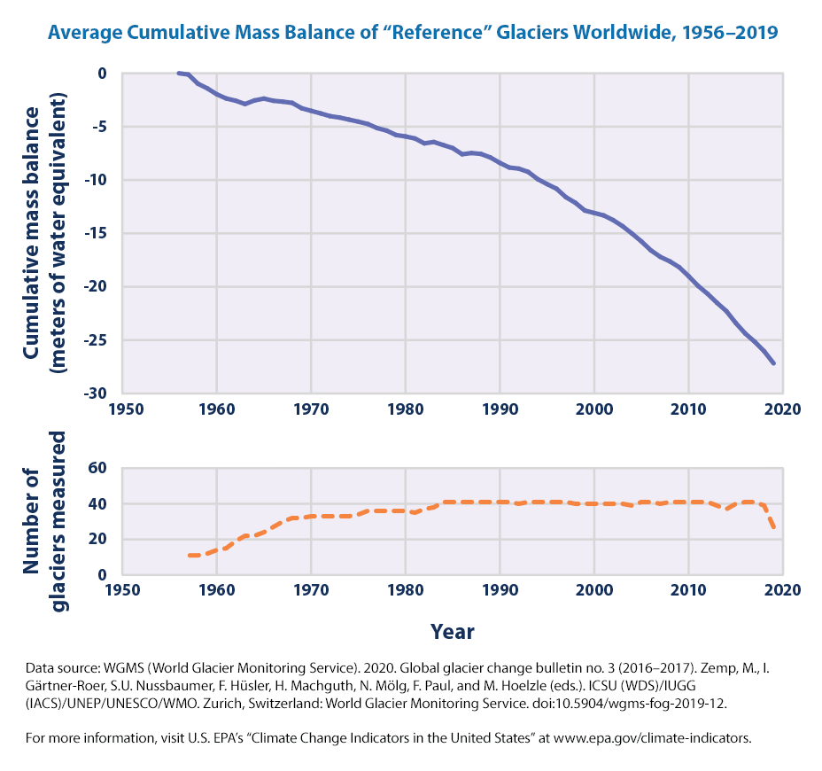
As EPA states > “The line on the upper graph represents the average of all the glaciers that were measured. Negative values indicate a net loss of ice and snow compared with the base year of 1956. For consistency, measurements are in meters of water equivalent, which represent changes in the average thickness of a glacier.”
We can also plot the data from EPA ourlselves
from io import StringIO
import pandas as pd

import requests

headers = {
    "User-Agent": "Mozilla/5.0 (X11; Ubuntu; Linux x86_64; rv:109.0) Gecko/20100101 Firefox/118.0",
}

url = "https://www.epa.gov/system/files/other-files/2024-05/glaciers_fig-1.csv"

f = StringIO(requests.get(url, headers=headers).text)

df_glaciers = pd.read_csv(f, skiprows = 6)

df_glaciers = df_glaciers.iloc[1:, :]
Let’s plot the data:
fig = px.line(df_glaciers, x='Year', y='Mean cumulative mass balance')

fig.update_layout(
    title = "Average Cumulative Mass Balance of 'Reference' Glaciers Worldwide, 1956–2023",
    yaxis_title="Cumulative Mass Balance (meters of water equivalent)",
    title_x = 0.5
    )

fig.show()
Note, we used a ’’ in the title for Reference as the title is enclosed in ““.
It seems that there is a significant loss of mass, measured in water equivalents, since the base year of 1956.
Per the EPA eplanation for the figure,
On average, glaciers worldwide have been losing mass since at least the 1970s (see Figure 1), which in turn has contributed to observed changes in sea level (see the Sea Level indicator). A longer measurement record from a smaller number of glaciers suggests that they have been shrinking since the 1950s. The rate at which glaciers are losing mass appears to have accelerated over roughly the last decade.
9.2.5 Why do we care about Glaciers?
OK. Glaciers are losing a significant mass, as measured in water equivalents. That’a a lot of water! But why do we care? Is it something that we need to worry about? Is there a link between Loss of mass in glaciers \(->\) Sea Level Raise?
Let us check out the information from <https://wgms.ch/sea-level-rise/?
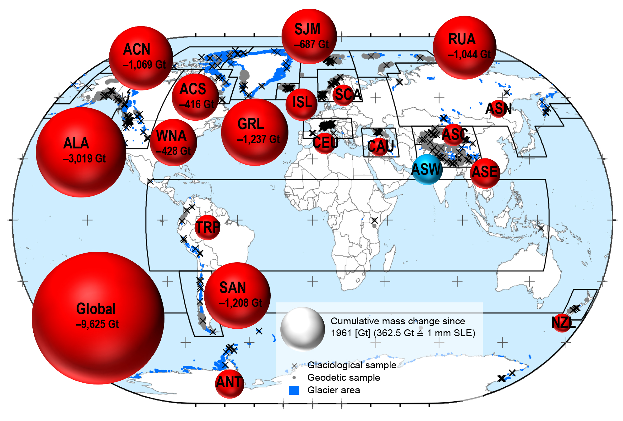
Melting ice sheets in Greenland and the Antarctic as well as ice melt from glaciers all over the world are causing sea levels to rise. For the IPCC special report on “Ocean and Cryosphere in a Changing Climate“, and AR6 WG-I, an international research team combined glaciological field observations with geodetic satellite measurements – as available from the WGMS – to reconstruct annual mass changes of more than 19’000 glaciers worldwide. This new assessment shows that glaciers alone lost more than 9,000 billion tons of ice between 1961/62 and 2015/16, raising water levels by 27 millimetres. This global glacier mass loss corresponds to an ice cube with the area of Germany and a thickness of 30 metres. The largest contributors were glaciers in Alaska, followed by the melting ice fields in Patagonia and glaciers in the Arctic regions. Glaciers in the European Alps, the Caucasus mountain range and New Zealand were also subject to significant ice loss; however, due to their relatively small glacierized areas they played only a minor role when it comes to the rising global sea levels.

Let is get some more data about glaciers from the EPA.
from io import StringIO
import pandas as pd

import requests

headers = {
    "User-Agent": "Mozilla/5.0 (X11; Ubuntu; Linux x86_64; rv:109.0) Gecko/20100101 Firefox/118.0",
}

url = "https://www.epa.gov/system/files/other-files/2024-05/glaciers_fig-2.csv"

f = StringIO(requests.get(url, headers=headers).text)

df = pd.read_csv(f,  skiprows=6)
df.head()| Year | South Cascade Glacier | Gulkana Glacier | Wolverine Glacier | Lemon Creek Glacier | |
|---|---|---|---|---|---|
| 0 | 1952 | NaN | NaN | NaN | 1.29 |
| 1 | 1953 | NaN | NaN | NaN | 0.80 |
| 2 | 1954 | NaN | NaN | NaN | 0.69 |
| 3 | 1955 | NaN | NaN | NaN | 1.88 |
| 4 | 1956 | NaN | NaN | NaN | 1.31 |
Also note that we got a bit lazy here and started using df instead of naming the dataset more appropriately, say df_glaciers_epa. But we are not reusing datasets from before so it is easier to use the short df and overwrite the data frames. It becomes more of an issue when we need to reuse a old dataframe or merge with another data frame.
We see there are a lot of NaN values as some of hte measurements may have started at a later time than 1952.
fig = px.line(df, x="Year", y=['South Cascade Glacier', 'Gulkana Glacier', 'Wolverine Glacier', 'Lemon Creek Glacier'])

fig.update_layout(
    title = "Cumulative Mass Balance of Four U.S. Glaciers, 1952–2023",
    yaxis_title="Cumulative Mass Balance (meters of water equivalent)",
    title_x = 0.5,
    legend=dict(
        x=0.05,
        y=0.5
    )
)
fig.show()
We have using similar commands before, but two items to note
- y=[‘South Cascade Glacier’, ‘Gulkana Glacier’, ‘Wolverine Glacier’, ‘Lemon Creek Glacier’]
- Here, instead of one column, the y parameter is a list of column names from the DataFrame: ‘South Cascade Glacier’, ‘Gulkana Glacier’, ‘Wolverine Glacier’, and ‘Lemon Creek Glacier’. These columns contain the data points for each respective glacier, which will be plotted on the y-axis.
- We have used fig.update_laypout to set the main title, yaxis title.
- We have also centered the title by using title_x = 0.5. In order to keep the chart area larger, we have moved the legend inside the chart. We chose x= 0.05 and y = 0.5 based on the empty space in the chart.
OK. Enough with the code. What is the figure telling us?
As per the EPA explanation,
This figure shows the cumulative mass balance of four U.S. reference glaciers since measurements began in the 1950s or 1960s. For each glacier, the mass balance is set at zero for the base year of 1965. Negative values indicate a net loss of ice and snow compared with the base year. For consistency, measurements are in meters of water equivalent, which represent changes in the average thickness of a glacier.
The four U.S. reference glaciers have shown an overall decline in mass balance since the 1950s and 1960s and an accelerated rate of decline in recent years. Year-to-year trends vary, with some glaciers gaining mass in certain years (for example, Wolverine Glacier during the 1980s), but the measurements clearly indicate a loss of glacier mass over time.
Trends for the four U.S. reference glaciers are consistent with the retreat of glaciers observed throughout the western United States, Alaska, and other parts of the world. Observations of glaciers losing mass are also consistent with warming trends in U.S. and global temperatures during this time period (see the U.S. and Global Temperature indicator).
The images from the EPA website also tell a clear story.
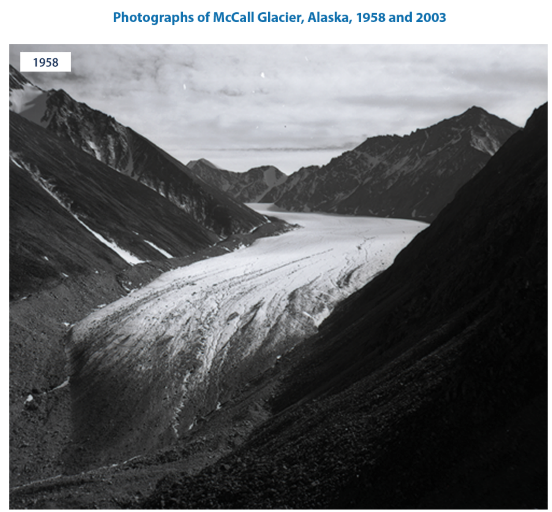
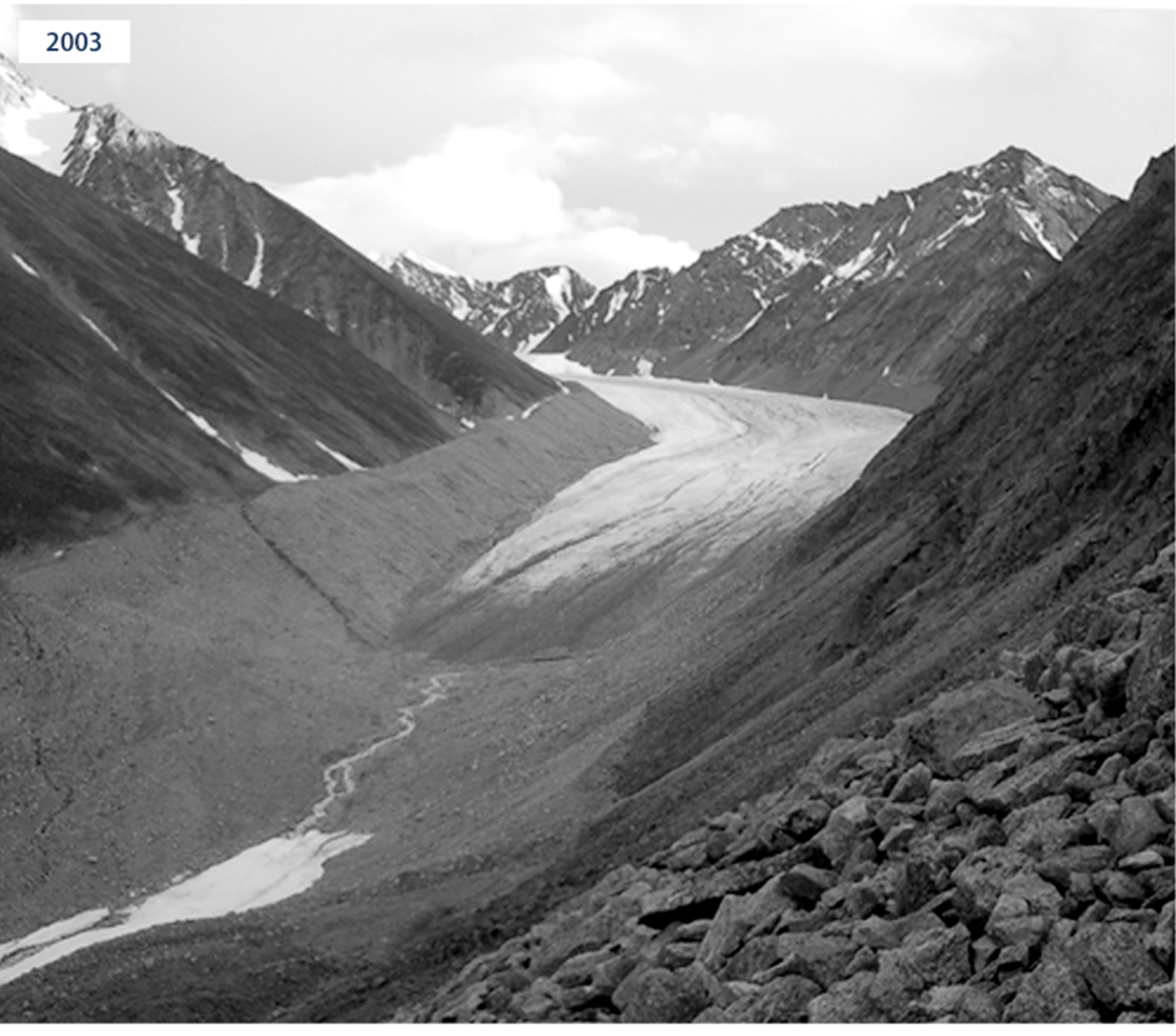
We can see stark differences!
9.3 Arctic Glaciers
Let us move on to Arctic Glaciers from the EPA website

As EPA states,
This figure shows the cumulative change in mass balance of a set of eight glaciers located at a latitude of 66°N or higher with data beginning in 1945. Each time series has been adjusted to make 1970 a common zero point because this was the first year for which mass balance data are available for all eight glaciers. Negative values indicate a net loss of ice and snow compared with the base year of 1970. For consistency, measurements are in meters of water equivalent, which reflects the mass loss of the glacier by representing changes in the glacier’s average thickness.
As before, we can download the data from EPA.
url = "https://www.epa.gov/system/files/other-files/2022-07/arctic-glaciers-fig-1_0.csv"

df_arcticg = pd.read_csv(url, skiprows = 6)

df_arcticg| Year | Meighen | White | Austre | Midtre | Devon | Melville | Storglaciaeren | Engabreen | Average | |
|---|---|---|---|---|---|---|---|---|---|---|
| 0 | 1945 | NaN | NaN | NaN | NaN | NaN | NaN | 11.14 | NaN | 9.25 |
| 1 | 1946 | NaN | NaN | NaN | NaN | NaN | NaN | 9.26 | NaN | 7.37 |
| 2 | 1947 | NaN | NaN | NaN | NaN | NaN | NaN | 8.97 | NaN | 7.08 |
| 3 | 1948 | NaN | NaN | NaN | NaN | NaN | NaN | 9.56 | NaN | 7.67 |
| 4 | 1949 | NaN | NaN | NaN | NaN | NaN | NaN | 8.81 | NaN | 6.92 |
| ... | ... | ... | ... | ... | ... | ... | ... | ... | ... | ... |
| 71 | 2016 | -9.12 | -10.35 | -23.61 | -18.69 | -7.33 | -16.31 | -5.57 | 2.10 | -11.19 |
| 72 | 2017 | -8.92 | -10.34 | -24.49 | -19.46 | -7.28 | -16.09 | -7.17 | 0.47 | -11.74 |
| 73 | 2018 | -9.75 | NaN | -25.20 | -20.02 | -7.80 | NaN | -7.48 | 1.26 | -12.10 |
| 74 | 2019 | -10.55 | NaN | -26.94 | -21.61 | -8.30 | NaN | -7.62 | 2.43 | -12.70 |
| 75 | 2020 | NaN | NaN | NaN | NaN | NaN | NaN | NaN | NaN | NaN |
76 rows × 10 columns
We can see that from 1945 to 1957 they didn’t record anything for the first 6 glaciers. Even after 1957 they didn’t record anything for two of the glaciers. So, let’s just graph the average first.
Let us plot the average:
fig = px.line(df_arcticg, x="Year", y="Average")


fig.update_layout(
    title="Cumulative Mass Balance of Eight Arctic Glaciers, 1945–2019",
    title_x = 0.5
)

fig.show()
We can definitely see that the average mass balance is going down over time and is in negative territory. Note that negative values indicate a net loss of ice and snow compared with the base year of 1970.
We only plotted the average. There are many missing value NaN for other glaciers in the initial years. The nice thing with NaN is that Plotly can ignore the NaN and plot the data when it is available.
Let us list the columns in the data frame
Index(['Year', 'Meighen', 'White ', 'Austre', 'Midtre', 'Devon', 'Melville',
       'Storglaciaeren', 'Engabreen', 'Average'],
      dtype='object')
We can see that there are many glaciers that we can plot.
fig = px.line(df_arcticg, x="Year", y=['Meighen', 'White ', 'Austre', 'Midtre', 'Devon', 'Melville',
       'Storglaciaeren', 'Engabreen'])


fig.update_layout(
    title=" Cumulative Mass Balance of Eight Arctic Glaciers, 1945–2020",
    title_x = 0.5,
    yaxis_title="Cumulative Mass Balance (meters of water equivalent)",
    legend=dict(
        x=0.05,
        y=0.05
    )
)
fig.show()
What do we take away from the figures? EPA’s key insights for the figures mention
Since 1945, the eight Arctic glaciers in Figure 1 have experienced a decline in mass balance overall. One exception to this pattern is Engabreen, near the subpolar zone along the coast of Norway, which gained mass over the period of record. This trend is anomalous and does not reflect the significant global loss of land ice as measured and catalogued from numerous glaciers elsewhere in the Arctic and around the world in the 20th century. Engabreen is more strongly influenced by precipitation than glaciers elsewhere in the Arctic.
The loss of land-based ice in the Arctic has accelerated in recent decades. The Arctic is the largest contributing source of land ice to global sea level rise.
Lets do one more thing as we have eight glaciers.
subset_columns = ['Meighen', 'White ', 'Austre', 'Midtre', 'Devon', 'Melville','Storglaciaeren', 'Engabreen']

correlation_matrix = df_arcticg[subset_columns].corr()

print(correlation_matrix.round(3))
Meighen White Austre Midtre Devon Melville \
Meighen 1.000 0.984 0.917 0.917 0.994 0.976
White 0.984 1.000 0.950 0.949 0.991 0.990
Austre 0.917 0.950 1.000 1.000 0.938 0.967
Midtre 0.917 0.949 1.000 1.000 0.936 0.965
Devon 0.994 0.991 0.938 0.936 1.000 0.985
Melville 0.976 0.990 0.967 0.965 0.985 1.000
Storglaciaeren 0.870 0.823 0.790 0.778 0.877 0.817
Engabreen 0.374 0.248 0.120 0.115 0.365 0.192
Storglaciaeren Engabreen
Meighen 0.870 0.374
White 0.823 0.248
Austre 0.790 0.120
Midtre 0.778 0.115
Devon 0.877 0.365
Melville 0.817 0.192
Storglaciaeren 1.000 0.668
Engabreen 0.668 1.000 What is the correlation matrix?
- A correlation matrix is a table showing correlation coefficients between variables. Each cell in the table shows the correlation between two variables.
- The value ranges from -1 to 1, where:
- 1 indicates a perfect positive correlation.
- -1 indicates a perfect negative correlation.
- 0 indicates no correlation.
The correlation_matrix is typically a DataFrame or a 2D array that contains correlation coefficients between different variables.
As we could see, the correlations are all positive indicating that all the glaciers are losing mass. Except Engabreen, the correlation among all the other glaciers is very high, more than 0.8 on average.
We can also plot the correlation matrix
The imshow function is designed to display image-like data, making it suitable for visualizing matrices. In this context, it will generate a heatmap where the color intensity represents the strength and direction of the correlations.
We can see that most of the plot is in yellow, with the correlation is greater than 0.8. Engabreen is the only one with a different color, indicating that the mass loss there is not significantly correlated with the other seven glaciers. As EPA states, Engabreen is more strongly influenced by precipitation than glaciers elsewhere in the Arctic.
9.4 Glaciers in Glacier National Park
There are a few other figures on the EPA website that take a closer look Glaciers in Glacier National Park.
We can follow the same steps as before 1. get the data from the EPA website 2. make sure that we read the data correctly 3. plot the figure
Why don’t you try it as an exercise?
Can you modify the following code?
```{python}
url = "https://www.epa.gov/sites/default/files/2021-03/glacier-park_fig-1.csv"

df_totalSA = pd.read_csv(url, skiprows = 6, encoding = "ISO-8859-1")

df_totalSA
```
How can you add titles and legends to the code below? See our code before.
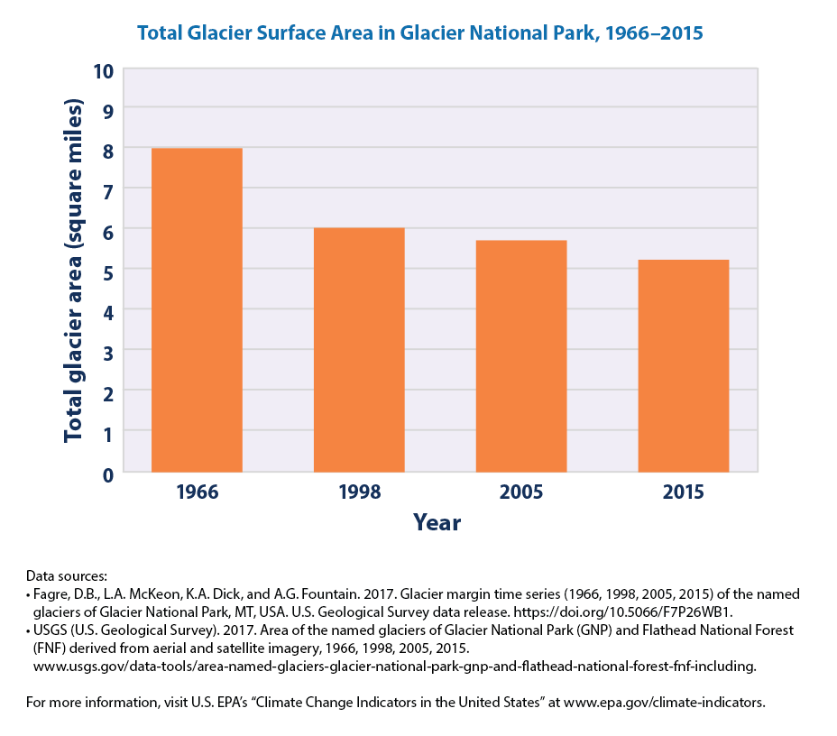
What does this figure convey?
The total surface area of the 37 named glaciers in Glacier National Park decreased by about 34 percent between 1966 and 2015.
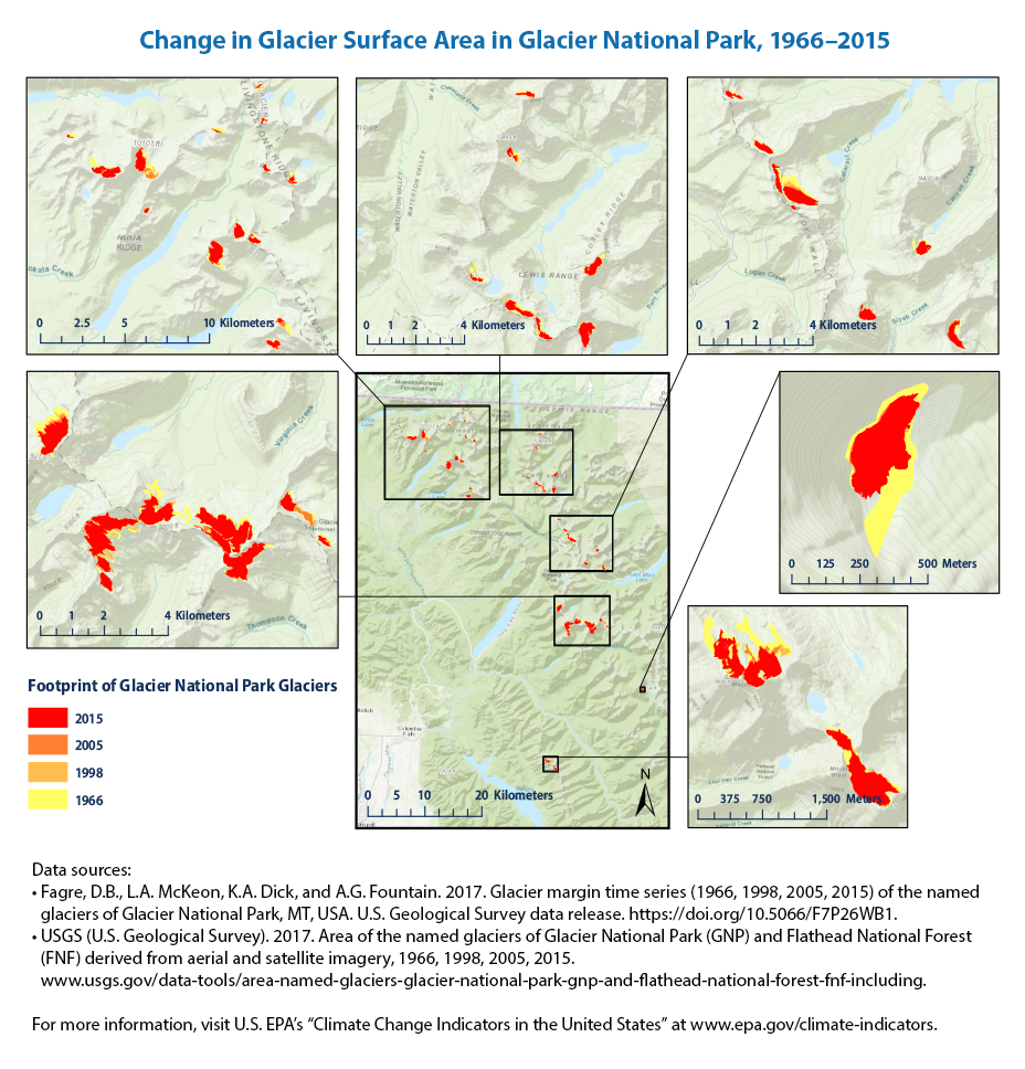
We don’t have all the data to plot this figure. But the EPA notes that
Every glacier’s surface area was smaller in 2015 than it was in 1966. Three glaciers temporarily gained some area during part of the overall time period.
The overall trend of shrinking surface area of glaciers in Glacier National Park is consistent with the retreat of glaciers observed in the United States and worldwide.
9.5 Great Lakes
From the EPA website,
The Great Lakes—Lake Superior, Lake Michigan, Lake Huron, Lake Erie, and Lake Ontario—form the largest group of freshwater lakes on Earth. These lakes support a variety of ecosystems and play a vital role in the economy of the eight neighboring states and the Canadian province of Ontario, providing drinking water, shipping lanes, fisheries, recreational opportunities, and more.
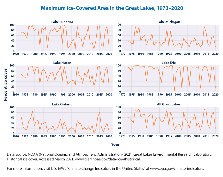
These graphs show the percentage of surface area in each of the Great Lakes that froze on the maximum day (the “most frozen” day) of each year since 1973. The graph at the lower right is an area-weighted average of all five lakes.
import pandas as pd
url = "https://www.epa.gov/sites/default/files/2021-04/great-lakes-ice_fig-1.csv"

df_lakes = pd.read_csv(url, skiprows = 6)

df_lakes| Year | Erie | Huron | Michigan | Ontario | Superior | All Lakes | |
|---|---|---|---|---|---|---|---|
| 0 | 1973 | 95.7 | 66.70 | 33.0 | 62.6 | 69.8 | 60.6 |
| 1 | 1974 | 88.5 | 61.40 | 39.4 | 24.5 | 73.8 | 58.7 |
| 2 | 1975 | 80.1 | 55.10 | 28.1 | 14.9 | 64.9 | 50.2 |
| 3 | 1976 | 95.4 | 52.50 | 29.5 | 15.2 | 49.9 | 39.9 |
| 4 | 1977 | 99.8 | 95.00 | 93.1 | 46.7 | 96.0 | 89.9 |
| 5 | 1978 | 100.0 | 95.80 | 66.6 | 57.7 | 92.5 | 83.0 |
| 6 | 1979 | 100.0 | 96.40 | 92.3 | 86.2 | 97.1 | 94.7 |
| 7 | 1980 | 93.4 | 70.30 | 38.6 | 30.6 | 77.2 | 62.8 |
| 8 | 1981 | 96.0 | 93.80 | 53.8 | 47.6 | 84.7 | 71.3 |
| 9 | 1982 | 99.1 | 93.30 | 60.2 | 50.7 | 85.3 | 74.8 |
| 10 | 1983 | 40.8 | 31.80 | 23.6 | 12.5 | 20.2 | 22.1 |
| 11 | 1984 | 95.7 | 77.60 | 43.3 | 40.7 | 88.2 | 65.2 |
| 12 | 1985 | 96.0 | 87.40 | 41.3 | 38.2 | 81.9 | 69.8 |
| 13 | 1986 | 95.5 | 73.50 | 66.8 | 43.7 | 90.7 | 76.4 |
| 14 | 1987 | 88.0 | 43.50 | 20.0 | 8.4 | 14.5 | 27.3 |
| 15 | 1988 | 91.5 | 60.10 | 32.7 | 21.1 | 67.3 | 53.6 |
| 16 | 1989 | 91.6 | 76.30 | 30.9 | 15.5 | 82.3 | 59.2 |
| 17 | 1990 | 72.8 | 73.80 | 32.4 | 29.5 | 78.1 | 59.7 |
| 18 | 1991 | 35.1 | 43.80 | 21.5 | 11.6 | 89.6 | 44.3 |
| 19 | 1992 | 89.8 | 69.90 | 32.8 | 17.5 | 73.3 | 45.5 |
| 20 | 1993 | 94.3 | 78.30 | 32.2 | 29.0 | 77.2 | 64.4 |
| 21 | 1994 | 96.7 | 96.90 | 82.7 | 55.7 | 96.1 | 89.0 |
| 22 | 1995 | 94.0 | 41.70 | 21.6 | 18.8 | 28.8 | 32.0 |
| 23 | 1996 | 100.0 | 98.20 | 75.0 | 45.1 | 100.0 | 81.7 |
| 24 | 1997 | 99.6 | 65.30 | 37.8 | 25.6 | 89.0 | 58.4 |
| 25 | 1998 | 5.4 | 28.60 | 15.1 | 6.2 | 11.1 | 14.0 |
| 26 | 1999 | 74.8 | 36.00 | 23.0 | 17.9 | 18.3 | 26.6 |
| 27 | 2000 | 90.7 | 41.90 | 27.2 | 22.3 | 33.5 | 34.8 |
| 28 | 2001 | 94.0 | 45.70 | 29.5 | 17.9 | 46.7 | 34.4 |
| 29 | 2002 | 14.4 | 26.10 | 12.4 | 4.0 | 10.3 | 11.8 |
| 30 | 2003 | 95.7 | 96.20 | 48.0 | 49.6 | 95.5 | 80.2 |
| 31 | 2004 | 95.4 | 64.50 | 36.4 | 38.5 | 52.2 | 51.9 |
| 32 | 2005 | 93.0 | 58.90 | 29.4 | 37.8 | 54.5 | 44.2 |
| 33 | 2006 | 21.9 | 32.17 | 16.2 | 14.3 | 16.7 | 20.4 |
| 34 | 2007 | 95.8 | 71.39 | 37.2 | 23.8 | 51.8 | 55.2 |
| 35 | 2008 | 93.4 | 59.51 | 33.5 | 14.0 | 62.7 | 53.7 |
| 36 | 2009 | 95.6 | 85.11 | 52.3 | 25.9 | 93.6 | 73.9 |
| 37 | 2010 | 93.1 | 36.95 | 23.5 | 13.1 | 27.3 | 27.5 |
| 38 | 2011 | 95.9 | 63.79 | 29.4 | 31.1 | 33.6 | 40.1 |
| 39 | 2012 | 13.9 | 23.06 | 16.7 | 1.9 | 8.2 | 12.9 |
| 40 | 2013 | 83.7 | 47.75 | 24.4 | 15.6 | 38.6 | 38.4 |
| 41 | 2014 | 96.1 | 96.10 | 93.1 | 60.8 | 95.8 | 92.3 |
| 42 | 2015 | 98.1 | 96.40 | 72.9 | 82.4 | 95.7 | 88.8 |
| 43 | 2016 | 78.7 | 47.98 | 26.8 | 23.5 | 22.7 | 33.8 |
| 44 | 2017 | 35.5 | 35.35 | 18.2 | 5.8 | 18.7 | 19.4 |
| 45 | 2018 | 95.1 | 81.39 | 51.3 | 24.7 | 77.2 | 69.0 |
| 46 | 2019 | 94.3 | 95.70 | 55.8 | 39.8 | 94.9 | 80.9 |
| 47 | 2020 | 15.9 | 32.10 | 17.2 | 10.7 | 22.6 | 19.5 |
We can see that there are columns for: ‘Erie’, ‘Huron’, ‘Michigan’, ‘Ontario’, ‘Superior’, ‘All Lakes’ along with ‘YEAR’.
We can plot
- lake by lake
- all the lakes in one plot
- lake by lake subplots and facet them into one graph
Lets do one lake first
import plotly.express as px
fig = px.line(df_lakes, x='Year', y='Erie')
fig.update_layout(title = "Maximum Ice-Covered Area for Lake Erie, 1973–2020",
    yaxis_title = "Percent Ice Cover",
    title_x = 0.5)

fig.show()
We haven’t used functions in a while. So, let us get some more practice with functions. We can see that all we need to change is the lake name or the column for the y-axis and the title.
import plotly.express as px
fig = px.line(df_lakes, x='Year', y='Erie')
fig.update_layout(title = "Maximum Ice-Covered Area for Lake Erie, 1973–2020",
    yaxis_title = "Percent Ice Cover",
    title_x = 0.5)

fig.show()What did we do?
- The function, plot_lake_ice_cover(), takes a single parameter, lake_name, which represents the name of the lake for which the ice cover data will be visualized.
- Within the function, a line plot is created using the Plotly px.line method. This method takes a DataFrame, df_lakes, and plots the data with ‘Year’ on the x-axis and the specified lake_name on the y-axis.
- After creating the initial plot, the function customizes the layout of the figure using the update_layout method.
- The title of the plot is set to “Maximum Ice-Covered Area for Lake {lake_name}, 1973–2020”, dynamically incorporating the lake_name parameter.
- The y-axis is labeled “Percent Ice Cover” to indicate the measurement being plotted.
- Additionally, the title is centered horizontally by setting title_x to 0.5.
- Finally, the function calls fig.show() to display the plot.
Let us try to call with a different lake name
We can see that the relevant lake (Huron in this case) data is used along with dynamically includng the Lake name in the title!
How about lake Michigan? Again, all we need to do is to make a function call changing the name of the lake or the input variable.
It beats writing out long lines of code. For example
```{python}
fig = px.line(df_lakes, x='Year', y='Huron')

fig.show()

fig = px.line(df_lakes, x='Year', y='Michigan')

fig.show()

fig = px.line(df_lakes, x='Year', y='Ontario')

fig.show()

fig = px.line(df_lakes, x='Year', y='Superior')

fig.show()

fig = px.line(df_lakes, x='Year', y='All Lakes')

fig.show()
```
All these without including titles and other information!
Lets exactly replicate the EPA figure by faceting all these figures together. Our function helps!
We already have done these in the Seasonal Temperatures graph. We can just adapt it here.
import plotly.graph_objects as go
from plotly.subplots import make_subplots

fig = make_subplots(rows=3, cols=2, subplot_titles=('Erie', 'Huron', 'Michigan', 'Ontario', 'Superior', 'All Lakes'),
        x_title= 'Year',
        y_title = 'Percent Ice Cover')

fig.update_layout(title = "Maximum Ice-Covered Area for Great Lakes, 1973–2020",
    title_x = 0.5)

fig.add_trace(go.Scatter(x=df_lakes['Year'], y=df_lakes['Erie'], name = 'Erie'), row=1, col=1)
What do we see? We sew space for 6 figures, 2 columns and 3 rows and we only added Lake Erie so far.
Let us add the rest
fig.add_trace(go.Scatter(x=df_lakes['Year'], y=df_lakes['Erie'], name = 'Huron'), row=1, col=2)
fig.add_trace(go.Scatter(x=df_lakes['Year'], y=df_lakes['Erie'], name = 'Erie'), row=2, col=1)
fig.add_trace(go.Scatter(x=df_lakes['Year'], y=df_lakes['Erie'], name = 'Ontario'), row=2, col=2)
fig.add_trace(go.Scatter(x=df_lakes['Year'], y=df_lakes['Erie'], name = 'Superior'), row=3, col=1)
fig.add_trace(go.Scatter(x=df_lakes['Year'], y=df_lakes['Erie'], name = 'All Lakes'), row=3, col=2)
What are the key takeaways based on the graphs? Per EPA,
Since 1973, the maximum area covered in ice on the Great Lakes has varied considerably from year to year. Adding the five Great Lakes together, maximum frozen area has ranged from less than 20 percent in some years to more than 90 percent in others (see Figure 1). All five lakes have experienced some degree of long-term decrease, but the decrease is only statistically significant in one lake (Superior). Years with much-lower-than-normal ice cover appear to have become more frequent during the past two decades, especially in lakes like Erie and Superior that have a history of freezing almost completely.
9.5.0.1 Duratuion of Ice Cover
Let us look at the duration of Ice Cover https://www.epa.gov/climate-indicators/climate-change-indicators-great-lakes-ice-cover
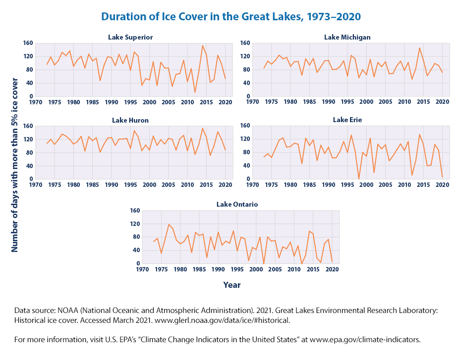
These graphs show the number of frozen days per year in each of the Great Lakes since 1973. A frozen day is defined here as a day when at least 5 percent of the lake’s surface area was covered with ice.
We need to follow the same recipte as before
- download data
- make subplots
import pandas as pd
url = "https://www.epa.gov/sites/default/files/2021-04/great-lakes-ice_fig-2.csv"

df_lakes = pd.read_csv(url, skiprows = 6)

df_lakes| Year | Erie | Huron | Michigan | Ontario | Superior | |
|---|---|---|---|---|---|---|
| 0 | 1973 | 67 | 108 | 85 | 67 | 97 |
| 1 | 1974 | 76 | 120 | 106 | 76 | 119 |
| 2 | 1975 | 65 | 105 | 97 | 32 | 95 |
| 3 | 1976 | 91 | 119 | 108 | 74 | 108 |
| 4 | 1977 | 117 | 136 | 124 | 118 | 133 |
| 5 | 1978 | 124 | 130 | 113 | 106 | 123 |
| 6 | 1979 | 96 | 120 | 117 | 71 | 137 |
| 7 | 1980 | 98 | 106 | 90 | 60 | 91 |
| 8 | 1981 | 108 | 113 | 104 | 67 | 110 |
| 9 | 1982 | 105 | 129 | 105 | 86 | 121 |
| 10 | 1983 | 47 | 85 | 64 | 34 | 86 |
| 11 | 1984 | 123 | 128 | 113 | 94 | 128 |
| 12 | 1985 | 101 | 116 | 94 | 85 | 107 |
| 13 | 1986 | 118 | 125 | 114 | 89 | 115 |
| 14 | 1987 | 56 | 82 | 72 | 19 | 48 |
| 15 | 1988 | 102 | 105 | 89 | 81 | 93 |
| 16 | 1989 | 77 | 124 | 107 | 43 | 120 |
| 17 | 1990 | 96 | 126 | 108 | 95 | 117 |
| 18 | 1991 | 64 | 102 | 81 | 56 | 93 |
| 19 | 1992 | 64 | 121 | 81 | 68 | 127 |
| 20 | 1993 | 83 | 121 | 89 | 62 | 99 |
| 21 | 1994 | 113 | 123 | 107 | 99 | 125 |
| 22 | 1995 | 80 | 93 | 61 | 39 | 79 |
| 23 | 1996 | 132 | 146 | 123 | 80 | 134 |
| 24 | 1997 | 85 | 128 | 113 | 75 | 122 |
| 25 | 1998 | 1 | 86 | 56 | 10 | 34 |
| 26 | 1999 | 80 | 103 | 80 | 49 | 54 |
| 27 | 2000 | 69 | 88 | 65 | 43 | 50 |
| 28 | 2001 | 123 | 130 | 111 | 80 | 105 |
| 29 | 2002 | 20 | 102 | 59 | 0 | 33 |
| 30 | 2003 | 105 | 119 | 102 | 81 | 103 |
| 31 | 2004 | 91 | 106 | 89 | 68 | 86 |
| 32 | 2005 | 103 | 123 | 104 | 70 | 86 |
| 33 | 2006 | 55 | 120 | 68 | 18 | 31 |
| 34 | 2007 | 70 | 88 | 69 | 51 | 67 |
| 35 | 2008 | 88 | 122 | 92 | 45 | 69 |
| 36 | 2009 | 106 | 132 | 106 | 65 | 109 |
| 37 | 2010 | 86 | 86 | 78 | 23 | 45 |
| 38 | 2011 | 113 | 124 | 102 | 54 | 84 |
| 39 | 2012 | 12 | 75 | 52 | 0 | 13 |
| 40 | 2013 | 56 | 105 | 84 | 25 | 75 |
| 41 | 2014 | 134 | 153 | 145 | 98 | 153 |
| 42 | 2015 | 104 | 126 | 109 | 90 | 126 |
| 43 | 2016 | 40 | 72 | 62 | 17 | 43 |
| 44 | 2017 | 42 | 101 | 80 | 4 | 51 |
| 45 | 2018 | 104 | 143 | 99 | 61 | 124 |
| 46 | 2019 | 87 | 120 | 93 | 73 | 97 |
| 47 | 2020 | 6 | 88 | 72 | 7 | 54 |
Note that reused the df_lakes dataframe. Nothing is the same as before. Now we see that the five lakes, but there is no column for All Lakes.
We could use the same code as before by removing the All Lakes
import plotly.graph_objects as go
from plotly.subplots import make_subplots

fig = make_subplots(rows=3, cols=2, subplot_titles=('Erie', 'Huron', 'Michigan', 'Ontario', 'Superior'),
        x_title= 'Year',
        y_title = 'Duration of Ice Cover')

fig.update_layout(
    title="Duration of Ice Cover in the Great Lakes, 1973–2020",
    title_x=0.5,
    legend=dict(x=0.7, y=-0.1)
)

fig.add_trace(go.Scatter(x=df_lakes['Year'], y=df_lakes['Erie'], name = 'Erie'), row=1, col=1)
fig.add_trace(go.Scatter(x=df_lakes['Year'], y=df_lakes['Erie'], name = 'Huron'), row=1, col=2)
fig.add_trace(go.Scatter(x=df_lakes['Year'], y=df_lakes['Erie'], name = 'Erie'), row=2, col=1)
fig.add_trace(go.Scatter(x=df_lakes['Year'], y=df_lakes['Erie'], name = 'Ontario'), row=2, col=2)
fig.add_trace(go.Scatter(x=df_lakes['Year'], y=df_lakes['Erie'], name = 'Superior'), row=3, col=1)
The only minor modifications that we have made are
- removed “All Lakes” from the subplot_titles
- changed the y_title to ‘Duration of Ice Cover’
- update the title in fig.update_layout
- moved the legend to the empty second column of third row as we only have 5 figures
What do we learn from these figures? EPA keynotes mention
Since 1973, the number of frozen days (duration) on all five Great Lakes has declined. Ice duration on these lakes has decreased at rates ranging from approximately one-fifth of a day per year in Lake Huron to almost a full day per year in Lakes Ontario and Superior (see Figure 2). Overall, this means the Great Lakes are frozen for eight to 46 fewer days now than they were in the early 1970s. The decreases in Lakes Ontario and Superior are statistically significant.
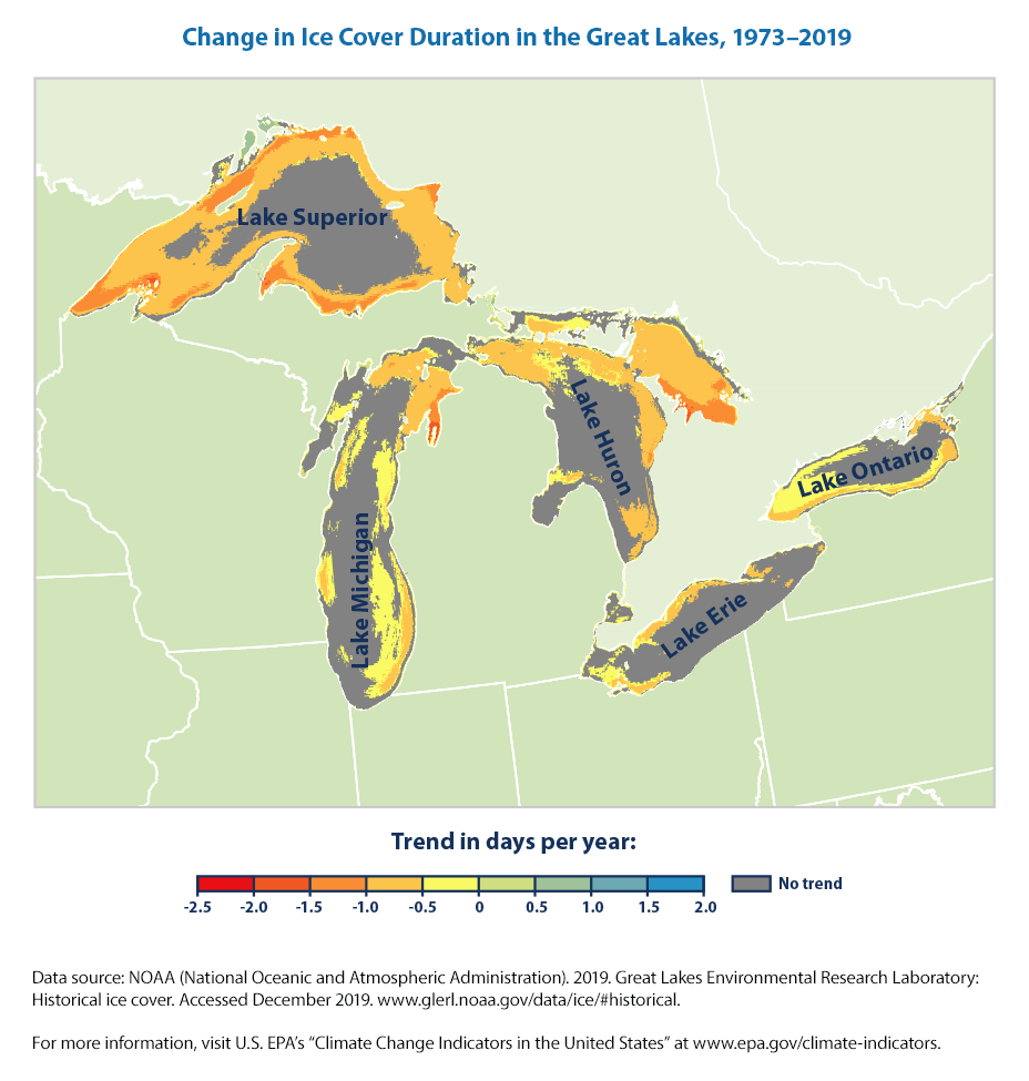
There is also a detailed map below (that we don’t know how to recreate)that shows that many areas of the Great Lakes have experienced significant decreases in ice cover duration, but other parts of the lakes have not changed significantly. Duration has decreased the most in areas near the shore.
9.6 Summary
9.6.1 Some Python concepts that we learned in this Chapter
We can collect the Python programming concepts towards the end
- Concatenating- Creating a new string or object that merges two strings togehter. In simple terms, we can create a new string variable by combining two strings together usually using the + symbol. An example may be “Climate” + “Change” giving us “Climate Change”.
9.6.2 Some Climate Insights that we learned in this Chapter
- Both the extent and thickness of Arctic sea ice has declined rapidly over the last several decades.
- The four U.S. reference glaciers have shown an overall decline in mass balance since the 1950s and 1960s and an accelerated rate of decline in recent years
- Ice duration on great Lakes and number of frozen days are declining.
9.7 Exercises / Check your knowledge of Python
In the code that we used in this chapter, there are some learning opportunities to think through. For example,
- why is the index at 13?
- what does for loop do?
- what is the value of {month}
- what is concatenate doing?
- why do we need axis = 0
9.8 Data Sources
Some of the data sources that have used are: