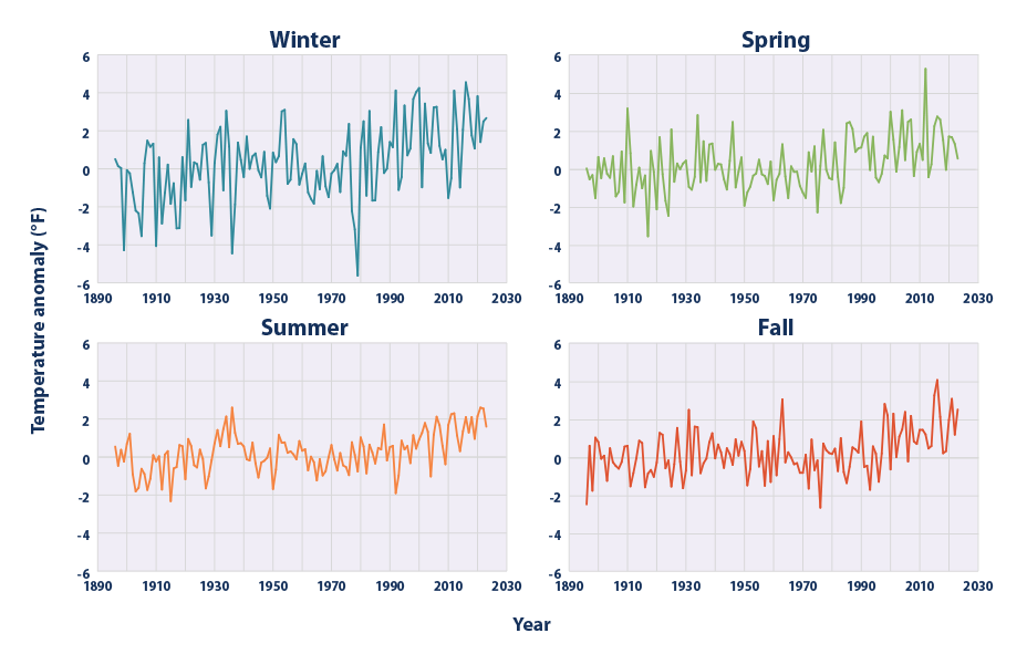
Average Seasonal Temperatures in the Contiguous 48 States, 1896–2023
As the EPA states,
This figure shows changes in the average temperature for each season across the contiguous 48 states from 1896 to 2023. Seasons are defined as follows: December, January, and February for winter; March, April, and May for spring; June, July, and August for summer; and September, October, and November for fall. This graph uses the 1901–2000 average as a baseline for depicting change. Choosing a different baseline period would not change the shape of the data over time.
Let us get the underlying data for the plot that EPA makes available in the same web page
import pandas as pdurl ="https://www.epa.gov/system/files/other-files/2024-06/seasonal-temperature_fig-1.csv"df_seasonal = pd.read_csv(url, skiprows=6, encoding="ISO-8859-1") df_seasonal
Year
Winter
Spring
Summer
Fall
0
1896
0.51
0.02
0.55
-2.49
1
1897
0.14
-0.55
-0.46
0.59
2
1898
0.04
-0.33
0.38
-1.77
3
1899
-4.28
-1.54
-0.24
1.02
4
1900
-0.07
0.62
0.70
0.79
...
...
...
...
...
...
123
2019
1.07
-0.05
0.96
0.31
124
2020
3.82
1.70
2.15
1.95
125
2021
1.41
1.66
2.60
3.06
126
2022
2.49
1.31
2.55
1.18
127
2023
2.67
0.54
1.60
2.50
128 rows × 5 columns
Some observations from looking at the data:
There are 128 rows and 5 columns. The data
The data is from year 1896 to 2023
There is one variable for each season: Winter, Spring, Summer and Fall
They represent the temperature anomaly relative to the entire period
Wouldn’t it be nice to show all the four seasons at once, side by side, like on the EPA website? Let’s do subplots.
We need to introduce a more full-featured version of plotly express in order to make subplots
import plotly.graph_objects as gofrom plotly.subplots import make_subplots
The plotly.graph_objects module provides a high-level interface for creating interactive plots using the Plotly library. It allows you to create various types of charts, such as scatter plots, bar charts, line charts, and more. This module is commonly used when you want to create custom visualizations with fine-grained control over the plot’s appearance and behavior.
The plotly.subplots module, on the other hand, provides a way to create subplots within a single figure. Subplots are useful when you want to display multiple plots side by side or in a grid layout. This module allows you to create complex layouts with multiple rows and columns of plots, each with its own data and settings.
The make_subplots function is used to create the subplot. It takes several parameters to customize the appearance and layout of the subplot. In this case, the rows parameter is set to 2, indicating that the subplot will have 2 rows, and the cols parameter is also set to 2, indicating that the subplot will have 2 columns.
The subplot_titles parameter is used to provide titles for each subplot. In this case, the titles are set to ‘Winter’, ‘Spring’, ‘Summer’, and ‘Fall’, corresponding to the four seasons.
Additionally, the x_title parameter is used to set the title for the x-axis of each subplot, and the y_title parameter is used to set the title for the y-axis of each subplot. In this case, the x-axis title is set to ‘Year’ and the y-axis title is set to ‘Temperature Anomaly’.
By using the make_subplots function and specifying the desired number of rows, columns, subplot titles, and axis titles, the code creates a subplot with four individual plots, each representing a different season, and with customized titles for the subplots and axis labels.
Each go.Scatter call adds a trace to the figure, representing a line plot. The x-axis values for all the traces are taken from the ‘Year’ column of the df_seasonal DataFrame, while the y-axis values are taken from different columns of the same DataFrame.
In the first go.Scatter call, the y-axis values are taken from the ‘Winter’ column of df_seasonal and the trace is given the name ‘Winter’. This trace is added to the first row and first column of the figure.
In the second go.Scatter call, the y-axis values are taken from the ‘Spring’ column of df_seasonal and the trace is given the name ‘Spring’. This trace is added to the first row and second column of the figure.
In the third go.Scatter call, the y-axis values are taken from the ‘Summer’ column of df_seasonal and the trace is given the name ‘Summer’. This trace is added to the second row and first column of the figure.
Finally, in the fourth go.Scatter call, the y-axis values are taken from the ‘Fall’ column of df_seasonal and the trace is given the name ‘Fall’. This trace is added to the second row and second column of the figure.
Overall, this code is creating a figure with a grid layout and adding four line plots to it, each representing a different season. The x-axis values are consistent across all the traces, while the y-axis values vary based on the season.
In the final piece of code.
# Update layout for the entire figurefig.update_layout(title='Seasonal Temperature by Year', title_x =0.5, showlegend=False) # Show the plotfig.show()
First, we have the fig.update_layout() function. This function is used to update the layout of a plot. In this case, it is updating the title of the plot to “Seasonal Temperature by Year”. The title_x parameter is set to 0.5, which means that the title will be horizontally centered within the plot. The showlegend parameter is set to False, which means that the legend will not be displayed in the plot.
After updating the layout, we have the fig.show() function. This function is used to display the plot. It will open a new window or tab in your IDE or browser, depending on the environment you are working in, and show the plot.
Overall, this code is updating the layout of a plot and then displaying it. It’s a common pattern in data visualization to update the layout to customize the appearance of the plot before showing it to the user.
The full code for creating a plot similar to the EPA plot is
import plotly.graph_objects as gofrom plotly.subplots import make_subplots# Create subplots: 2 rows, 2 columnsfig = make_subplots(rows=2, cols=2, subplot_titles=('Winter', 'Spring', 'Summer', 'Fall'), x_title='Year', y_title ='Temperature Anomaly (°F)')# Add traces for each season in their respective subplotfig.add_trace(go.Scatter(x=df_seasonal['Year'], y=df_seasonal['Winter'], name='Winter'), row=1, col=1)fig.add_trace(go.Scatter(x=df_seasonal['Year'], y=df_seasonal['Spring'], name='Spring'), row=1, col=2)fig.add_trace(go.Scatter(x=df_seasonal['Year'], y=df_seasonal['Summer'], name='Summer'), row=2, col=1)fig.add_trace(go.Scatter(x=df_seasonal['Year'], y=df_seasonal['Fall'], name='Fall'), row=2, col=2)# Update layout for the entire figurefig.update_layout(title='Seasonal Temperature by Year', title_x =0.5, showlegend=False) # Show the plotfig.show()
What are the climate insights from these figures?
As EPA key points for this plot mentions
Since 1896, average winter temperatures across the contiguous 48 states have increased by about 3°F (see Figures 1 and 3). Spring temperatures have increased by about 2°F, while summer and fall temperatures have increased by about 1.6°F.
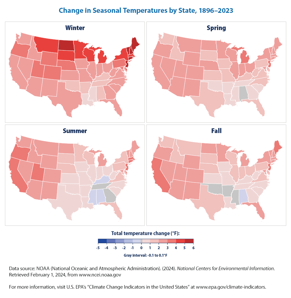
6.2 Change in Seasonal Temperatures by State, 1896–2023
Now that we have already done a chloropeth map at the FIPS level, we can do one at the state level and by season.
We are trying to replicate
Change in Seasonal Temperatures by State, 1896–2023
First, let us get the data as before
import pandas as pdurl ="https://www.epa.gov/system/files/other-files/2024-06/seasonal-temperature_fig-2.csv"df_seasonal = pd.read_csv(url, skiprows=6, encoding="ISO-8859-1") df_seasonal.head()
State
Winter
Spring
Summer
Fall
0
AL
1.167842
0.002762
-0.462791
-0.224346
1
AR
1.152616
0.543169
0.192406
0.003743
2
AZ
2.543605
2.744586
2.585792
2.416751
3
CA
2.672202
2.701781
3.028089
3.075545
4
CO
3.230923
2.656650
2.663118
2.200145
df_seasonal.describe()
Winter
Spring
Summer
Fall
count
48.000000
48.000000
48.000000
48.000000
mean
3.206372
1.939621
1.622241
1.631349
std
1.305010
0.869417
1.210277
1.007394
min
0.911410
0.002762
-0.462791
-0.224346
25%
2.402253
1.391434
0.566597
0.866533
50%
2.782267
2.096493
1.781704
1.618496
75%
4.248619
2.667387
2.600763
2.384811
max
5.663118
3.436265
4.155015
3.345022
We can see that the data is
there are 48 observations
data is missing for Alaska
data is from 1986 to 2023
data is at the state level
there are 4 columns, one for each season, Winter, Spring Summer and Fall
import plotly.express as pxfig = px.choropleth(df_seasonal,locations='State', locationmode ="USA-states", color='Winter', color_continuous_scale="Reds", range_color=(-6, 6), scope="usa", labels={'Winter':'Winter (°F)'} )fig.update_layout(title='Winter Temperature Change by State', title_x =0.5, showlegend=False)fig.update_layout(margin={"r":0,"t":50,"l":0,"b":0})fig.show()
We can create one for each season by modifying the above code. Or better, can use the subplots that we just learned, to create a plot with four subplots, one for each season, just as the EPA plot?
Alas, it looks like we can’t easily do it. We tried and we get errors becuase Plotly choropleth is not compatible with the default 2D Cartesian subplots created by make_subplots. Choropleth maps require a specific map subplot type, which is not the same as the default “xy” (Cartesian) subplots.
There may be a smarter way to do it, but we took the easy way out and display the plots for each season separately.
fig = px.choropleth(df_seasonal,locations='State', locationmode ="USA-states", color='Spring', color_continuous_scale="Reds", range_color=(-6, 6), scope="usa", labels={'Spring':'Spring (°F)'} )fig.update_layout(title='Spring Temperature Change by State', title_x =0.5, showlegend=False)fig.update_layout(margin={"r":0,"t":50,"l":0,"b":0})fig.show()
fig = px.choropleth(df_seasonal,locations='State', locationmode ="USA-states", color='Summer', color_continuous_scale="Reds", range_color=(-6, 6), scope="usa", labels={'Summer':'Summer (°F)'} )fig.update_layout(title='Summer Temperature Change by State', title_x =0.5, showlegend=False)fig.update_layout(margin={"r":0,"t":50,"l":0,"b":0})fig.show()
fig = px.choropleth(df_seasonal,locations='State', locationmode ="USA-states", color='Fall', color_continuous_scale="Reds", range_color=(-6, 6), scope="usa", labels={'Fall':'Fall (°F)'} )fig.update_layout(title='Fall Temperature Change by State', title_x =0.5, showlegend=False)fig.update_layout(margin={"r":0,"t":50,"l":0,"b":0})fig.show()
More importantly, what are the climate change insights?
From the EPA website
Temperature changes vary by state, with larger seasonal increases across the northern states and the Mountain West, and smaller increases in the South and Southeast. All 48 states experienced winter warming over this time period. Most states experienced warming in the spring, summer, and fall, but a few states had little to no overall change or cooled slightly (for example, Alabama) during those months.
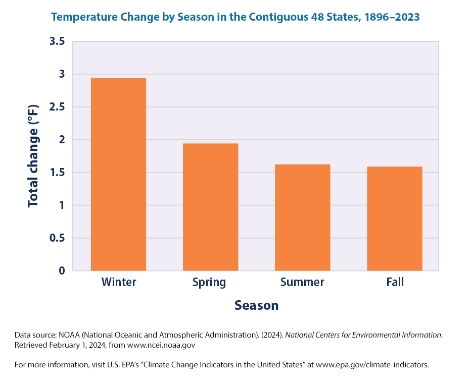
6.3 Temperature Change by Seasons in States
Let us recreate the plot from the EPA website on Temperature Change by Season in the Contiguous 48 States, 1896–2023.
Temperature Change by Season in the Contiguous 48 States, 1896–2023
import pandas as pdurl ="https://www.epa.gov/system/files/other-files/2024-06/seasonal-temperature_fig-3.csv"df_change = pd.read_csv(url, skiprows=6, encoding="ISO-8859-1") df_change
Season
Total change
0
Winter
2.943983
1
Spring
1.941192
2
Summer
1.622838
3
Fall
1.588786
This is a simple bar chart! It is very easy for us to do now!
import plotly.express as pxfig = px.bar(df_change, x ="Season", y ="Total change", title ="Temperature Change (°F) by Season in the Contiguous 48 States, 1896–2023 ")fig.update_layout(yaxis_title ='Total Change (°F)')fig.show()
6.4 Summary
The key insights from these plots are, from the EPA website,
Since 1896, average winter temperatures across the contiguous 48 states have increased by about 3°F (see Figures 1 and 3). Spring temperatures have increased by about 2°F, while summer and fall temperatures have increased by about 1.6°F.
A trend toward warmer winters is consistent with observed reductions in snow (see the Snowfall, Snow Cover, and Snowpack indicators) and shorter ice seasons (see the Lake Ice indicator). Warmer winter, spring, and fall temperatures are also consistent with longer growing seasons (see the Length of Growing Season indicator). Warmer average summer temperatures align with the observation that extremely hot temperatures have become more frequent since the mid-20th century (see the Heat Waves indicator).
Temperature changes vary by state, with larger seasonal increases across the northern states and the Mountain West, and smaller increases in the South and Southeast (see Figure 2). All 48 states experienced winter warming over this time period. Most states experienced warming in the spring, summer, and fall, but a few states had little to no overall change or cooled slightly (for example, Alabama) during those months.